
Last updated: July 2026
Cohort analysis is the practice of grouping customers by when they first appeared in your business, a sign-up date, a first purchase, a first appointment, and then watching what that group does in every subsequent period. By the end of this page, you’ll be able to build your own retention curve from scratch, read its shape like a diagnostic, and use the five-bucket growth accounting model to pinpoint exactly where your revenue is being made or lost.
Here’s the problem it solves. Every business owner looks at a revenue chart going up and to the right and concludes things are working. Sometimes they are. But that chart is a net number, it shows what’s left after customers who left have been subtracted from customers who arrived. You can grow your top line while quietly hemorrhaging your best customers, replacing them with cheaper, harder-to-retain ones. You won’t see it in aggregate. Cohort analysis pulls back the curtain.
A gym that signs up 200 new members in January, loses 180 of them by April, and signs up another 200 in May looks, in aggregate, like a gym that has 220 members and is growing. What it actually has is a revolving door with a marketing budget attached. The retention curve shows you the door. Everything else just shows you the lobby.
The idea in 30 seconds
- Cohort analysis groups customers by when they first bought, then tracks what percentage return over time.
- The retention curve is the output: a line that drops steeply early and either flattens (healthy) or falls toward zero (broken).
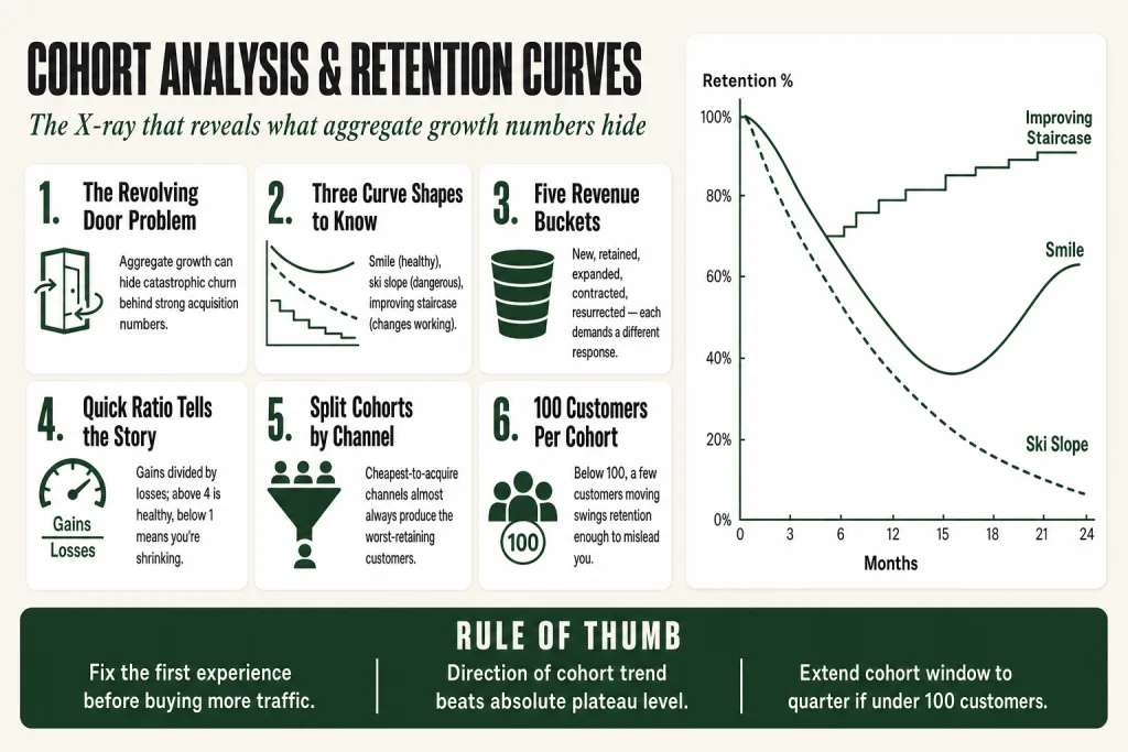
- A flat aggregate growth number can hide catastrophic churn, cohort analysis is the X-ray that reveals it.
- Growth accounting splits your revenue into five buckets, new, retained, expanded, contracted, and resurrected, so you can see exactly where growth is coming from and where it’s leaking.
- The curve’s shape tells you more than its level: where it drops fast, where it stabilizes, and whether newer cohorts are improving tell you what to fix and in what order.
- A small business can run a basic cohort analysis in a spreadsheet using nothing but transaction dates and customer IDs.
Where Cohort Analysis Came From
The word ‘cohort’ traces back to the Roman army, a unit of roughly 300 to 600 soldiers. It moved into scientific use in the early twentieth century through epidemiology. Wade Hampton Frosta Professor of Epidemiology at Johns Hopkins University, wasn’t the first to develop cohort analysis, but it was the posthumous publication of his 1936 lecture on age and time trends of tuberculosis mortality that directed wide attention to the method. His move, grouping patients by birth year rather than current age, and following each generation forward through time, is the whole insight. Track a defined group forward instead of cutting across groups at a single moment. That logic holds just as well for customer data as it did for tuberculosis mortality rates in Massachusetts.
The business formalization came decades later. Jonathan Hsu’s ‘Diligence at Social Capital’ essay series (Parts 1 to 5, published on Medium) gave operators a precise, reproducible version of growth accounting, the five-bucket decomposition of revenue into new, retained, expanded, contracted, and resurrected, that is now close to standard practice at any well-run recurring-revenue business. Hsu later extended the thinking at Tribe Capital in ‘A Quantitative Approach to Product Market Fit.’ A technique originally built to track disease mortality turns out to be exactly the right tool for the most important question in your business: are the customers who came in last quarter still here?
How Cohort Analysis Actually Works
The mechanics are simpler than the vocabulary suggests. Take every customer who made their first purchase in a given time window, say, January, and label them the January cohort. Then track what percentage of that group comes back in February, March, April, and so on. Do the same for the February cohort, the March cohort, and every period after that. Stack those rows in a table and you have a cohort matrix.
Each row is a cohort. Each column is time elapsed since that cohort’s start date, Month 0, Month 1, Month 2. The number in each cell is the retention rate: what fraction of the original cohort is still active. Read across a single row and you’re watching one group age. Read down a single column and you’re comparing different cohorts at the same age, were customers acquired in Q4 better retained at the six-month mark than customers acquired in Q1? That column comparison is where some of the most useful intelligence lives.
Plot the retention rate on the Y-axis against time on the X-axis and you get the retention curve. It almost always drops steeply in the early periods, most attrition happens fast, and then flattens. The shape of that flattening, and where the curve levels off, is the signal you’re reading.
The Three Curve Shapes
The smile curvedrops fast, then flattens above zero. This is the healthy pattern. A core segment has found lasting value and stopped churning. The height of the plateau matters, but context does too: a B2B SaaS product with annual gross revenue retention in the 85 to 95% range is performing in line with or above industry norms (per SaaS Capital’s annual private-company survey, median GRR across B2B SaaS sits around 90 to 92%); a consumer loyalty program with lower absolute retention can still be viable if the economics hold.
The ski slopecontinuous decline toward zero. Every cohort eventually runs out of active customers. This is the most dangerous shape because it can hide behind good acquisition numbers for months. If you’re bringing in enough new customers, the aggregate line still goes up. You’re on a treadmill, not a flywheel.
The improving staircasenewer cohorts flatten higher than older ones. This is what you want to see when you’ve made meaningful changes to your product, offer, or onboarding. The June cohort retains better at Month 3 than the January cohort did. That’s evidence that something you changed actually worked.
A retention curve that shows no sign of flattening by month six is one of the clearest signals that the core offer isn’t creating lasting habits. No amount of acquisition spend fixes a ski slope.
Growth Accounting: Decomposing Revenue into Five Buckets
The retention curve tells you whether customers are staying. Growth accounting tells you where your revenue is actually coming from, and where it’s leaking out. The framework, formalized by Jonathan Hsu in the ‘Diligence at Social Capital’ series, decomposes any period’s revenue or activity into five categories, each pointing to a different part of the business.
The identity at the center of it:
Revenue (this period) = New + Retained + Resurrected + Expanded
Revenue lost = Churned + Contracted
Each bucket has a specific definition:
- Newrevenue from customers who were active for the first time this period.
- Retainedrevenue carried over from customers who were active last period and returned at roughly the same level.
- Expandedadditional revenue from customers who were already retained but spent more this period. An existing client who adds a service, a subscriber who upgrades.
- Contractedrevenue lost from customers who are still active but spending less. They didn’t leave, they pulled back. Often a leading indicator of eventual churn.
- Resurrectedrevenue from customers who had previously churned and came back.
- Churnedrevenue lost from customers who were active last period and are completely absent this period.
Each bucket requires a different operational response. A business whose growth is almost entirely ‘New’ is acquisition-dependent, the moment CAC rises or the channel dries up, growth stalls. A business with strong ‘Retained’ and meaningful ‘Expanded’ can grow revenue even without adding a single new customer.
One sharp diagnostic from this framework is the Quick Ratio: total gains (New + Resurrected + Expanded) divided by total losses (Churned + Contracted). A ratio above 4 is generally considered healthy. Below 1 means you’re losing more revenue than you’re gaining.
A second useful output is net revenue retention (NRR): if you acquired zero new customers next month, would revenue from existing customers go up, stay flat, or go down? An NRR above 100% means your existing base is expanding on its own. According to SaaS Capital’s 2025 private B2B SaaS benchmarking research, companies with ACVs between $25,000 and $50,000 see a median NRR of 102% and top-quartile companies reaching 111%, though these figures vary meaningfully by ACV tier and market segment, so the right comparison is always against peers at a similar price point, not against enterprise averages.
Consider a rough illustration. Your business grew 10% this month. Growth accounting reveals: 9% came from new customers, 1% from resurrected ones, 4% from expansion, but 4% was contracted away. Churned revenue was effectively zero. That profile is a healthy B2B business: low churn, meaningful expansion, some win-back. Now compare to a consumer business that also grew 10%, but where 15% came from new customers and 5% churned completely. Same aggregate growth rate, completely different underlying health. The first business keeps growing if it stops marketing tomorrow. The second stops the moment the acquisition tap closes.
Putting this to work? The ideas in the Canon are the foundation under the tactical playbook in Build a Complete Marketing Department — grab the free companion kit at mmsvegas.com/resources.
How an Operator Builds a Cohort Analysis Today
You don’t need Amplitude, Mixpanel, or any analytics platform to do this. You need two columns: a customer identifier and the date of their first transaction. Everything else is time arithmetic.
Step 1: Pull the data
From your POS, CRM, e-commerce platform, or billing system, export a table with every transaction: customer ID, transaction date, and revenue amount. If your system tracks ‘first seen’ dates, use that. If not, find the minimum transaction date per customer, that’s their cohort assignment date.
Step 2: Assign each customer to a cohort
Round their first transaction date to the nearest month (or quarter, for businesses with longer cycles). Every customer who first bought in January belongs to the January cohort. Simple.
Step 3: Calculate retention by period
For each cohort, count how many customers made at least one purchase in Month 0, Month 1, Month 2, and so on. Divide each count by the cohort’s original size to get a retention percentage. This is the cohort table.
Step 4: Plot the curves
Pick three or four cohorts and plot their retention percentages over time on the same chart. Look for the three shapes. Are newer cohorts improving on older ones? Where does the steepest drop occur, Month 0 to 1, or Month 1 to 2? That tells you whether you have an activation problem (people try and immediately leave) or a habit-formation problem (people use it a while but don’t become regulars).
Step 5: Apply growth accounting
For each month, categorize your revenue into the five buckets. A spreadsheet handles this with VLOOKUP or SUMIF logic, tedious to build the first time, worth every hour. Once you have it, you can see at a glance what’s driving growth and what’s draining it.
On sample size and cohort window
A cohort needs at least 100 customers before the retention percentages carry much weight. That threshold is an industry rule of thumb for business cohort work, at fewer than 100, a handful of customers moving in or out swings the retention rate enough to make trend-reading unreliable. If your monthly new-customer count is smaller than that, extend the cohort window to a quarter. You’re not sacrificing the methodology; you’re trading time-axis granularity for a cohort large enough to read. The retention curve still shows the same shapes, smile, ski slope, improving staircase, the column labels just say Q1, Q2, Q3 instead of January, February, March.
If your quarterly cohorts still only contain 15 or 20 customers, the analysis is directionally useful but treat every number as a hypothesis, not a finding. A single large order or one churned anchor client can move the whole cohort. Use it to decide what to investigate, not to declare what’s true.
What cadence to run it
Monthly for most businesses. Quarterly review of the full cohort matrix. Weekly if you’re running experiments you want reflected quickly, though weekly cohorts are volatile and need more interpretive caution than monthly ones.
Where Cohort Analysis Pays Off, and Where It Doesn’t
Cohort analysis pays off most when repeat behavior is both possible and commercially necessary. Subscriptions, memberships, SaaS products, professional service retainers, e-commerce businesses with consumable products, restaurants, salons, anywhere the ideal customer comes back more than once, the retention curve is a live signal of business health.
The analysis is particularly powerful when you’ve been running the business for at least a year and have multiple cohorts to compare. The comparison between cohorts is where you learn whether changes you made actually improved anything. A single cohort gives you a number; multiple cohorts give you a trend.
Cohort analysis is less useful, not useless, just less analytically rich, when the natural purchase cycle is very long. A residential real estate agent, a custom furniture maker, a business selling commercial HVAC systems: your customers might have a natural return interval of five to ten years. The retention curve looks like a ski slope by design, not by failure. What matters there is referral behavior and lifetime value, not monthly active rates.
For businesses with genuinely one-time purchases, cohort analysis of acquisition behavior can still be useful, tracking which channel produced buyers who referred more, or which promotional cohort had a higher average order, but it’s doing different analytical work than retention measurement.
One underused application: cohort analysis on channelsnot just time periods. Group customers by acquisition source, paid search, organic, referral, trade show, and track their retention separately. Almost every operator who does this discovers that the cheapest-to-acquire channel produces the worst-retaining customers. That single finding often justifies rebalancing an entire media budget.
Shopify is a useful public example of cohort logic applied at scale. CFO Jeff Hoffmeister noted on the Q1 2026 earnings call that “the cohort dynamics continue to compound”, the kind of language a finance executive only uses when older merchant vintages are reliably growing their spend over time. Small operators rarely publish their cohort data publicly, but the analytical logic is identical: which vintage of customers is growing its spend, and which is fading?
Reading the Retention Curve: Practical Diagnostics for Operators
The curve’s shape is a diagnostic tool, not just a scorecard. Different shapes point to different operational problems, and the fix changes depending on which problem you actually have.
Steep drop in the first period
The biggest drop between Month 0 and Month 1 almost always points to an onboarding or activation problem. Customers tried you, didn’t get to value fast enough, and left before they formed a habit. This is a product, service delivery, or expectation-management problem, not an acquisition problem. Throwing more marketing at a steep Month 0 to 1 drop is exactly the wrong response. Fix the first experience first.
If the first interaction ends flat or negative, the customer’s mental model of you is already set against return. The fix is usually making the first session or first delivery feel more complete, a clearer next step, a faster win, a follow-up that acknowledges what just happened.
Gradual slope through the middle periods
A slow decline through Months 2 to 5 without a flattening point suggests the product or service is being used occasionally but hasn’t become a habit. Customers find some value but not enough to anchor their routine around it. This is usually a depth-of-value problem, often solvable with better feature discovery, use-case education, or simply asking customers what would make them come back.
No plateau at all
If the curve never flattens and all cohorts trend to zero, you have a foundational problem with value delivery. No retention tactic fixes this. Get back to customer discovery, find out why people left, find the minority who stayed, and ask them what made the difference.
Improving cohorts
When newer cohorts flatten higher than older ones, you’re seeing the compound benefit of changes you’ve already made, better onboarding, a stronger offer, a changed pricing model. This is the best possible reading. Identify exactly what changed and double down on it.
Diverging cohorts by acquisition channel
If you compare a cohort acquired heavily through paid social against one acquired heavily through word-of-mouth, and the word-of-mouth cohort retains significantly better, that’s an acquisition quality signal. Referral customers are typically better matched to your product, trust you more before they arrive, and churn at lower rates. The implication is usually that organic channels deserve more investment, even if they’re slower to scale.
On benchmarks: per SaaS Capital’s 2025 research on private B2B SaaS companies, GRR of 90% or above is considered performance parity with peers, and the top quartile approaches 95%. Consumer apps tend to show much sharper early drop-offs. But the benchmark that matters most to a small operator is the trend in their own data, are newer cohorts better than older ones? That question beats any industry average.
What People Get Wrong About Cohort Analysis
‘My business is growing so retention must be fine.’ The central trap. Aggregate revenue growth is compatible with severe retention problems as long as you’re acquiring new customers fast enough to replace the ones leaving. The cohort table breaks the illusion. Two businesses at identical growth rates can have radically different retention curves, and the one with the worse curve is far more fragile when acquisition gets expensive.
‘Low retention means bad product.’ Not necessarily. Some businesses have structurally low retention by design, a tax preparer, a wedding photographer, a college admissions consultant. Low cohort return rates in those contexts don’t signal a broken experience; they signal a naturally infrequent purchase cycle. Shift the analysis toward referral rates and lifetime value. Cohort analysis is still useful for channel comparison, but the retention rate alone doesn’t carry the same diagnostic weight.
‘A higher plateau is always better.’ The plateau level matters, but shape and trend matter more. A business flattening at 35% whose most recent cohorts are improving is in a better position than one flattening at 50% whose most recent cohorts are declining. Direction beats level, especially early in the business.
‘Cohort analysis is only for tech companies.’ The math was invented to track tuberculosis mortality. A dental practice, a gym, a landscaping company on annual contracts, a marketing agency with retainer clients, all businesses where the retention curve tells you something directly actionable. The tools are different (a spreadsheet instead of Mixpanel), but the logic is identical.
‘The resurrected bucket is a win.’ Resurrected customers are valuable, but over-reliance on resurrection to prop up growth is a warning sign. If a meaningful chunk of your ‘growth’ is lapsed customers coming back, that means churn was high enough to build a large pool of lapsed customers in the first place. Win-back campaigns are legitimate tactics; a business model that depends on them is structurally weaker than one with high baseline retention.
Common Mistakes
- Defining ‘active’ differently across analyses — Lock your active-customer definition in writing before building the spreadsheet, ‘made at least one purchase in the last 30 days’ or ‘logged in at least once this month.’ Write it in the spreadsheet header. One quiet definitional change mid-analysis makes every cohort comparison meaningless, and it’s easy to drift without noticing.
- Treating all cohort periods as equally readable regardless of size — Check cohort size before interpreting the curve. A cohort of 12 customers where one anchor client churns looks, mathematically, like a catastrophic retention collapse. It isn’t, it’s noise. If a period cohort is under 50 customers, note it explicitly and treat the curve as directional only. Extend the window to a quarter before drawing any conclusions about trend.
- Ignoring contracted revenue until it becomes churn — Customers who reduce spend before they fully leave typically show up in the contracted bucket 30 to 60 days before they disappear entirely. Run the contracted bucket as its own monthly alert. A spike in contraction is an early warning signal, not a rounding error to smooth over, and it’s recoverable in a way that completed churn is not.
- Mixing new-customer revenue into NRR calculations — Net revenue retention measures only what happens to the revenue base you already had. If you include new customers acquired during the measurement period in the numerator, the number is inflated and tells you nothing about actual retention health. Pull new and existing customer revenue into separate columns before calculating NRR.
- Running cohort analysis on time periods only, never on channels — Once you have channel attribution data, split cohorts by acquisition source and plot retention curves separately for each. Paid social, referral, organic, and trade-show cohorts will almost always show meaningfully different retention shapes. The gap between your best-retaining and worst-retaining acquisition channel is usually the single most useful input to next quarter’s budget decision.
Operator’s Take
The first thing I’d actually do, before touching a chart, is build the growth accounting split. Monthly, not quarterly. The five-bucket breakdown takes an hour to set up the first time and twenty minutes to update after that. The single number you pull from it immediately: what share of total revenue is coming from retained and expanded customers versus new-only? If retained and expanded are carrying 40% or more of growth, you have a business that compounds on its own momentum. If you’re above 80% dependent on new customers, you’re one bad acquisition month away from a problem you currently can’t see in the revenue line.
Same week, plot your last four to six cohorts on one chart. Ask two questions and only two. Does the curve flatten, or does it ski-slope toward zero? And are newer cohorts landing higher than older ones at the same age? Most operators study the first question and skip the second entirely. That’s a mistake. A business where each cohort retains slightly better than the last has compounding evidence that its changes are working, and that signal shows up in the cohort chart months before the revenue line moves.
If you’ve got the ski slope, no plateau, all cohorts trending toward zero, I’d stop buying traffic before doing anything else. More acquisition into a broken retention engine just confirms the bucket has a hole, at whatever your current CAC happens to be. The investigation almost always lands in the first 30 days: a confusing handoff, a delivery that didn’t match the promise, an onboarding sequence that never connected someone to the specific outcome they came for. Talk to people who left. Find the ones who stayed and ask what made them different.
Two places most operators never get to, but should. Build a separate retention curve for each acquisition channel, paid search, referral, organic, trade show. The cheapest-to-acquire channel almost always produces the worst-retaining customers, and the gap is usually wider than expected. That one finding tends to rewrite where next quarter’s budget goes. Then do the same split between customers acquired at full price versus customers acquired through promotional discounts. Discount cohorts routinely show steeper early drop-off and lower plateaus, the cohort table surfaces the real cost of a promotion in a way that conversion rate never will.
One honest caveat: cohort analysis is a lagging signal. A change you made last month won’t show up in retention behavior for two or three months, the cohort needs to age far enough to reveal the pattern. If you want faster feedback on experiments, you need early activation metrics running alongside the cohort data. The curve confirms the diagnosis. It doesn’t give you same-day results, and treating it like it does leads to overcorrecting on noise.
AI tools cut the setup time here considerably, writing the SQL to pull transaction data, building the pivot structure, flagging cohorts that look anomalous against the baseline. Use them for that. The judgment call, whether a spike in resurrected customers reflects a successful win-back campaign or is evidence that your churn was catastrophic enough to build a large lapsed pool in the first place, that’s yours. The tool surfaces the pattern. You decide what it means and what to do about it.
Used in
- ✓ Build a Complete Marketing Department
Used to evaluate whether acquisition investments are producing durable revenue or merely replacing churned customers, the retention curve and growth accounting framework inform budget allocation decisions across channels. - ✓ The Missing Manual for FunnelKit
Applied to measure whether funnel sequences (onboarding automations, post-purchase flows) are producing cohorts that retain better over time, the before/after cohort comparison is the primary test of whether a new sequence is working. - ✓ The Missing Manual for Make
Used to automate the monthly growth accounting pipeline, pulling transaction data, assigning cohort labels, and flagging contracted or churned customers for re-engagement sequences without manual spreadsheet work.
FAQ
What’s the difference between cohort analysis and regular retention reporting?
Regular retention reporting gives you a single rate for the whole business at a point in time. Cohort analysis tracks specific groups of customers forward from when they started, so you can compare how different vintages of customers behave and whether things are improving. The cohort view reveals trends over time; aggregate retention can mask them.
How many customers do I need before cohort analysis is meaningful?
Aim for at least 100 customers per cohort period. That threshold reflects a practical rule of thumb widely used in business cohort work: below 100, a few customers moving in or out can swing the retention percentage enough to make trend-reading unreliable. If your monthly acquisition is smaller than that, extend the cohort window to a quarter, you’re trading time-axis granularity for a large enough sample to read. The analysis becomes directionally useful even with smaller numbers, but treat the results as signals to investigate rather than statistically precise findings.
What does it mean if my retention curve never flattens?
It means every cohort eventually loses all its customers, no stable core of regulars is forming. This is the most serious signal cohort analysis can produce. Before investing more in acquisition, you need to understand why customers are leaving and whether the core offer is delivering enough value to justify return.
How is growth accounting different from cohort analysis?
Cohort analysis tracks groups of customers over time to produce retention curves. Growth accounting is a complementary framework that decomposes any period’s revenue change into five categories, new, retained, expanded, contracted, and resurrected, regardless of cohort. Used together, cohort analysis shows the trajectory; growth accounting shows where the money is coming from right now.
Can I run cohort analysis without analytics software?
Yes. You need a customer ID, a first-transaction date, and a list of subsequent transaction dates. Google Sheets handles this for businesses with a few hundred to a few thousand customers. The setup takes a few hours the first time; after that, monthly updates are straightforward.
Is cohort analysis relevant for service businesses without repeat customers?
Somewhat. For businesses with naturally long purchase cycles, residential real estate, one-time custom projects, the retention curve won’t be the right signal. But cohort analysis on referral behavior (which vintage of clients refers most), channel quality, or average deal size by acquisition period can still surface useful insights about which customers and channels are worth the most over time.
Further reading
- ‘Diligence at Social Capital’ by Jonathan Hsuthe essay series (Parts 1 to 5, published on Medium) that formalized growth accounting for revenue and user engagement; foundational reading for the mathematical grounding behind the five-bucket model. Hsu later updated the thinking in ‘A Quantitative Approach to Product Market Fit,’ published under Tribe Capital.
- Lean Analytics by Alistair Croll & Benjamin Yoskovitzcovers cohort analysis in the context of building stage-appropriate metrics for early-stage businesses; useful for operators who want to know what to measure and when.
- Tribe Capital’s ‘A Quantitative Approach to Product Market Fit’applies growth accounting directly to the question of whether a business has product-market fit; publicly available and worth reading alongside your own cohort data.
Sources: Wade Hampton Frost / American Journal of Hygiene: a 1936 lecture on age, time and cohort analysis of tuberculosis mortality, published posthumously in 1939 after Frost’s death, Frost was not the first to develop cohort analysis, but the posthumous publication directed wide attention to the method, per Comstock, International Journal of Public Health2001); Jonathan Hsu / ‘Diligence at Social Capital’ Parts 1 to 5, Medium (growth accounting framework); Tribe Capital / Jonathan Hsu, ‘A Quantitative Approach to Product Market Fit’ (updated five-bucket revenue decomposition); SaaS Capital 2025 Private B2B SaaS Retention Benchmarks (median GRR ~90 to 92%, median NRR 102% at $25K, $50K ACV tier, top-quartile NRR 111% at that tier; NRR benchmarks vary by ACV segment, figures drawn from SaaS Capital’s annual survey of private B2B SaaS companies); Shopify Q1 2026 Earnings Call / CFO Jeff Hoffmeister remarks and press release (merchant cohort compounding language; 34% revenue growth, $101B GMV); ChartMogul Subscription Growth Benchmark 2024 via Optifai (median NRR for venture-backed SaaS 106%, N=2,100); SaaS Capital 2025 Bootstrapped SaaS Benchmarks (median NRR 104%, GRR 92%, for bootstrapped companies with $3M, $20M ARR).
Brian Kasday spent forty years in direct-response marketing before rebuilding the whole operation as a one-person shop. He writes The Operator’s Library — including “Build a Complete Marketing Department” — for operators who’d rather build it themselves than wait on someone else.
Build the department these ideas describe — the free companion kit: mmsvegas.com/resources.
More The Operator's Canon guides
Free · Operator Toolkit
Want the tools, not just the guide?
Get the free operator toolkit — templates and checklists for the systems you actually run, plus a note when this guide changes.
Get the free toolkit →How to cite: Cohort Analysis & Retention Curves. Associated with Wade Hampton Frost, 1939. The Operator’s Canon, MMS Vegas. https://mmsvegas.com/library/cohort-analysis-retention-curves-explained/