
The 30-second answer
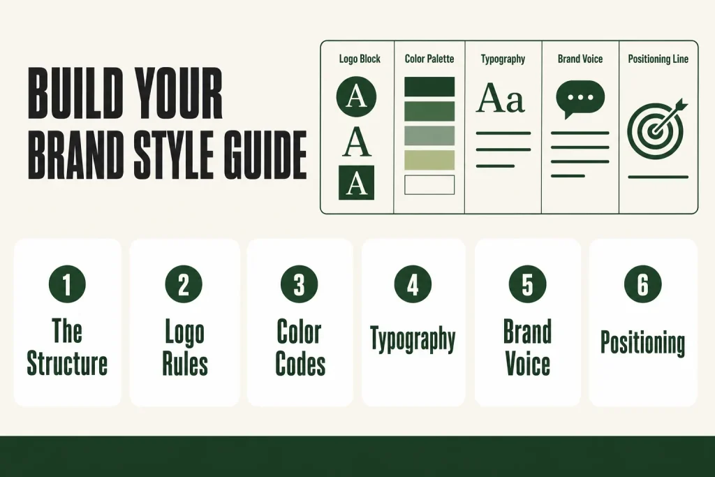
- Five sections, one page: logo usage, color palette (with hex codes), typography (two fonts max), brand voice (three do/don’t pairs), and a one-line positioning statement.
- Logo: show your primary logo, a reversed/white version, and a minimum-size rule. Flag what not to do.
- Colors: pick one primary, one accent, one or two neutrals. Record hex for digital, CMYK for print.
- Fonts: one heading font, one body font. Google Fonts keeps it free and consistent everywhere.
- Voice: three adjectives that describe how you sound, paired with an on-brand and off-brand example sentence each.
- Tool: Canva’s Brand Kit is the fastest place to build and store the whole thing. The free plan gives you one Brand Kit with up to three colors only: no logo uploads to the Brand Kit and no custom font uploads. Those are paid-plan features. Canva Pro gives you up to five Brand Kits, each with logos, custom fonts, and more colors (check Canva’s current plan page, as limits can change).
- Judgment stays with you: AI can help you draft your voice section, but you decide what actually sounds right for your business. The pattern-spotting is the tool’s job; the final call is yours.
Take this fix into your next scenario. The free Builder’s Companion Kit collects the checklists and templates that pair with this guide — so next time, you start from a template, not a blank page. Grab it free →
- Why One Page Beats a 40-Page Brand Book
- What Goes on Your DIY Brand Style Guide
- Section 1: The Logo Block
- Section 2: The Color Palette
- Section 3: Typography (Two Fonts. Not Three.)
- Section 4: Brand Voice (The Part Most Small Businesses Skip)
- Section 5: The One-Line Positioning Statement
- Where to Build and Store Your DIY Brand Style Guide
- Worked Example: Building a DIY Brand Style Guide for a Solo Service Business
- When to Update It (And When to Leave It Alone)
- FAQ
A DIY brand style guide is the one document that stops your business from looking like three different companies on three different channels. Without one, every social post, email, and flyer is a fresh decision: which logo file, which shade of blue, which tone. That decision fatigue adds up. A single page that locks in your logo rules, color codes, fonts, and voice means you make those calls once and stop remaking them forever. This article walks you through building exactly that, in one sitting, with no design background required.
Why One Page Beats a 40-Page Brand Book
A one-page brand style guide gets used. A 40-page brand book gets filed and forgotten. That’s not a knock on thorough documentation; it’s just the reality of running a small business solo. Your marketing SOPs only help you if you actually open them.
A brand style guide is the document that keeps your visual identity consistent across time, team members, and platforms, and for most small businesses, a single well-organized page beats a 40-page PDF that no one opens. That’s the bar you’re aiming for: something you’d hand to a freelance designer or a social media scheduler at 8am and trust them to get it right without a call.
Here’s the cost of skipping it. Stretching or changing the proportions of your logo dilutes its impact and looks unprofessional, and using shades that are close enough to your brand colors rather than using the exact hex codes creates a messy, inconsistent visual experience. Both of those mistakes happen when the rules don’t exist in writing. One page fixes both.
What Goes on Your DIY Brand Style Guide
A complete brand identity has two pillars: visual identity and verbal identity. Visual identity includes your logo system, color palette, typography, and imagery style. Verbal identity includes your brand voice, tone, and core messaging. Your one-pager covers both, stripped to the minimum that actually controls consistency.
Here are the five sections. Put them all on one landscape page or one scrollable slide.
- Logo block
- Color palette
- Typography
- Brand voice
- Positioning line
That’s it. Resist adding more until the business genuinely needs it.
Section 1: The Logo Block
Your logo block answers one question: which file do I use, and how do I use it?
Include your primary logo (your main, full-version logo) and a submark or icon (a simplified version for small spaces like profile photos or favicons). For most small businesses, a reversed or white version matters too: you need something legible on dark backgrounds.
Logo guidelines stop your logo from looking stretched, blurry, or ‘off’ across print, digital, and merch. Your guidelines should include spacing, color values, fonts, logo variations, minimum sizes, and the right file formats.
On the one-pager, show three things side by side: full-color version, white/reversed version, icon-only version. Below each, note the file format to use (PNG for digital, SVG for scalable use). Then add one explicit ‘never do this’ example, even if it’s just a note that says ‘do not stretch or recolor.’
Stretched, recolored, or badly placed logos drag down brand quality fast. You’re not being pedantic by writing this down. You’re saving yourself a conversation later.
Section 2: The Color Palette
Keep your palette small and strict. Your palette should include a primary color, a secondary color, and one or two neutrals, each defined with an exact HEX code.
Why exact codes? Because ‘navy blue’ is not a color. It’s a direction. Establish primary and secondary colors and specify the hex code for each color, so whether a designer is using CMYK color codes for printed material or RGB for the website, they can replicate the exact shades every time.
Here’s the format to follow for each color swatch on your one-pager:
- Color name (give it a real name, not just ‘primary’)
- HEX code for web and digital design
- RGB values for screen graphics
- CMYK values for anything printed
Use Pantone color codes for commercially printed materials. Use CMYK values for materials intended for print. CMYK stands for cyan, magenta, yellow, and black: the inks used by printers. Make sure any image you intend to print is in ‘CMYK’ mode and the proper color values are selected. Use RGB color values when creating images intended for viewing only on computer screens. RGB stands for the red, green, and blue light used by computer monitors. Use hex codes to create the desired colors on webpages.
If you don’t have a designer-supplied color system yet, tools like Coolors (coolors.co) let you generate a palette from a seed color or from an uploaded logo image. Once you have the hex codes, record them on the guide and never guess again.
Section 3: Typography (Two Fonts. Not Three.)
Typography carries a huge amount of brand weight. Select one primary font for headers and a secondary, highly legible font for body text. Two fonts is the right call for a one-pager. Three is a practical ceiling most designers and typographers recommend before things start looking cluttered, but two is plenty for a solo operator.
On the guide, show each font at two sizes: headline weight and body weight. Label them. ‘Heading: Playfair Display Bold, 32pt. Body: Open Sans Regular, 14pt.’ That single line does most of the work.
For free, licensable options, Google Fonts offers over 2,000 free, open-source font families (the directory grows regularly; check fonts.google.com for the current count). Most families include multiple weights and styles. Common pairings that read well across both print and screen include:
- Playfair Display + Lato for a professional, editorial feel
- Montserrat + Open Sans for modern and clean
- Merriweather + Open Sans for trust-driven and readable
If you pick from Google Fonts, your web designer, your Canva templates, and your email platform can all reference the same font family by name, which keeps everything consistent without licensing headaches.
Typography comes down to one or two typefaces with clear hierarchy rules: which font is for headings, which is for body text, and how they work together.
Section 4: Brand Voice (The Part Most Small Businesses Skip)
Visual consistency is half the job. The other half is sounding the same in every email, every caption, and every product description. Most small business style guides skip this section because it feels vague. Here’s how to make it concrete.
Pick three adjectives that describe how your brand sounds. Then, for each one, write one sample sentence that’s on-brand and one that’s off-brand. That table is your voice guide.
Example:
| Adjective | On-brand | Off-brand |
|---|---|---|
| Direct | ‘Here’s what you get.’ | ‘We are pleased to inform you that the following deliverables are included.’ |
| Warm | ‘We’ve been in your shoes.’ | ‘As valued clients, we appreciate your continued patronage.’ |
| Plain | ‘This takes about 20 minutes.’ | ‘Leveraging our streamlined onboarding methodology.’ |
Consider choosing two to three words to describe your tone overall. Make a list of words and phrases you like to use in your content. Also create a list of words and phrases you want to avoid. If you find formal words like ‘therefore’ go against your tone, list them in the ‘no-go’ section.
When picking your adjectives, be specific. Avoid generic words like ‘professional’ or ‘friendly’ unless you define exactly what they mean for your brand.
AI can help you draft this section. Paste three to five pieces of copy that felt right, ask the tool to describe the patterns it notices, and use that output as a starting point. The draft is a map, not a verdict. You still have to read it, test it against copy you’re proud of, and decide whether those patterns actually represent how you want your business to sound. That final call doesn’t belong to the tool. It belongs to you.
Once your voice guide exists, it becomes the brief you hand to freelancers or the filter you run your own draft copy through. It’s also what keeps AI-assisted copy anchored to your actual personality instead of drifting generic.
Section 5: The One-Line Positioning Statement
The last section of your one-pager is a single sentence. It answers: who do you serve, what do you do for them, and why does that matter to them specifically?
One ‘what we do’ statement gets used in your Google Business Profile, Instagram bio, email signature, and front-of-house. One sentence, written once, used everywhere.
The structure that works: ‘We help [specific person] [do or achieve something] so they can [real outcome].’ Keep it under 25 words. Read it aloud. If it sounds like a corporate press release, rewrite it in the language your best customers actually use when they describe the problem you solve. Your customer survey answers are a reliable source for this exact language.
This line doesn’t have to explain everything about the business. It has to be specific enough that the right person reads it and thinks ‘that’s for me.’ That’s its only job.
Once it’s written, it belongs in three places: the top of your brand guide, your website header, and every intake form or brief you send to contractors.
Where to Build and Store Your DIY Brand Style Guide
The document format doesn’t matter much, but your tool choice affects how easy it is to keep the guide alive and share it. Two sensible options:
Canva (recommended for most operators): Brand Kits let you upload and organize your team or organization’s official logos, colors, fonts, and assets in one place. The free plan gives you one Brand Kit with up to three brand colors only. Logo uploads to the Brand Kit and custom font uploads are both paid-plan features: they require Canva Pro (or another paid plan). If you’re on the free plan, you can still select fonts from Canva’s built-in library, which includes Google Fonts, so Google Fonts pairings work fine without upgrading. Canva Pro gives you up to five Brand Kits, each with logos, uploaded fonts, and more colors. These limits reflect current documentation as of late 2026, but Canva updates its plans periodically, so confirm the current limits at canva.com before making a plan decision.
The practical workflow in Canva: create a one-page landscape design, lay out your five sections, then separately set up the Brand Kit (on Pro) so those assets live in the sidebar for every future design. Canva will automatically pull in colors from any logos you upload, and pre-populate the colors area as palettes. It’s worth removing these and instead uploading your colors individually for the most accuracy.
Google Slides or Notion (if you prefer plain documents): A shared slide or a Notion page with embedded color swatches and font samples works fine. The advantage is a shareable link anyone can open without a Canva account. The trade-off is that it doesn’t auto-apply to your designs the way a Brand Kit does.
Whichever you pick, store the final file in one canonical location and put that link in every project brief you send. A brand guide that lives in one person’s email drafts isn’t a brand guide; it’s a liability.
Worked Example: Building a DIY Brand Style Guide for a Solo Service Business
Here’s how this plays out in practice. Say you run a one-person bookkeeping firm. You’ve been in business two years. You have a logo a designer made, but you’ve been picking colors from memory and writing emails in whatever tone felt right that day.
Step 1: Pull your logo files. You have a dark logo and a light logo. Export both as PNG (transparent background), plus a small square icon version for profile photos. These are your three logo variants.
Step 2: Use the eyedropper tool on your logo to pull exact hex codes. Your logo uses a deep teal (#1E6E6E), an off-white (#F5F1EB), and a charcoal for text (#2C2C2C). Record those three, plus CMYK equivalents for when the local Chamber of Commerce asks for your logo on a printed banner.
Step 3: Pick your fonts. You want to feel credible, not corporate. You pick Merriweather Bold for headings (authoritative, readable, free on Google Fonts) and Open Sans Regular for body text (clean, screen-friendly). You note the sizes you use: headings at 24pt, body at 14pt, captions at 11pt.
Step 4: Write your voice table. You pick three adjectives: Calm, Clear, Human. For each, you write one on-brand example sentence from a real email you’re proud of, and one off-brand example from an email you wish you’d rewritten. That contrast is what makes the guide useful to anyone else who touches your copy, including a VA or a social media scheduler.
Step 5: Draft your one-line positioning statement. ‘We handle the books for self-employed tradespeople who’d rather be on the job than in a spreadsheet.’ Under 25 words. Specific person. Real outcome.
Total time, including pulling files and setting up a Canva Brand Kit: about two hours. That’s the only brand design session you need for the next year. Next time someone needs your assets, you send one link. Your one-page marketing plan can reference the brand guide directly, and your social media plan uses it as the visual brief for every post.
When to Update It (And When to Leave It Alone)
Update the guide when something real changes: a new logo, a rebrand, a deliberate pivot in audience, or a price repositioning that changes how you need to sound. Don’t update it because you’re bored with your colors or because a competitor just refreshed their site.
Brand recognition is cumulative. Your brand colors are powerful recognition tools. When used consistently, they become associated with your business. Changing colors twice a year resets that clock every time.
Set a review date, once a year works for most small businesses, to check that the guide still reflects the business. If your best current customers aren’t the person your positioning line describes, update the line. If you’ve added a new logo variant (a holiday version, a co-branded asset), add it to the kit and note any usage restrictions.
Keep old versions dated and archived. If you ever hire a designer or a first marketing hire, version history tells the story of how the brand evolved and prevents old files from reappearing in new work.
FAQ
how long does it take to make a brand style guide yourself
For a one-page guide covering logo, colors, fonts, voice, and positioning, expect two to three hours if your logo files are already organized. Most of that time goes to writing the voice section and nailing the positioning line, not the visual elements.
what’s the difference between a brand kit and a brand style guide
A brand style guide is a document that defines the rules. A brand kit (like the one in Canva) is where you store the actual assets, such as logo files, color swatches, and fonts, so they’re applied automatically when you design. Ideally you build both: the guide explains the rules, the kit enforces them.
do I need a graphic designer to make a brand style guide
No. If you already have a logo and a rough color preference, you can build a functional one-page guide yourself in Canva using free templates. The judgment calls, specifically which colors feel right and how you want to sound, belong to you anyway, not a designer.
what hex code format should I use in my brand guide
Use hex codes for anything web or digital (social posts, email, website). Add CMYK values for any printed materials. If you work with professional printers regularly, Pantone codes are more reliable than CMYK for color accuracy. Record all three once and you’re covered for every format.
can I use AI to write my brand voice guide
AI can help you draft it. Feed the tool three to five pieces of copy that felt right, ask it to describe the patterns, and use that as a starting point. The final version needs your review: AI surfaces voice patterns, but only you know whether those patterns actually represent how you want your business to sound. The pattern-spotting is the tool’s job. That final call is yours, not the tool’s.
how many colors should a small business brand have
One primary, one accent, and one or two neutrals is enough for most small businesses. Four to five colors total is a practical ceiling. More than that and consistency gets harder to maintain across channels, especially when you’re doing the work solo.
Sources:
- Canva Help Center, “Set up Brand Kits”, canva.com/help/brand-kit/ (verified against live documentation)
- Canva Help Center, “Brand Kit Best Practices Guide”, canva.com/help/brand-kit-best-practices/ (verified against live documentation; full Brand Kit confirmed as paid-plan feature on Pro, Teams, Business, Enterprise, Education, and Nonprofits)
- Canva Help Center, “Upload and use brand logos”, canva.com/help/brand-logos/ (verified against live documentation; logo uploads confirmed as paid-plan only)
- Canva Help Center, “Upload and use Brand Kit fonts”, canva.com/help/upload-fonts/ (verified against live documentation; custom font uploads confirmed as paid-plan only)
- Adobe, “Create a brand style guide for your business”, adobe.com/creativecloud/business/teams/resources/how-to/brand-guide.html
- Shopify, “Brand Guidelines: How to Create a Style Guide”, shopify.com/blog/brand-guidelines
- Google Fonts directory, fonts.google.com (over 2,000 families as of October 2026 per github.com/maucworks/google-font-downloader catalog; count grows regularly; check fonts.google.com for the current figure)
- Northwestern McCormick, Color Usage Guidelines (color code format definitions), mccormick.northwestern.edu
- Vistaprint, “Logo usage guidelines”, vistaprint.com/hub/logo-usage-guidelines
- Stellar Media Marketing, “Brand Identity for Small Business”, stellarmediamarketing.com
- Countingup, “How to Create Tone of Voice Guidelines”, countingup.com
- Ukiyo Productions, “Brand Voice Guidelines: A Tone of Voice Guide”, ukiyoprod.com
Brian Kasday spent forty years in direct-response marketing before rebuilding the whole operation as a one-person shop. He writes The Operator’s Library — including “Build a Complete Marketing Department” — for operators who’d rather build it themselves than wait on someone else.
Get the Builder’s Companion Kit — the free checklists and templates that pair with this guide: mmsvegas.com/resources.
This guide handles one marketing job. Build a Complete Marketing Department builds the whole department. See the manual →
More Marketing guides
Free · Marketing Operator Toolkit
Running marketing on your own?
Get the free toolkit — the templates and the expensive mistakes behind a one-person marketing department, plus a note when this guide changes.
Get the free toolkit →