
Last updated: August 2026
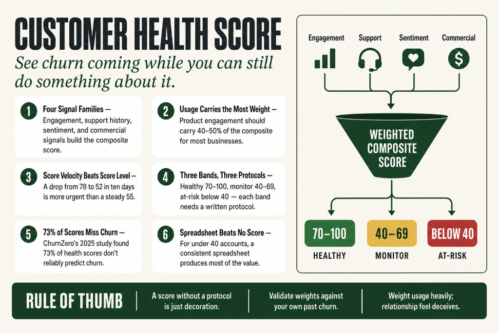
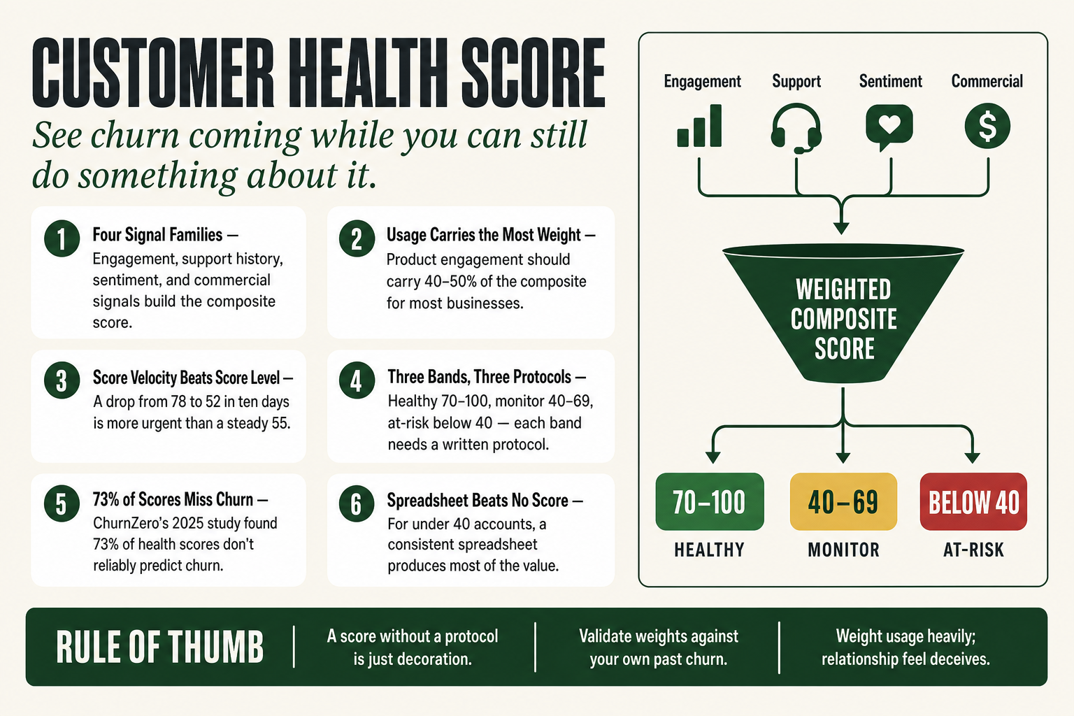
A customer health score is a composite, weighted metric that combines behavioral and sentiment signals to predict whether a customer will renew, expand, or churn, and it gives you that read while you can still do something about it. By the end of this page, you’ll be able to design a basic health scoring system from the data you already have, identify which signal families matter most for your business model, and translate scores into concrete actions your team will actually take.
Here’s the situation most subscription operators know personally: a customer who looked fine on the last check-in sends a cancellation email, and nobody saw it coming. The quarterly review was pleasant. The champion responded to emails. The account showed up green on whatever cobbled-together dashboard the team had. And then, gone.
The problem isn’t that the signals weren’t there. They were. The problem is that nobody had assembled them into a single, honest read of account health, and nobody had a protocol for acting on a deteriorating score before it became an exit. That’s exactly what a customer health score is built to solve. Not a magic number. An organizational habit of looking at every customer through the same consistent lens, usage, support, satisfaction, commercial behavior, so that the accounts that need attention surface automatically, instead of only when a cancellation email arrives.
The idea in 30 seconds
- A customer health score is a single composite number, built from weighted signals across usage, support, sentiment, and commercial behavior, that estimates how likely each customer is to stay, grow, or leave.
- It shifts your team from reactive firefighting (responding to cancellation emails) to proactive intervention (reaching out while there’s still time to change the outcome).
- The four core signal families are: product/service engagement, support history, sentiment (NPS, CSAT, CSM notes), and commercial signals (contract value, payment history, expansion behavior).
- There is no universal formula, the right weights depend on your business model. Start with two or three signals you already have data for, then add more as you learn which ones actually predict churn in your accounts.
- A health score is a leading indicator, not a report card. If it doesn’t trigger an action, it isn’t doing its job.
- Works best when segmented by customer type or lifecycle stage, the signals that matter in month one of a contract are different from the signals that matter at month eleven.
Where the Customer Health Score Came From
The customer health score didn’t come from academic research or a consulting whitepaper. It was invented under commercial pressure, by SaaS operators watching their businesses die quietly from behind-the-scenes churn.
Two companies converged on the same problem around the same time. Totango launched in 2010, founded by Guy Nirpaz, Omer Gotlieb, and Oren Raboy. JBara Software, co-founded in 2009 by Jim Eberlin and Sreedhar Peddineni, brought in Nick Mehta as CEO in February 2013, when Battery Ventures led a $9 million Series A and the company rebranded as Gainsight. Both were solving the same problem: SaaS businesses were spending all their energy acquiring customers and almost none keeping them.
Eberlin had lived the pain directly. Running Host Analytics, he had become its chief customer officer and found himself watching renewals slip away with no reliable signal that they were coming. There was plenty of technology to get customers in the door; there was almost nothing to help understand what they were doing once they were in. Gainsight was built to fill that gap, not as an abstract product idea, but as a tool the founder personally needed.
Early adoption was slow. The first-wave CS tech vendors faced a specific obstacle: theirs was a new category that required a lot of explaining to prospective customers. Buyers had to be convinced that gut-feel account management was genuinely insufficient, that product usage data predicted churn, and that a structured scoring approach would outperform an experienced CSM’s instincts. CS managers themselves often resisted, a data-driven score implicitly challenged their read of a relationship.
By mid-2014, the market had moved. The argument was shifting from nice-to-have to protect-your-ARR. What the broader movement codified over the following decade, through Gainsight, ChurnZero, Totango, Vitally, and others, was that you couldn’t manage retention at scale through anecdotal check-ins. By the mid-2010s, health scoring was standard infrastructure in B2B SaaS. By the early 2020s, it was migrating into professional services, managed IT, digital agencies, and wealth management, any business running on recurring revenue.
The Problem: You Don’t Know a Customer Is Leaving Until They’re Gone
Churn rarely announces itself. Customers don’t send a warning email three months in advance. They get quieter. They use the product a little less. The champion changes roles and nobody introduces a replacement. Support tickets pile up unresolved. The invoice gets paid late for the first time. Each signal, in isolation, looks like noise. Together, they’re a story, but only if someone is watching all of them at once and reading them as a composite picture.
Most small operators aren’t. They’re watching NPS responses when customers bother to fill them out (most don’t). They’re skimming support queues. They’re trusting the sales rep’s assessment that a relationship is strong. None of those individual views is wrong, exactly, they’re just incomplete. They miss the customer who’s happy in surveys but disengaged in the product. Or the account that’s actively using the product but harboring a grievance about support that never quite got resolved. Those mismatches are where churn hides.
The health score aggregates the view. Instead of asking “what does the support queue look like?” you ask a single question: given everything we know about this account right now, usage, satisfaction, support history, commercial signals, how healthy is the relationship? That composite number lets a small team prioritize where to spend attention this week.
An operator managing forty accounts can’t give all forty the same level of care. The health score tells you which ten need a call, which twenty are fine on their own, and which three need an executive-level conversation before the end of the month. That’s triage. That’s the actual job.
There’s also the upside. A health score isn’t only a churn detector, it’s an expansion signal. An account scoring 85 out of 100, with heavy feature adoption and a champion who keeps attending your webinars, is probably ready for a conversation about adding seats or upgrading a plan. The score surfaces that readiness in the same way it surfaces risk. Both outcomes matter to revenue.
How a Customer Health Score Actually Works
The mechanical structure is simpler than it looks. You choose a set of signals that are meaningful for your business model, the things that, when they go wrong, tend to predict that a customer is heading for the door. You assign each signal a weight that reflects its relative importance. You score each signal on a consistent scale, multiply by its weight, sum the results, and arrive at a composite score, usually expressed on a 0-to-100 scale. Red, yellow, and green bands give the score immediate visual meaning for a team that needs to act on it quickly.
The signals fall into four broad families, and most well-built health scores draw from all of them.
Product or service engagement. How often does the customer actually use what they’re paying for? In SaaS, this means login frequency, feature adoption breadth, seat utilization, the ratio of active users to paid seats. In a managed services business, it might mean how often the customer engages with your reporting portal, attends review meetings, or uses the features of the service they contracted. Usage data is typically the most predictive signal family. It’s also the one operators most often under-weight, because it feels less warm than a good conversation with the customer.
Support history. Volume, severity, and resolution pattern of support tickets. A sudden spike in tickets is a risk signal. So is a customer who used to open tickets and suddenly stopped, that can mean they’ve given up trying to get help and are quietly evaluating alternatives. The quality of resolution matters as much as volume: unresolved escalations are churn predictors in a way that quickly resolved issues are not.
Sentiment. NPS responses, CSAT scores, and, critically, the CSM or account manager’s qualitative read of recent interactions. Sentiment captures what the data doesn’t: the fact that the champion is distracted by internal politics, that the buyer has changed roles, that there’s a competitor evaluation underway. Sentiment data is imprecise and inconsistent, which is why you weight it appropriately and don’t let it dominate the score. Ignoring it entirely produces false confidence.
Commercial signals. Payment behavior (late invoices matter), contract value trends, expansion or contraction history, renewal date proximity. An account that downgraded on last renewal and is approaching another renewal is a different risk profile than an account that expanded. These signals are often sitting in your billing system or CRM, untouched, while the team is focused on the product usage dashboard.
Weighting is where the judgment call lives. A SaaS platform where product engagement is the primary driver of value should weight usage heavily, somewhere in the range of 40-50% of the composite score is common, with support history around 25%, sentiment around 20%, and commercial signals making up the rest. A professional services firm where relationship quality drives retention might shift sentiment and commercial signals higher. There’s no universal formula, and anyone who sells you one should be viewed with suspicion.
The score should also vary by lifecycle stage. In the first 90 days, onboarding milestones are the dominant signal, whether the customer has actually implemented the product and hit their first meaningful value moment. A customer who completes onboarding on time is far more likely to renew than one who limps through it six months late. At renewal, the commercial signals carry more weight. In between, usage and support patterns dominate. A single static score model applied across all stages tends to be less accurate than one that adjusts its weights to match where the customer is in the relationship.
Building Your First Customer Health Score Without Overcomplicating It
Most operators stall on this because they think they need perfect data and a sophisticated platform before they can start. They don’t. A working health score built on imperfect data beats no score at all, because it builds the organizational habit of checking it and acting on it, which is where the actual value lives.
Start with what you already have. Pick two or three signals you already have clean data for. If you’re running SaaS with product analytics, login frequency and feature adoption are probably already in a dashboard somewhere. If you’re running a managed services business, support ticket volume and time-to-resolution are likely in your helpdesk. Combine those with the CSM or account manager’s own qualitative rating of relationship temperature, even a simple 1-to-5 score entered manually, and you have the inputs for a first version.
Normalize everything to the same scale. Bring each signal to a 0-100 range before you weight and combine them. For login frequency, decide what “perfect” looks like for your product (say, five logins per week per seat) and score proportionally, three logins is a 60, one login is a 20. For support tickets, reverse the scale: zero open tickets above SLA is a 100; three open tickets past SLA might be a 20. For the CSM’s relationship rating, 5 out of 5 becomes 100, 1 out of 5 becomes 20. Then assign weights, multiply, and sum.
You don’t need enterprise software to do this. A Google Sheet or a simple CRM custom field can hold first-version health scores for forty accounts. What matters is consistency, every account scored the same way, updated on the same cadence, not the tool. Automation makes consistency easier as you scale, but it’s not a prerequisite for starting.
Three banding tiers are enough to start. Healthy (70-100), monitor (40-69), at-risk (below 40). The bands should trigger specific actions, not just different colors on a dashboard. Healthy accounts get a scheduled expansion conversation. Monitor accounts get a proactive check-in this week. At-risk accounts get an escalation protocol, executive outreach, a root-cause conversation, a service recovery offer if something went wrong. A health score without a playbook attached to each band is just a number that raises your blood pressure.
Let AI handle the logistics, not the judgment. AI tools can pull CRM data, calculate weighted scores, flag changes in score trend, a drop of 15+ points in a week matters more than an absolute level, and draft the outreach email for the CSM to review and send. The judgment about what to say and how to say it stays with the operator. AI reduces your dependence on a dedicated analyst or a purpose-built CS platform; it doesn’t replace the account manager’s read of the situation.
Recalibrate at least quarterly. Validate that your score actually predicts outcomes, that low-scoring accounts are churning at higher rates than high-scoring ones, and that the signals you’ve weighted most heavily are actually the ones that move. If NPS is correlating weakly with churn but feature adoption is a near-perfect predictor, adjust the weights. A model you never revisit drifts out of alignment with your actual business.
Putting this to work? The ideas in the Canon are the foundation under the tactical playbook in Build a Complete Marketing Department — grab the free companion kit at mmsvegas.com/resources.
How Real Operators Are Using Customer Health Scores Today
The SaaS world has had the most visible examples, partly because they were earliest to adopt and partly because the data infrastructure is often built into the product itself. Automated, multi-signal health scores give CS teams the ability to identify at-risk accounts and the factors driving that risk, the window for effective intervention shrinks fast once a customer has mentally decided to leave.
One case that circulates in the CS community: a project management SaaS found that their CSMs were assessing account health based on the warmth of recent conversations, while product usage data was showing a sustained decline in daily active users. The two signals pointed in opposite directions. The CSM’s read was a false positive; the product signal was the real one. Once they built a composite score that weighted product usage more heavily than relationship feel, their churn predictions improved significantly and proactive outreach became actually targeted rather than calendar-driven.
Beyond SaaS: wealth management. This is the example that surprises people, and it shouldn’t. A registered investment advisory (RIA) firm running sixty client relationships has the same triage problem as a SaaS business running sixty accounts. The signals look different, portal login frequency, attendance at annual review meetings, response time to planning documents, referral activity, and whether a client has added assets or quietly moved money to another institution, but the composite logic is identical. Weight them, combine them, score them. The accounts drifting toward the door show up as yellow or red before the advisor has a clue. The accounts ready for a deeper planning relationship show up as green with an expansion signal. Wealth management firms tracking engagement metrics like meetings attended and portal logins as components of account health are running, functionally, a customer health score, many just haven’t named it that yet.
Managed IT and professional services. A managed IT services firm might track: percentage of endpoints with current patches applied (usage/adoption), open tickets past SLA (support health), client NPS from quarterly reviews (sentiment), and whether the contract expanded or contracted at last renewal (commercial signal). Weighted and combined, those four signals give the account manager a defensible read of which clients are vulnerable at renewal, months before the renewal conversation happens. An agency doing SEO retainers has analogous signals: are clients logging into the reporting portal? Engaging with deliverables? Responding to monthly strategy calls or going quiet? The signals differ; the logic is identical.
The cautionary data point. According to ChurnZero’s 2025 Customer Revenue Leadership Study, drawing on nearly 800 customer and post-sales leaders, 73% of CS leaders say their current health score doesn’t reliably predict churn. The reason is almost never the tool. It’s that the score was built once, with convenient metrics rather than predictive ones, and was never validated against actual churn outcomes. A dashboard full of green dots that doesn’t flag the accounts that subsequently cancel is worse than no dashboard, because it creates false confidence and makes cancellations more surprising, not less.
Where the Customer Health Score Still Applies
The customer health score works best when three conditions are present: recurring revenue, enough customers to need triage, and enough data touchpoints to make the score meaningful.
Recurring revenue is the key condition. If you sell one-time projects, a health score has limited utility, the relationship ends with delivery, and the only downstream signal is whether the client comes back for the next project. But as soon as a business has subscriptions, retainers, or any ongoing commercial relationship that involves a renewal decision, the health score becomes directly useful. The score is most valuable in the ninety-day window before a renewal, which is exactly when a reactive approach tends to fail, the customer has already decided, and you’re showing up too late.
The triage requirement becomes apparent around twenty to thirty active accounts. Below that, an attentive account manager can hold the full picture of every account in their head. Above it, intuition stops scaling. The score substitutes for memory: it’s the system that notices when account number 31 has gone quiet, even when the account manager’s attention is absorbed by the five accounts loudly demanding it this week.
Data richness matters more than data perfection. You don’t need behavioral analytics, a CRM, a support platform, and a billing system all fully integrated to get started. You need a few consistent signals, captured consistently, evaluated consistently. A managed services firm with a spreadsheet, a helpdesk, and a quarterly NPS survey has enough raw material to build something useful today.
The model also extends naturally into expansion identification. Accounts scoring above 80 with high feature adoption and an active champion are flagging their own readiness for upsell conversations. Health scoring turns what would otherwise be a manual, instinct-driven decision, who should we try to expand this quarter? into a data-supported one. That compounds at scale: your top-performing accounts get attention at the right time, not just when a sales rep happens to think of them.
Where the Customer Health Score Breaks Down
The hype around customer health scoring has produced a generation of operators who built elaborate dashboards and then watched accounts churn anyway. Worth being direct about that.
Scoring with the wrong signals. If your score is built from metrics that are easy to collect rather than metrics that actually predict churn in your specific business, the score will look official and produce terrible results. Login frequency matters a lot for a daily-use tool. It matters much less for a tool used intensively at quarterly intervals. If you weight login frequency heavily for a quarterly-use product, you’ll classify users as at-risk when they’re perfectly healthy. Validate your signals against real outcomes before trusting them.
Treating the score as a reporting metric rather than a trigger for action. A colored dot on a dashboard that nobody acts on does nothing. The health score’s value is entirely downstream of the action it triggers. If your process for a yellow account is the same as your process for a green account, essentially nothing, then the score is decorative. Every score band needs a protocol: who contacts the customer, how, with what goal, within what timeframe.
The friendly-champion trap. A health score built heavily on CSM relationship quality will systematically miss accounts where the champion is warm and responsive but the actual user base has disengaged. The CSM has great calls with someone who has already mentally moved on. The product usage data tells the real story, but the model is being dominated by the relationship feel. This is why usage signals need meaningful weight, and why the CSM’s input, valuable as it is, shouldn’t be the single dominant factor.
Building it once and never revisiting it. Customer behavior shifts. Products change. The features that drove retention in year one may not be the same features that predict renewal in year three. A model calibrated to 2022 customer behavior and never updated is working with a stale map. Score models need quarterly validation, did the accounts flagged as at-risk actually churn at higher rates? Are there accounts you called healthy that canceled anyway? What signal did you miss?
One more, and it’s important: health scores don’t work well in very low-volume, high-touch relationships where the entire account relationship is essentially a single ongoing conversation with an executive. When you have four clients who each pay you $300,000 a year, you don’t need a scoring system, you need four strong relationships and a deep understanding of each client’s business. The health score is a tool for scale, not for the boutique end of the market.
What People Get Wrong About the Customer Health Score
“One good metric is enough.” The most common misunderstanding is that you can proxy the entire health score with a single leading indicator, typically NPS or product usage. NPS tells you how customers feel when you survey them; it misses the gap between what customers say and what they do. Product usage tells you what customers do but misses why, a user stuck in a configuration loop generates heavy usage signals while actively experiencing friction. The composite score exists precisely because no single signal captures the full picture.
“A high score means the customer is safe.” A health score is a probability estimate, not a guarantee. A customer scoring 82 out of 100 can still churn; the score means the probability is lower, not zero. The score should make your team more calibrated about risk, not complacent about it. High-scoring accounts still need occasional proactive contact. The difference is that the contact can be relationship-building and expansion-oriented rather than rescue-oriented.
“The same score model works across all customers.” An enterprise customer with a three-year contract and fifteen seats has a fundamentally different risk profile than a solo user on a monthly plan. Weighting usage breadth heavily for an enterprise account makes sense; applying the same weight to a single-seat monthly subscriber is probably wrong, that user is the only user, and the relevant signal is depth of use rather than breadth. Score models should be segmented, at minimum, by customer size and contract type. Lifecycle stage matters too: an onboarding account should be evaluated primarily on adoption milestones, not the same signals as a mature account at renewal.
“It’s a Customer Success tool, not a marketing or sales tool.” This one costs operators real money. Health scores are equally useful for identifying expansion-ready accounts, the kind marketing should target with upgrade campaigns, and that sales should prioritize for account-expansion outreach. A customer scoring 85+ with heavy adoption of core features and an active champion is signaling readiness to expand, whether or not anyone acts on it. Keeping health scores siloed in Customer Success and out of marketing and sales workflows leaves expansion revenue on the table.
“You need enterprise software to do this.” Platforms like Gainsight, ChurnZero, Totango, Vitally, and Planhat are excellent at scale. For an operator managing forty accounts, a well-designed Google Sheet updated weekly, with a clear protocol for each score band, will produce 80% of the value at a fraction of the cost. The tool amplifies the practice; it doesn’t substitute for it. Build the practice first, then buy the tool when manual processes become the bottleneck.
Common Mistakes
- Updating scores monthly or ad-hoc instead of weekly — Schedule a fixed weekly refresh, automated if possible, manual if not. A score that’s six weeks stale when a customer starts disengaging gives you no lead time. Accounts can go from yellow to gone in a matter of weeks; monthly cadence catches most of that movement too late.
- Using score level as the outreach trigger instead of score movement — An account sitting at 55 for three consecutive weeks is far less urgent than one that dropped from 78 to 52 in ten days. Score velocity, rate and direction of change, is a more reliable intervention trigger than crossing a threshold band. Set alerts on drops of 10+ points in a rolling seven-day window.
- Applying the same signal weights across all lifecycle stages — An onboarding account (under 90 days) should be weighted almost entirely on adoption milestones and time-to-first-value. NPS and support history are nearly meaningless at week three. A mature account approaching renewal needs commercial signals weighted more heavily. Build at minimum two score variants: one for accounts under 90 days, one for accounts past 90 days.
- Siloing health scores inside the Customer Success team — Marketing can’t run effective upgrade campaigns without knowing which accounts are expansion-ready. Sales can’t prioritize account-expansion outreach without the same data. Export your top-quartile scores to marketing and sales monthly with a simple ‘expansion candidate’ tag and get those accounts into the right sequences. Siloed scores leave revenue on the table.
- Never testing whether low scores actually predicted churn in your own history — Pull every account that churned in the last 12 months and reconstruct what their score would have been 60 days before exit. If fewer than half would have shown red, your model is measuring the wrong things, or weighting them incorrectly. Run this audit before your quarterly recalibration. A score that can’t retroactively explain past churn won’t predict future churn either.
Operator’s Take
After watching operators build health scores they never use, I have a pretty clear view of where the whole thing breaks down. It’s almost never the design. It’s the gap between having a number and having a habit. So let me give you the advice I’d actually give a friend: not the theory, but the specific moves, in order, that get you from zero to a working system fast.
Start in week one with exactly two signals. Don’t wait for perfect data or a platform decision. Pull your last 90 days of product login data or service engagement logs, and your last 90 days of support tickets. Score each account 0-100 on each, usage weighted at 60%, support at 40%. That’s your v1. It’s imperfect. Use it anyway. The point isn’t precision; it’s getting your team in the habit of looking at a number and asking what it means.
In week two, add the gut-check layer. Have every account manager score their accounts 1-5 on relationship quality, then convert to 0-100. Blend it in at 20%, drop usage to 50%, support to 30%. Now you have three signals. Assign red, yellow, or green to every account and look at the full list. Where the score doesn’t match your instinct, investigate before you adjust the model. The mismatch is usually where the real information is, either the data is catching something your gut missed, or your gut is catching something the data can’t see yet.
Week three is the step most operators skip, and it’s the whole ballgame: attach a protocol to each band. Write it down. Green (70+): one scheduled expansion conversation per quarter, not a check-in, an actual conversation about what’s next for them. Yellow (40-69): outreach within five business days; goal is to surface friction before it compounds. Red (below 40): escalate within 48 hours, someone above the CSM level makes contact, diagnose the root cause, decide whether a service recovery offer makes sense. No protocol means no action. No action means the score is just decor.
In month two, validate against your own history. Pull every account that churned in the last twelve months. What would their score have been, two months before they left? If your at-risk band is capturing most of them, you’ve built something real. If churned accounts would have scored yellow or green, your signals are wrong. Don’t adjust the thresholds; adjust the signals and weights. A score that can’t explain the past won’t predict the future.
Don’t treat expansion as an afterthought. Take your green accounts, filter for high feature adoption and a recently active champion, and you have your expansion pipeline for the quarter. Hand that list to whoever owns upsell conversations and put a calendar date on each one within 60 days. Expansion from existing customers costs a fraction of equivalent new-customer revenue, the health score does the prioritization work for you. Use it.
On AI: it earns its keep on the logistics side, not the judgment side. An AI tool can aggregate your CRM data, recalculate scores on a weekly cadence, flag any account that drops 10+ points in a rolling seven-day window, and draft a first-pass outreach email. What it can’t do is read the room on a call or decide whether the right move is a phone call, a discount, or a service recovery play. That call stays with the operator. AI reduces your dependence on a dedicated analyst; it doesn’t replace what a good account manager knows.
One honest caveat on prediction accuracy. Vendor marketing tends to cite 85%+ churn prediction rates for AI-powered health scores. Those numbers come from large deployments with years of behavioral data and continuous model retraining. Starting from scratch, expect something more like 60-70% improvement over gut instinct, which is still worth building for, and which compounds as you recalibrate quarterly. Set realistic expectations with your team before you launch the system, or the first missed churn will kill confidence in the whole thing.
Used in
- ✓ Build a Complete Marketing Department
Used to structure the retention and expansion stages of the marketing hourglass, health scores provide the data layer that tells the team which existing customers need intervention and which are ready for upgrade offers. - ✓ The Missing Manual for FunnelKit
Used to design post-purchase automation sequences that respond dynamically to account health signals, low-scoring customers trigger support or re-engagement flows, while high-scoring customers trigger expansion or referral offers. - ✓ The Missing Manual for Make
Used to build the automated data aggregation and alert workflows that pull signals from CRM, helpdesk, and product analytics into a single composite score, and route alerts to the right team member based on score thresholds.
FAQ
Do I need a dedicated customer success platform to use a customer health score?
No. For operators managing fewer than forty accounts, a well-structured spreadsheet updated consistently will produce most of the value. Purpose-built platforms like Gainsight, ChurnZero, Vitally, or Planhat become worth their cost when the consistency required to maintain the score manually becomes the bottleneck, typically above 80-100 accounts.
Which signals should I weight most heavily in my health score?
For most product or service businesses, engagement with the actual deliverable, feature adoption, portal usage, utilization of what they’re paying for, is the strongest churn predictor and should carry the most weight, often 40-50% of the composite. Support history and sentiment fill out the rest. Commercial signals (payment timing, contract changes) add value but are typically lagging rather than leading indicators.
How often should I update and review health scores?
Weekly updates and reviews are the practical minimum for a score that actually influences team behavior. Quarterly you should do a deeper calibration: compare your at-risk predictions against accounts that actually churned or renewed, and adjust signal weights to close prediction gaps.
Can a customer health score work for non-SaaS businesses?
Yes, any business with recurring revenue has the right conditions. A managed services firm, marketing agency, wealth management practice, or accountancy firm can score accounts on meeting attendance, portal engagement, support history, and renewal/expansion behavior. The signals differ; the logic is identical.
What score threshold should trigger outreach?
A common starting framework: 70-100 is healthy (expansion conversation candidate), 40-69 warrants a proactive check-in this week, below 40 triggers an escalation protocol with executive-level outreach. Your specific thresholds should be calibrated against your own data over time rather than adopted blindly from industry benchmarks.
Is a customer health score the same as NPS?
No. NPS is a single survey-based sentiment signal, one possible input to a health score. The health score is a composite that combines behavioral data (usage, support) with sentiment signals (NPS, CSAT, relationship quality) and commercial indicators. NPS tells you how a customer feels when asked; a health score tells you what a customer is doing, which is usually a more reliable predictor of what they’ll do at renewal.
Further reading
- Customer Success: How Innovative Companies Are Reducing Churn and Growing Recurring Revenue by Nick Mehta, Dan Steinman, and Lincoln Murphy, the book that codified the customer success discipline and provided the frameworks that health scoring grew out of. Useful for understanding the organizational context, not just the metric.
- ChurnZero’s Customer Success Health Score Handbook and Churnopediapractitioner-level documentation on health scoring models, signal selection, and benchmark data, including the annual Customer Revenue Leadership Study. One of the more rigorously sourced public resources on implementation.
- Totango and Vitally documentation and blogsboth maintain updated implementation guides covering signal selection, weighting approaches, and lifecycle-stage segmentation. Useful complements to vendor-neutral reading.
Sources: ChurnZero (churnzero.com), 2025 Customer Revenue Leadership Study (N≈800 CS and post-sales leaders); Churnopedia definitions and health score handbook; ChurnZero blog, ‘Customer Health Scores in the Age of AI’ (May 2026). Gainsight (gainsight.com), company history, platform documentation, and Series A press release (April 17, 2013) confirming JBara Software rebrand, Nick Mehta appointment as CEO, and Battery Ventures Series A lead. Forbes (forbes.com), Gainsight acquisition profile (November 2020) confirming Jim Eberlin and Sreedhar Peddineni as co-founders of JBara Software in 2009 and Nick Mehta’s appointment as CEO in 2013. Battery Ventures (battery.com), case study confirming February 2013 investment, Mehta installation as CEO, and JBara-to-Gainsight rebrand. Crunchbase / Canvas Business Model / Totango press materials, Totango founding year confirmed as 2010; founders Guy Nirpaz, Omer Gotlieb, and Oren Raboy. Vandfort.com, analysis of ChurnZero 2025 study findings on health score prediction failure rates (73% figure). Sramana Mitra interview with Nick Mehta (December 2013), founding context of JBara/Gainsight; Eberlin’s role as Host Analytics CCO and the origin problem. Vitally (vitally.io) and Planhat (planhat.com), platform documentation and health scoring feature references. Assembly (assembly.com), non-SaaS health score signal examples for service firms. SelectAdvisorsInstitute.com, wealth management client engagement metrics and account health signal examples. Accoil.com, January 2026 practitioner guide on health score banding and weekly review cadence.
Brian Kasday spent forty years in direct-response marketing before rebuilding the whole operation as a one-person shop. He writes The Operator’s Library — including “Build a Complete Marketing Department” — for operators who’d rather build it themselves than wait on someone else.
Build the department these ideas describe — the free companion kit: mmsvegas.com/resources.
More The Operator's Canon guides
Free · Operator Toolkit
Want the tools, not just the guide?
Get the free operator toolkit — templates and checklists for the systems you actually run, plus a note when this guide changes.
Get the free toolkit →