
Last updated: July 2026
The decoy effect is one of the most practically useful findings in behavioral economics, and one of the most misapplied by operators who’ve read a blog post about it and assumed the psychology does all the heavy lifting. It doesn’t. But used correctly, it’s one of the few pricing moves that can shift your revenue mix without a discount, a pitch, or a price change.
The core insight: people are bad at judging the value of a thing in isolation. Put a hotel room in front of someone for $189 a night and they might hesitate. Put it next to a nearly identical room at $229 that offers 20 square feet more and a slightly better pillow menu, and that $189 room suddenly looks like a steal. The comparison does the selling. You didn’t change the room. You changed what it’s standing next to.
That’s the decoy effect in one paragraph. Everything else on this page is about applying it without screwing it up, because the gap between a smart three-tier structure and a clumsy one is wider than most pricing advice suggests, and the clumsy version can actively cost you trust.
The idea in 30 seconds
- The decoy effect is a behavioral phenomenon where adding a third, strategically inferior option shifts which of your other two options customers prefer.
- People don’t evaluate price or value in absolute terms, they compare options side by side, and a decoy controls what that comparison looks like.
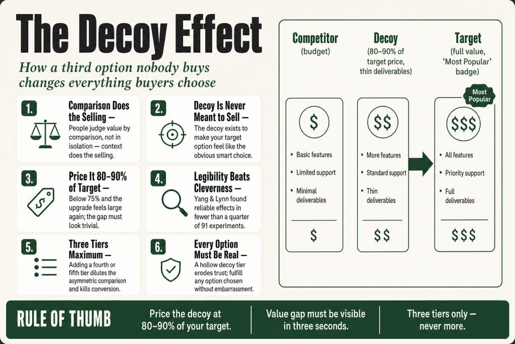
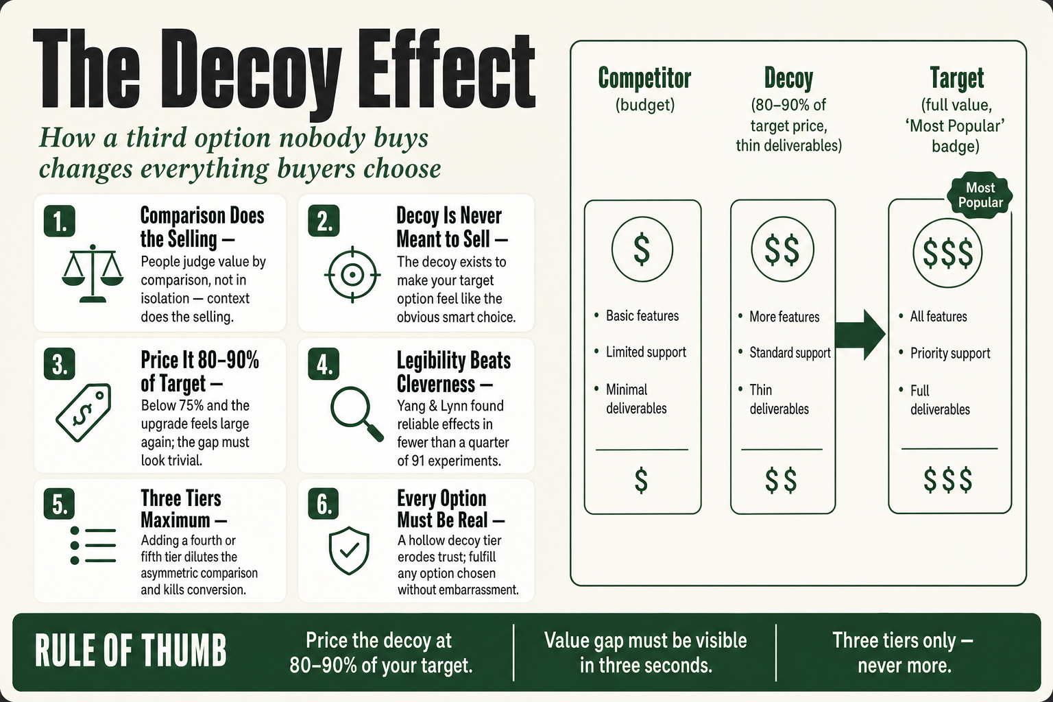
- The decoy is not meant to sell; it exists to make your target option feel like the obvious, smart choice.
- It applies across physical products, service packages, subscriptions, and anything presented as a tiered menu of options.
- Done right, it reduces buyer hesitation and can shift revenue mix significantly, Dan Ariely’s Economist experiment moved purchase behavior from 32% to 84% choosing the higher-priced option.
- Done wrong, when the decoy is transparently hollow or absurdly priced, it erodes trust faster than it builds revenue.
- The effect is real but context-sensitive: two large 2014 replication studies found it weakens or disappears outside tightly structured two-attribute lab settings. Build your menu to be genuinely legible, not to rely on psychology doing all the work.
Where It Came From, and What the Replications Actually Say
Joel Huber, John Payne, and Christopher Puto published the original paper in the Journal of Consumer Research in 1982. Their finding: adding a strategically dominated third option to a choice set shifts preferences toward the intended target. This was academically explosive because it violated the ‘regularity condition’, the foundational rational-choice assumption that a new option can only take share from existing options, never increase the probability of one being chosen. Huber’s team proved it wrong. A new option nobody picks can make an existing option more likely to win.
Dan Ariely’s 2008 book Predictably Irrational brought it to a mainstream business audience, with The Economist’s subscription pricing as the centerpiece, buyers choosing the combined web-and-print subscription jumped from 32% to 84% once a print-only option at the same price was introduced as a decoy. Worth knowing: that example came from Ariely’s own classroom demonstration, not a controlled experiment The Economist ran and published. There’s no public record of whether The Economist ever formally tested it. The example is illustrative, not a verified field study.
Here’s the part that most primers skip: in 2014, two large replication efforts found the effect was fragile. Frederick, Lee and Baskin ran 38 attempts and found the effect largely disappeared when realistic stimuli replaced clean two-attribute numerical paradigms. Yang and Lynn ran 91 experiments across 23 product categories and found reliable effects in fewer than a quarter of them, and specifically, that using meaningful qualitative descriptions or pictorial depictions substantially reduced the size of those effects. The practical implication isn’t ‘ignore this’, it’s ‘don’t rely on the psychology to do work your menu design should be doing.’ When the value difference is immediately visible, the effect holds. When buyers have to read footnotes to understand it, it doesn’t.
The Real Problem: Buyers Don’t Know What Things Are Worth
Here’s what most operators miss about why the decoy effect functions: it’s not a trick. It’s a response to a genuine limitation in human cognition. People don’t carry an internal value meter. They focus on the relative advantage of one thing over another and estimate value from that comparison.
When a buyer lands on your pricing page with two options, a basic package at $97 and a premium at $297, they have no reliable frame of reference. They can’t easily weigh the features against their needs in the abstract. So they do what humans do when facing uncertainty: they compare. With only two options, the comparison collapses to price. The buyer doesn’t ask ‘is this worth $297?’, they ask ‘is this worth $200 more than the basic option?’
That question, with only two options, frequently resolves in favor of the cheaper one. Not because the premium is overpriced. Because without context, the difference feels arbitrary. A third option restructures the comparison. Now the buyer isn’t asking ‘is $297 worth $200 more than $97?’, they’re asking ‘which of these three makes the most sense for me?’ And if the third option is constructed correctly, the answer almost writes itself.
This is why the decoy effect shows up in service pricing, software tiers, restaurant menus, cinema snack bars, and real estate listings. The question is whether you’re using it deliberately or just hoping customers figure out your pricing on their own.
How It Actually Works: The Mechanics
A properly constructed decoy arrangement has three roles: the competitor (usually the budget option), the target (the option you most want to sell), and the decoy (the option engineered to make the target look obviously better by comparison). The decoy is asymmetrically dominatedclearly inferior to the target on most or all dimensions, but not necessarily inferior to the competitor. It sits in the target’s neighborhood without being able to beat it.
Here’s a simplified version for a service business:
- Basic: Monthly reporting only, $500/month
- Decoy: Monthly reporting + one strategy call, $950/month
- Target (Pro): Monthly reporting + two strategy calls + priority email access, $1,100/month
Nobody’s buying the Decoy. It’s $950 for one call. The Pro tier gives them twice the calls plus priority access for $150 more. The Decoy makes that $150 increment feel trivial. Without it, the jump from $500 to $1,100 feels significant. With it, the buyer’s brain runs a different calculation: ‘I could get Decoy for $950, or Pro for $1,100 and get substantially more, that’s the obvious choice.’
The technical name is asymmetric dominance: the decoy is dominated by the target, but not by the competitor. If the decoy were clearly worse than both options, it would just confuse people. The decoy has to be plausibly close to the target in price while being unmistakably worse in value.
There’s a related variant worth knowing: the compromise effectwhich Itamar Simonson documented separately. Rather than introducing an inferior option, you introduce a premium option that makes your target feel like the sensible middle choice, not too cheap, not extravagant. Many operators use both simultaneously in a three-tier menu, where the top tier creates the compromise effect for the middle option and the bottom tier sets a quality-floor contrast. That’s architecture, not coincidence.
One mechanical limit: the decoy effect weakens as you add options. Spreading the comparison across four or five tiers dilutes it, because buyers lose the clean asymmetric comparison that makes the choice feel easy. Three tiers is the ceiling, not a suggestion.
The Decoy Effect in Practice: Modern Examples
The Economist example from 2008 is the canonical one, and yes, everyone citing behavioral economics leads with it. Worth moving past it.
Movie theater popcorn is probably the example most people have actually experienced. A small at $3 and a large at $7 produced mostly small-bucket purchases. Add a medium at $6.50 and most buyers choose the large, because at only $0.50 more than the medium, the large looks like the rational move. The medium doesn’t sell. It just flipped the comparison.
Apple runs a version of this with every iPhone release cycle. When the lineup offers a previous-generation model, a mid-tier option, and the current flagship, each separated by roughly $100, the flagship’s premium feels measured rather than steep. The prior-gen model isn’t positioned to sell in volume; it’s positioned to make the upgrade gap feel small. Apple’s product team knows exactly what they’re doing there.
Netflix’s current tier structure, ad-supported Standard at $8.99, ad-free Standard at $19.99, and Premium at $26.99, functions similarly. The $7-per-month gap between ad-free Standard and Premium is narrow enough that premium feels like a modest upgrade for four 4K streams versus two. The ad-supported tier at the bottom isn’t just a price point, it anchors the comparison and makes paying for no ads feel reasonable. Whether Netflix designed this as a deliberate decoy structure or it evolved through pricing iterations doesn’t change how it reads to buyers.
SaaS pricing tables run the same logic constantly. One documented case: a SaaS team reduced their tiers from five to three, simplified their feature list, and added a ‘Most Popular’ badge to the middle tier. Conversion went from 1.2% to 3.1% without touching price, a 158% lift from structure, not product changes. The comparison was easier to read; the target was easier to identify. That’s the whole mechanism.
At a local scale: a home-services contractor offering a basic inspection, a standard package, and a comprehensive package with annual follow-up can engineer the same dynamic. A fitness studio with a 3x/week plan and an unlimited plan priced only marginally above it will watch most members land on unlimited, not because they planned to, but because the marginal cost looks trivial next to the gain. This isn’t a Silicon Valley technique. It’s how menus work.
Putting this to work? The ideas in the Canon are the foundation under the tactical playbook in Build a Complete Marketing Department — grab the free companion kit at mmsvegas.com/resources.
Where the Decoy Effect Applies for Operators
The decoy effect is most powerful anywhere buyers must compare options side by side before deciding. That’s a broader category than most operators realize.
Service packages and retainers. If you sell professional services, consulting, marketing, legal, accounting, design, and you’re presenting options to a prospective client, the decoy structure applies directly. Three tiers, with the middle-to-upper tier as your real target. The decoy lives just below your target in price but clearly below it in deliverables.
Subscription and SaaS pricing pages. The three-column pricing table is the natural home of this technique. If you’re building a pricing page from scratch, identify which tier you most want to fill first, then construct the decoy tier around that target, not the other way around. SaaS teams that get the order of operations wrong end up with a decoy that accidentally competes with the target instead of pointing toward it.
Menu design in food and beverage. Any time you have size or tier options, you can place a decoy. The price gap between medium and large should be small enough that large feels rational, but not so small that medium feels pointless.
Product bundles and add-ons. A standalone product at one price, a bundle with accessories at a slightly higher price that looks obviously better value, and a premium bundle at a meaningfully higher price creates the same comparative frame. The middle bundle becomes your target if you price it correctly against both flanks.
Proposals and quotes. This is chronically underused. When you send a proposal with three scopes of work, the decoy approach means your ‘Recommended’ option should have a close-but-inferior ‘Lite’ alternative that shares a similar price point without delivering comparable scope. Most buyers will land on the Recommended option, not because you pushed them, but because the comparison made it self-evident. Three-scope proposals consistently outperform single-scope ones on close rate, and this is a large part of why.
The common thread: the buyer needs to see options simultaneously. Sequential pitching, one option at a time, kills the effect. It needs a visible menu.
Where It Fails, and Where Operators Get Hurt
The decoy effect is not a universal pricing fix. There are real conditions under which it weakens, fails, or actively hurts your business.
Sophisticated buyers who recognize the structure. B2B procurement teams, experienced buyers in commoditized markets, and repeat customers who’ve seen your pricing before are more resistant. They’re running deliberate comparisons, sometimes with spreadsheets and multiple vendors, and a hollow mid-tier option is likely to get called out rather than accepted as a frame. The structure can still work in complex B2B sales, but the value gap has to be substantively real, not cosmetically arranged.
When the value gap isn’t immediately legible. This is the lesson from the 2014 replications and it’s the one operators most consistently ignore. If a buyer has to read the fine print to understand why the target beats the decoy, the decoy isn’t doing its job. Qualitative descriptions and complex feature lists kill the effect. The advantage has to be obvious from a table row, the kind of thing you can see in three seconds without reading a footnote.
When the decoy is obviously fake. There’s a meaningful difference between ‘nobody picks this but it’s a legitimate offer’ and ‘this is a placeholder we invented to game the comparison.’ Buyers, even price-unsophisticated ones with enough time, recognize the latter. And in local or niche markets where reputation travels fast, a clumsy decoy structure does real damage. Every option on your menu, including the decoy, needs to be a real offer you’d fulfill without embarrassment if someone actually chose it.
When you add too many tiers. Adding a fourth or fifth option to ‘strengthen’ the effect actually weakens it, because the clean asymmetric comparison gets lost in the noise. Buyers default to either the cheapest or paralysis. Three-tier pages consistently outperform four-and-above in conversion data, not because of the psychology alone but because the comparison is simply easier to make.
When the decoy creates inflated expectations. If buyers choose your target option because the decoy made it look impressive, and then the target doesn’t live up to that implied standard, you have a churn and refund problem, not a conversion win. The conversion metric looks good for 30 days. The retention metric tells the real story.
One-of-a-kind or bespoke work. Custom engagements, unique inventory, genuinely one-time offers, these don’t lend themselves to side-by-side comparison menus. The decoy effect requires a repeatable option structure. It’s a system, not a one-off move.
The Ethics Question: Persuasion vs. Manipulation
This one deserves a direct answer rather than a hedge. The decoy effect sits in genuinely gray territory, not illegal, not dishonest on its face, but not entirely neutral either. You’re designing a context that influences a decision. Whether that’s ethical depends on a few things operators should think through clearly.
The line, as I see it: the decoy is ethical when the target option it’s pointing toward is genuinely a better fit for most buyers who choose it, and when the decoy itself is a real offer someone could legitimately buy. It’s manipulative when the decoy is a fictionally overpriced non-product that exists solely to distort the comparison, or when the target option it’s steering people toward doesn’t actually deliver what the comparison implies.
The practical risk is real and has gotten more real recently. Buyers now have price-comparison apps, Reddit threads where people post screenshots asking ‘is this pricing weird?’, and a general cultural fluency with behavioral pricing tactics that didn’t exist in 2008. A decoy structure that reads as insulting can trigger the opposite response: instead of feeling guided toward the smart choice, buyers feel played, and they leave. Small businesses are especially exposed here because the relationship is local and reputational. You can’t absorb that trust damage the way a subscription software company might.
The practical guide: make sure every option on your menu, including the decoy, is a real offer you’d happily fulfill if someone chose it. Price it without artificial inflation. If the decoy provides genuinely less value per dollar than the target, that’s structurally honest. Buyers will see it and make the better choice. If the decoy is a made-up tier priced to create an illusion, you’re on the wrong side of the line.
There’s also a simpler self-interest argument: your best buyers are repeat buyers. Manipulation that produces short-term conversion but long-term distrust is a bad trade in any business where lifetime value matters. That’s essentially every business in a local or niche context.
Building Your Own Decoy Structure
Here’s how to actually build this, step by step, without a pricing consultant.
Step 1: Identify your target. Before you design anything else, decide which option you most want buyers to choose. Usually this is your most profitable tier, not necessarily your highest-priced, but the one where your margin is best and your client fit is strongest. Everything else is built around making this option the obvious choice.
Step 2: Build your target tier first. Define its deliverables, its price, and its value story clearly. The decoy only functions if what it’s pointing toward actually warrants the upgrade.
Step 3: Build the decoy. Price it at 80 to 90% of the target’s price. Give it a noticeably thinner set of deliverables, fewer sessions, less access, less output, a meaningful constraint. The gap in value needs to be visible without explanation. If someone has to read the fine print to understand why the target is better, the decoy isn’t pulling its weight.
Step 4: Build the entry option. Your budget tier should be real and usable but clearly limited. It serves two roles: it makes your target look like the sensible, non-extravagant choice (the compromise effect), and it gives genuinely price-sensitive buyers somewhere to land without walking away entirely. Don’t make it so thin that nobody would buy it, make it legitimately useful for someone with a real budget constraint.
Step 5: Present them simultaneously. Side-by-side tables on a pricing page, a three-column proposal format, a laminated one-pager for in-person presentations. The comparison has to be visible all at once. Sequential pitching kills the effect.
Step 6: Label the target. ‘Most Popular,’ ‘Recommended,’ or ‘Best Value’, a single label on the target tier does real work. It adds social proof and reinforces what the comparison already implies. Don’t label the decoy.
Step 7: Test and measure over at least 60 days. Track which tier buyers actually choose. If nobody is choosing your target, either the decoy isn’t close enough in price, the value gap isn’t visible enough, or your target’s deliverables aren’t compelling enough to justify the step-up. Adjust one variable at a time, not the whole structure based on a month of data.
AI tools can help you draft initial tier structures and stress-test your value descriptions, specifically, whether the copy makes it immediately obvious why the target beats the decoy. That’s a prompt worth running before you publish. Whether your decoy is fair to buyers, and whether your target actually delivers, that call stays with you.
Common Mistakes
- Launching the decoy tier without testing legibility — Before publishing, show the three-tier layout to someone unfamiliar with your business and ask them which option looks like the better deal. If they hesitate or reach for the fine print, the value gap isn’t visible enough. Widen the deliverable difference or simplify the copy, usually both.
- Pricing the decoy too far below the target — When the decoy sits below 75% of the target’s price, the upgrade step starts feeling large again and you’ve lost the key mechanic. The whole point is that the gap from decoy to target looks trivial. If a buyer sees $950 vs. $1,100 and thinks ‘close enough, I’ll upgrade,’ the decoy worked. If they see $500 vs. $1,100 and think ‘that’s a big jump,’ it didn’t.
- Building a decoy nobody could actually buy in good conscience — Every tier on your menu needs to be a real, fulfillable offer. If a prospect emails and picks the decoy, you need to deliver it without embarrassment. Operators who create placeholder tiers, essentially fictional SKUs designed purely to manipulate the comparison, are on the wrong side of the ethical line and in local or niche markets, that story travels.
- Presenting options sequentially in the sales conversation instead of simultaneously — The decoy effect requires a visible, simultaneous comparison, a side-by-side table, a three-column proposal, a printed one-pager. Operators who walk through options one at a time in discovery calls or email threads lose the comparative context entirely. The structure only functions when all three options are visible at once.
- Rebuilding the entire tier structure after 30 days of inconclusive data — One month of proposal data is almost never statistically meaningful. Run the structure for a full quarter before drawing conclusions, and track not just tier selection but downstream retention. A decoy that boosts 30-day conversions but inflates expectations can increase churn by month three, that’s a net loss, not a win.
- Adding a fourth or fifth tier to ‘strengthen’ the comparison — More options dilute the asymmetric comparison the decoy creates. Buyers in a five-tier menu default to the cheapest option or walk away. Consolidate to three tiers before trying to engineer a decoy structure, the constraint is the point, not a limitation to work around.
Operator’s Take
Here’s the thing most people teaching the decoy effect won’t tell you: the structure only works if it’s legible. Not clever. Not layered. Legible, meaning a first-time visitor should be able to see, within about ten seconds, exactly why your target tier beats your decoy. If they can’t, the effect doesn’t fire. The 2014 replication data is pretty blunt about this: Yang and Lynn ran 91 experiments and found reliable effects in fewer than a quarter of them, specifically because real-world stimuli, qualitative descriptions, images, feature lists, degraded the clean comparison the effect depends on. So before you worry about anything else, go look at your pricing page and ask: can someone see the advantage at a glance, or do they have to read to find it? If the answer is ‘read,’ you have a copy problem, not a pricing problem.
Now, the structure itself. Stop sending single-option proposals. If you’re giving a prospect one scope and one price, you’re asking them to evaluate your offer against whatever they can imagine, and their imagination almost always includes ‘do nothing’ or ‘find someone cheaper.’ Three scopes change the question from ‘should I buy this?’ to ‘which of these is right for me?’ That’s a genuinely different conversation, and you want to be in it.
The specific build: three scopes, your Recommended in the middle. Your Lite scope at roughly 85% of Recommended’s price, same category of work, but with a real constraint. Fewer deliverables, less access, a tighter turnaround window. Something a buyer would actually feel, not a cosmetic difference. Your Complete scope sits above Recommended, it triggers the compromise effect, makes Recommended look like the non-extravagant professional choice. Label the Recommended scope once: ‘Most Popular’ or ‘Best Value.’ One label, not three. Most buyers land there. Not because you pressured them. Because the structure made it the obvious call.
A few specific things to check before you publish:
- The decoy price should sit at 80 to 90% of your target price. Below 75% and the jump to target starts feeling large again. Above 95% and some buyers accidentally choose the decoy on price alone, and you’ve created a client you didn’t plan for at a margin you didn’t design.
- The decoy has to be a real offer. Not a placeholder. If a client calls and says ‘I’ll take the Lite Plus,’ you need to fulfill it without embarrassment. A hollow decoy that no real buyer could want isn’t strategy, it’s manipulation, and in a local or niche market, that reputation spreads faster than you’d like.
- In B2B proposals, make the value gap structural, not cosmetic. Procurement buyers and experienced clients compare scopes line by line. A decoy that looks thin at first glance but is obviously padded on closer inspection will get you called out in the room. The deliverable difference has to be substantive, fewer outputs, genuinely shorter engagement, meaningfully less access.
- Watch the 60-day cohort, not the 30-day snapshot. Conversion rate at the end of month one is the wrong metric. If the decoy comparison created expectations the target couldn’t meet, you’ll see it in churn and refund requests, not in your initial close rate. The close rate is what the structure produces. The retention rate is what your product produces. Both matter.
One legitimate use for AI in this process: paste all three of your tier descriptions into a prompt and ask whether the advantage of your target over your decoy is obvious to a first-time reader, or whether it requires study. If the answer is study, fix the copy before you publish. That’s the kind of outside-eyes review an editor would give you, and AI can run it in about 30 seconds. What it won’t do is decide whether your target tier actually delivers what the comparison implies. That judgment is yours, and it matters more than the pricing architecture does.
Used in
- ✓ Build a Complete Marketing Department
Used when designing the offer and pricing menu that anchors the marketing funnel, specifically in structuring service packages so the target tier has the highest close rate without discounting. - ✓ The Missing Manual for FunnelKit
Applied when building order bump and upsell sequences, the decoy structure maps directly to how FunnelKit order pages present tiered offers and bundles side by side. - ✓ The Missing Manual for Make
Referenced when automating pricing page A/B tests and tracking tier-selection data, Make workflows can route buyer tier choices into CRM fields for ongoing decoy performance analysis.
FAQ
Does the decoy effect work for services as well as physical products?
Yes, in some ways it applies more cleanly for services, because service value is inherently harder to evaluate in absolute terms. Side-by-side service package comparisons give buyers a structure they’d otherwise lack, and a well-built decoy makes the target package’s advantage obvious without requiring deep explanation.
How close in price should the decoy be to the target?
Roughly 80 to 90% of the target’s price is the practical guideline. Close enough that the step up to the target feels trivial, but not so close that the decoy accidentally wins on price alone. The value gap between decoy and target needs to be immediately visible, not buried in feature descriptions.
Can the decoy effect backfire?
It can. If the decoy is obviously artificial, priced high for no clear reason, or offering almost nothing, buyers recognize the manipulation and trust erodes. In niche or local businesses where reputation travels fast, a clumsy decoy structure can do real damage. Every option on the menu should be a real offer you’d fulfill without embarrassment.
What’s the difference between the decoy effect and the compromise effect?
The decoy effect (asymmetric dominance) introduces an option that is clearly inferior to the target, making the target look like the smart upgrade. The compromise effect introduces an extreme option that makes the target look like the sensible middle choice. Many effective three-tier pricing structures use both simultaneously, the bottom tier triggers the compromise effect for the middle, and the decoy tier triggers asymmetric dominance.
Does this work in B2B sales, or only B2C?
It applies in B2B but requires more care. B2B procurement buyers do more deliberate comparison, sometimes across vendors, so the decoy needs to represent a genuinely real scope difference, not just a price arrangement. A three-scope proposal format with a clear recommended scope still benefits from the comparative structure, but the value gap has to withstand line-by-line scrutiny.
How many options should I offer for the decoy effect to work?
Three. The effect weakens as you add more choices, because the clean asymmetric comparison gets lost in the noise. If you currently have five tiers, consolidate to three before trying to engineer a decoy structure.
Does the decoy effect always work? I’ve heard it doesn’t replicate.
Fair question. Two large 2014 studies found the effect weakened or disappeared when comparisons used realistic qualitative descriptions instead of the clean two-attribute numerical paradigms from the original 1982 research. Yang and Lynn ran 91 experiments across 23 product categories and found reliable effects in fewer than a quarter of them, specifically because verbal and pictorial descriptions degraded the clean comparison the effect depends on. The practical implication: build menus where the value difference is obvious at a glance, not buried in copy. That’s where it holds.
Further reading
- Predictably Irrational by Dan Ariely, the book that brought the decoy effect to mainstream business audiences, with the Economist subscription experiment as its centerpiece example.
- ‘Adding Asymmetrically Dominated Alternatives’ by Huber, Payne, and Puto, Journal of Consumer Research (1982), the original academic paper; the experimental design is worth reading if you want to understand the precise conditions under which the effect was first demonstrated.
- Thinking, Fast and Slow by Daniel Kahneman, broader context on how comparison and context shape all value judgments, of which the decoy effect is one expression.
- ‘The Limits of Attraction’ by Frederick, Lee & Baskin, Journal of Marketing Research (2014), the most significant replication challenge to the original findings; essential reading before you assume the effect will simply fire on your pricing page.
Sources: Huber, Payne & Puto (1982), ‘Adding Asymmetrically Dominated Alternatives,’ Journal of Consumer Research, Vol. 9; Simonson (1989), ‘Choice Based on Reasons,’ Journal of Consumer Research, Vol. 16; Ariely, Dan, Predictably Irrational (2008), Harper Collins; Frederick, Lee & Baskin (2014), ‘The Limits of Attraction,’ Journal of Marketing Research, Vol. 51; Yang & Lynn (2014), ‘More Evidence Challenging the Robustness and Usefulness of the Attraction Effect,’ Journal of Marketing Research, Vol. 51; EBSCO Research Starters, ‘Decoy Effect’ (2024); The Conversation, ‘The decoy effect: how you are influenced to choose without really knowing it’ (QUT, 2021); BehavioralEconomics.com Mini-Encyclopedia entry on the Decoy Effect; Rsisinternational.org, ‘Ethical Considerations in Leveraging the Decoy Effect’ (2025); Padamwar et al., ‘An integrative review of the decoy effect on choice behavior,’ Psychology & Marketing (2024); PipelineRoad Agency, ‘SaaS Pricing Page Best Practices: What Actually Converts in 2026’ (2026).
Brian Kasday spent forty years in direct-response marketing before rebuilding the whole operation as a one-person shop. He writes The Operator’s Library — including “Build a Complete Marketing Department” — for operators who’d rather build it themselves than wait on someone else.
Build the department these ideas describe — the free companion kit: mmsvegas.com/resources.
More The Operator's Canon guides
Free · Operator Toolkit
Want the tools, not just the guide?
Get the free operator toolkit — templates and checklists for the systems you actually run, plus a note when this guide changes.
Get the free toolkit →