
Last updated: July 2026
Hick’s Law is the principle that the time it takes a person to make a decision increases as the number of available choices grows, and understanding it will let you identify exactly where your website, offer, or sales process is quietly losing buyers who never tell you why they left. By the end of this page, you’ll be able to audit every decision point your customer faces and cut the friction that’s stalling them.
The frustrating part is that most of those friction points were built with good intentions. You added the extra service package because you wanted to serve more clients. You listed every feature on the pricing page because you wanted buyers to feel informed. You kept seven items in your navigation because each one felt important. None of those decisions were wrong in isolation. Together, they turned your funnel into a puzzle, and puzzles don’t convert.
Hick’s Law doesn’t just describe a UX quirk for app designers. It describes what happens inside your buyer’s head at every moment they face a fork in the road: which package, which button, which service, which form to fill out. The more forks you put in front of them, the longer they pause. And the longer they pause, the more likely they are to do nothing at all.
The idea in 30 seconds
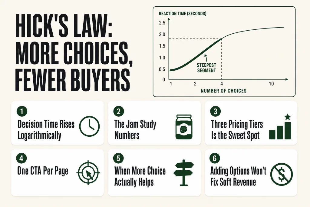
- Hick’s Law states that decision time increases logarithmically as the number of choices grows, every option you add costs your buyer time and mental energy.
- The Paradox of Choice extends this: past a cognitive ceiling, more options don’t just slow decisions, they prevent them entirely and leave buyers less satisfied with what they did choose.
- The fix isn’t always fewer SKUs, it’s fewer choices at each decision point: one CTA per page, three pricing tiers, short forms, tight navigation.
- The effect is strongest when buyers lack prior preferences, when options look similar, and when the stakes feel high, which describes most first-time visitors to a small-business website.
- Operators most commonly violate this by adding options to appear comprehensive, when they’re actually just creating friction that costs them the sale.
- The antidote is deliberate editorial restraint: make the best choice obvious, hide the complexity, and let buyers move fast.
Hick’s Law: Just Enough History to Know Why It Holds
In 1952, William Edmund Hicka British psychologist at the Medical Research Council’s Applied Psychology Unit in Cambridge, published “On the Rate of Gain of Information” in the Quarterly Journal of Experimental Psychology. His setup was deceptively simple: ten lamps arranged in a circle, each paired with a Morse key. A randomized tape activated a lamp every five seconds; the subject pressed the matching key as fast as possible. Hick varied how many lamps were active and measured every response. Decision time rose predictably as options multiplied, and it did so logarithmicallynot linearly. That shape is the whole insight.
American psychologist Ray Hyman confirmed and extended the result in 1953, showing that reaction time tracks not just raw option count but the statistical entropy of the stimulus set, the informational uncertainty, in Claude Shannon’s terms. The combined finding became the Hick-Hyman Law. The brain isn’t being slow when it hesitates in front of more options. It’s processing each additional choice as an additional bit of uncertainty. That grounding in information theory is why the effect generalizes so cleanly beyond the original lamp-and-key experiment.
The principle lived inside human-factors research for decades before entering mainstream marketing. The catalyst was a 2000 field study by Sheena Iyengar and Mark Lepper at Draeger’s, an upscale grocery store in Menlo Park, California. They alternated a jam tasting booth between 24 varieties and 6. The 24-jam display drew more browsers, about 60% of passersby stopped, but only 3% purchased. The 6-jam display drew fewer browsers but converted at 30%, roughly ten times the rate. Barry Schwartz’s 2004 book The Paradox of Choice gave the broader pattern a cultural story and a name that stuck.
One honest caveat: a 2010 meta-analysis by Scheibehenne, Greifeneder, and Todd found the average effect of choice overload to be effectively zero across 50 studies. A 2015 meta-analysis by Chernev, Böckenholt, and Goodman then identified four factors that predict when the effect is more likely, choice set complexity, decision task difficulty, preference uncertainty, and the buyer’s decision goal. Several of those factors typically apply on a small-business website for a first-time visitor, and the guidance holds. The operator question isn’t “does this exist in a lab?” It’s “which of those factors apply to my buyer right now?”
What’s Actually Happening in Your Buyer’s Head
The math behind Hick’s Law is RT = a + b log₂(n), reaction time rises steeply with the first few added options, then flattens. You don’t need to memorize it. What matters is the shape: going from one option to four costs far more cognitive work than going from twenty to twenty-four. That first handful of choices is where the most damage happens.
Two things fire at once when a buyer faces multiple options.
Processing cost. The brain encodes each option, holds it in working memory while evaluating the others, and runs comparisons across the full set. Three options means three pairwise comparisons. Five means ten. Eight means twenty-eight. George Miller’s 1956 research put working memory capacity at roughly seven items, under clean, low-pressure conditions. Your pricing page is not a clean, low-pressure condition.
Anticipated regret. This is Schwartz’s piece of the story. Before the buyer even chooses, they’re running a mental simulation of what it would feel like to have chosen wrong. More options make that simulation more vivid and more exhausting. A buyer facing three service packages wonders if they picked the right one. A buyer facing nine is convening an internal tribunal. Neither one is filling out your contact form while that tribunal meets.
The result has two failure modes that look almost identical in your analytics:
- Decision delay: They “want to think about it.” They’ll come back. They don’t.
- Full bounce: They leave without knowing exactly why, just a vague discomfort, a sense that something wasn’t quite right. They don’t call it choice overload. They just close the tab.
Bounce rate ticks up. Time on page is misleading, they weren’t disengaged, they were stuck. Contact form submissions run below what your traffic volume would predict. That’s the fingerprint of a Hick’s Law problem. Most operators diagnose it as a traffic issue and buy more ads. The friction was there before the traffic arrived.
Hick’s Law Across Every Decision Point Your Buyer Faces
Every spot in your funnel where a buyer has to choose something is a potential Hick’s Law problem. Not all of them matter equally, but all of them matter. Walk through yours with this lens.
Pricing and Packages
This is the highest-stakes application for most small businesses. A common mistake is building out every service permutation you offer and presenting it as a menu. A client-facing pricing page with six or seven tiers, each with long feature lists, doesn’t communicate comprehensiveness, it communicates confusion. The buyer has to figure out which tier they are, compare features line by line, and worry they’ll pick the wrong one.
The research-backed sweet spot for service and SaaS pricing is three tiers. Three gives buyers a sense of range and lets them self-select; it’s few enough that the comparison is manageable. One of the three should be clearly positioned as the recommended choice, highlighted, anchored, named differently, so the buyer’s default path is obvious. A new visitor should be able to decide which tier fits them in under sixty seconds.
If you sell truly customized services where fixed packages don’t work, fine, but then the choice you’re presenting is binary: “Let’s talk / Don’t talk.” Don’t try to simulate packages when your actual product is scoped per project. The fake menu is worse than no menu.
Navigation
Your navigation menu is a choice set, full stop. Every link asks the visitor to evaluate whether it’s relevant before they’ve read a word of your content. Seven, eight, nine items, each one adds load. A practical target for primary navigation is five to seven items, maximum. If you have more, you have a prioritization problem that’s been disguised as a navigation problem. Supporting content, terms, privacy, blog archive, belongs in a footer, not a nav bar.
Forms
Every field in a form is a micro-decision: do I fill this out, what do I put here, is this required? For lead-gen and opt-in forms, ask for the minimum. Name and email, or just email. If you genuinely need more information before you can usefully respond, a service business quoting a project, break the form into stages. One or two questions per screen with a progress indicator dramatically outperforms a single twelve-field form. Each stage feels like an easy decision because it is one.
Calls to Action
A page with three or four CTAs competing for attention, “Call us,” “Book online,” “Download the guide,” “Read our blog”, is a page that converts at a fraction of what it could. Each button asks the visitor to choose which one is right for them. That takes energy. Most take the fourth option: none of the above.
One CTA per page is the principle. If you absolutely need two, make one dominant, visually prominent, action-oriented, above the fold, and one subordinate. The secondary CTA should be a lower-commitment step, like “Watch a quick video,” not a competing offer of equal weight.
Email and Content
An email with five links, three article recommendations, and two promotional offers asks your reader to play editor. Most close it. A single-focus email with one link consistently outperforms multi-link emails on click-through rate. Pick the one thing you want the reader to do. Same logic on social: one message, one action. Not “follow us, share this, save for later, and comment below.”
Physical Locations and Menus
If you run a restaurant, retail shop, or any physical location, the same dynamic applies. Menus with forty or fifty items push buyers toward familiar defaults rather than genuinely choosing, and when everything looks equally weighted, nothing feels special. A tighter menu moves faster and often generates higher average ticket. It also signals something worth saying out loud: you’ve done the hard work of deciding what’s worth offering, so the buyer doesn’t have to.
Putting this to work? The ideas in the Canon are the foundation under the tactical playbook in Build a Complete Marketing Departmentgrab the free companion kit at mmsvegas.com/resources.
When Simplifying Works, and When It Backfires
It would be dishonest to present Hick’s Law as a universal mandate to strip your business down to one option. There are real conditions under which more choice helps, and operators who ignore them end up with oversimplified experiences that underdeliver.
The clearest case where more choice helps is when the buyer already knows what they want and is shopping for fit. Someone looking for a 42mm, titanium, GPS-only smartwatch wants a search interface and enough options to find the exact match. Collapsing that to three pre-set bundles would frustrate them. The jam study hit its dramatic result partly because those shoppers had no prior preference for any of the jams, everything was unfamiliar. Your returning client who knows exactly what they want doesn’t look like that shopper at all.
Expert buyers in complex categories often want depth, too. A developer evaluating an API, a contractor specifying materials, a CFO comparing software integrations, these buyers expect detail, and hiding complexity from them reads as evasive. The answer is progressive disclosure: show essentials first and offer a “see full details” expansion for those who want it. Give novices the simple path, give experts the detailed path, and don’t force either through the other’s experience.
The diagnostic comes from Chernev, Böckenholt, and Goodman’s 2015 meta-analysis: choice overload is most likely when the choice set is complex, the decision task is difficult, the buyer’s preferences are uncertain, and the buyer’s decision goal favors minimizing effort. Stack those factors and simplification almost certainly helps your conversion rate. Knock most of them out, returning client, warm referral, expert buyer, and test before assuming you need to cut.
What Hick’s Law Looks Like in Practice
Apple’s product line is the most cited real-world expression of deliberate choice reduction at scale. At any given moment, Apple offers a small number of iPhone models, a few sizes, a handful of storage and color configurations, compared to Android competitors whose product matrices run to dozens of options. The bet is explicit: fewer decisions means more buyers complete the purchase, and those who do feel less post-purchase regret because they weren’t tortured by the alternatives. The conversion behavior of Apple’s retail environments has consistently supported that thesis.
Google’s homepage is the minimalist’s canonical example. One search bar, two buttons, a handful of nav links. In a world where Google could put anything on that page, ads, news tickers, personalization widgets, they’ve kept it close to empty for decades. The user’s decision is trivially simple: type what you want, hit Enter.
Netflix offers the cautionary counter-example. With a catalog of thousands of titles, Netflix has so thoroughly embodied choice overload that “spending twenty minutes browsing and watching nothing” has become a cultural trope. The platform has invested heavily in algorithmic recommendation and “Top 10 in your country” features specifically to simulate the editorial restraint that a smaller catalog would provide naturally. They’re engineering around a problem they created by scaling. Most operators don’t have Netflix’s engineering budget, so the smarter move is not to create the problem in the first place.
In SaaS pricing, the three-tier model, Basic, Pro, Enterprise, became near-universal after the jam study and Schwartz’s book reshaped product thinking. Companies that had offered six or eight plans found that collapsing to three, with a highlighted recommended plan, generated higher conversion rates even when the underlying product was unchanged. Unbounce tested this directly: cutting registration options from four to three lifted conversion by nearly 17%.
For a small-business analog: a local law firm offering unbundled à la carte pricing, forty line items with hourly rates, asks the buyer to assemble their own service package and estimate their own costs. That’s a massive decision burden on someone who came to them precisely because they didn’t want to figure that out. A practice that offers three clearly named packages, “Essentials,” “Growth,” “Full-Service”, removes that burden entirely. The buyer’s only job is to identify which bucket they’re in. Most can do it in ninety seconds.
Hick’s Law, the Value Equation, and the Right Kind of Simplicity
There’s a real tension worth naming between Hick’s Law and the Value EquationAlex Hormozi’s four-lever framework for making offers more compelling. One of Hormozi’s levers is reducing the time and effort required from the buyer. Hick’s Law says something similar: reduce the cognitive effort of the decision itself. So far, aligned.
But another lever is increasing the buyer’s perceived likelihood of achievementtheir confidence that this will actually work for them. Operators sometimes over-apply simplicity here: they cut so much context that the buyer doesn’t have enough information to feel confident choosing. The offer feels thin.
The resolution is to think in terms of decision architecture rather than raw option count. Your job isn’t to strip away information, it’s to strip away decisions. A detailed, information-rich page can still ask the buyer for only one primary choice at a time. The detail builds confidence; the single clear CTA removes the burden. These aren’t in conflict.
Practically: a well-designed three-tier pricing page might include detailed feature lists, testimonials, a FAQ section, and specific outcome descriptions, and still only ask the buyer to do one thing: click the tier that fits them. Lots of content. One decision. That’s the target.
Common Mistakes
- Presenting all service tiers with identical visual weightFind the package 70 to 80% of your best clients actually buy and make it visually dominant: different border color, a ‘Most Recommended’ badge, bolder header. Write the entry tier as ‘not quite ready for this’ and the top tier as ‘more than most businesses need.’ Run this for at least six weeks before judging results, you’re measuring contact-form submissions and proposals sent, not just closed revenue.
- Fixing the website’s choice count while ignoring every other touchpointMap every buyer touchpoint, website, email sequences, proposals, sales calls, trade show materials, and apply the one-primary-decision-per-moment rule at each. A Hick’s Law problem on a proposal converts just as badly as one on a landing page.
- Sending cold traffic and warm referrals to the same pageBuild two separate entry paths. Cold traffic gets three tiers, one highlighted recommendation, single CTA. Warm referrals and returning clients get the fuller conversation, more detail, more options, because they’ve already narrowed their preferences and won’t be paralyzed by depth.
- Restoring cut options after the first slow monthHold the simplified structure for a minimum of six to eight weeks. Short-term dips after a structural change usually reflect existing pipeline clearing through the old setup. Track contact-form submissions and proposals sent relative to traffic, not just closed revenue, so you catch positive leading signals before they show up in your bank account.
- Building a comparison table where every tier checks every boxMake the gaps do the positioning work. The entry tier should visibly lack at least two features the middle tier has. The middle tier should be missing at least one thing the premium tier includes. Pair this with a visually distinct recommended column, different background, a label, so the buyer’s eye goes there without effort.
- Loading every email with multiple CTAsOne email, one action. Decide the single most important thing you want the reader to do and ask for only that. Every additional link is a decision fork that lowers the probability of any action being taken. If you’re in a promotional sequence, the promotion is the only CTA, nothing else rides in the same send.
Operator’s Take
If I were sitting across from you auditing your business for Hick’s Law problems, here’s where I’d start, and it’s different depending on what kind of business you’re running.
For a service business, agency, consultancy, professional practice, the highest-leverage move is almost always the pricing page. Open yours cold, new browser, no login, and time how long it takes you to identify which tier a typical new client should pick. If it takes you more than ninety seconds and you built the thing, it’s taking your first-time visitors three times that. Drop to three tiers. Find the package that 70 to 80% of your best clients actually chose, not the one you wish they’d buy, the one they bought, and make it visually unmistakable. Different border color, a “Most Recommended” badge, bolder header. Then write the flanking tiers honestly: the lower one for buyers who aren’t quite ready, the upper one for needs beyond most. That framing does positioning work your current layout is leaving completely undone.
For e-commerce, the problem usually isn’t the pricing page, it’s the category page and the product detail page. If your category page shows thirty items with no sorting logic visible to a first-time visitor, you’re dumping the editorial burden on the buyer. The fix isn’t hiding products; it’s a “Best Sellers” or “Start Here” rail that gives cold traffic a curated shortlist while keeping the full catalog accessible via filters. Cold visitors need a recommended path. Returning shoppers who know what they want will use search. Build for both, separately.
For brick-and-mortar, restaurants, retail, service counters, the friction almost always hides in the menu or the service board. If your menu has forty items, you probably have eight great ones and thirty-two that dilute them. A tighter menu not only converts faster, it tends to lift average ticket because the buyer’s attention concentrates on what you’re actually proud of rather than scanning an exhaustive list for the safest choice.
Across all of them: map every touchpoint in the buyer’s path, not just the website. Your welcome email with five links, your proposal with four un-ranked options, your sales call where you list “five ways we can work together” without recommending one, each of those is a Hick’s Law problem wearing different clothes. The principle doesn’t stop at the homepage.
One thing worth flagging directly: the temptation to add options spikes when revenue is soft. It feels like action. “Maybe we’re not offering enough”, so you add a tier, expand the menu, put a second CTA on the landing page. This is almost always the wrong move. Soft revenue is almost never a signal that buyers want more options. It’s usually a signal that the current offer isn’t clear, the targeting is off, or the follow-up is weak. Adding complexity to a pipeline problem is like adding lanes to a traffic jam.
AI can help here, not as a replacement for judgment, but as a fast first pass. Paste your current pricing page into a large language model and ask it to flag what a first-time visitor would find hard to compare or evaluate. Ask it to suggest how to consolidate five service descriptions into three outcome-oriented tiers. You get a draft hit list faster than you’d build it alone. But the call about what to cut, what to anchor as the recommendation, and which path cold traffic should hit first, that stays with you. The AI doesn’t know which package 80% of your best clients actually chose. You do.
Used in
- ✓ Build a Complete Marketing Department
Used to structure service packages, pricing pages, and campaign CTAs so that every buyer-facing decision point has a single, obvious best path rather than a menu that stalls conversion. - ✓ The Missing Manual for FunnelKit
Applied when designing funnel steps and checkout flows, each page is audited for competing CTAs and unnecessary form fields, keeping buyer decisions singular and fast at every stage. - ✓ The Missing Manual for Make
Informs how automation sequences are structured, each triggered email or follow-up contains one action for the recipient, preventing the multi-link confusion that tanks click-through rates.
FAQ
Does Hick’s Law mean I should only ever offer one product or service?
No, it means you should only ask buyers to make one decision at a time. You can have multiple offerings; just don’t present all of them simultaneously on the same page or in the same pitch. Route buyers to the right option first, then introduce alternatives if that one doesn’t fit.
Is the jam study actually reliable? I’ve heard it’s been questioned.
It’s been significantly complicated. A 2010 meta-analysis by Scheibehenne, Greifeneder, and Todd analyzed 50 studies and found the mean effect of choice overload to be essentially zero across the range examined. A 2015 meta-analysis by Chernev, Böckenholt, and Goodman then identified four factors that predict when the effect is more likely: choice set complexity, decision task difficulty, preference uncertainty, and the buyer’s decision goal. For most small-business first-time visitors, several of those factors apply, which is why the practical guidance holds even if the original jam study overstated how universal the effect is.
What’s the right number of items for a navigation menu?
Five to seven items is the practical target for primary navigation. More than seven and you’re asking visitors to do meaningful evaluation work before they’ve engaged with your content. Items beyond that threshold belong in footer links or submenus.
How does Hick’s Law apply to email marketing?
Every link in an email is a potential decision fork. Emails with a single focused CTA consistently outperform multi-link emails on click-through rate. Pick the one action you want the reader to take, and only ask for that, everything else is friction.
What if my buyers are experts who want lots of detail?
Expert buyers with clear criteria benefit from depth, but the solution is progressive disclosure, not a firehose. Show the essentials first and offer an expansion path (‘see full feature list,’ ‘download the spec sheet’) for those who want it. Don’t force novice buyers through an expert experience to reach a simple choice.
Can AI tools help me apply Hick’s Law to my business?
Yes, in a supporting role. You can use an AI tool to audit a page’s decision points, flag competing CTAs, or suggest ways to consolidate service descriptions. The judgment calls, which package to anchor, which nav items actually matter, which CTA reflects your conversion goal, stay with you, because you know your buyers and your business in ways no tool does.
Further reading
- Barry Schwartz, The Paradox of Choice: Why More Is Less (2004)The book that brought choice-overload research into mainstream marketing and business thinking. Treat it as an interesting framework rather than settled science, but the cultural argument is worth engaging with.
- Sheena Iyengar, The Art of Choosing (2010)A deeper, more nuanced treatment of choice research from the researcher who ran the jam study. More rigorous than Schwartz and more useful for understanding when more choice actually helps.
- W.E. Hick, “On the Rate of Gain of Information,” Quarterly Journal of Experimental Psychology4(1), pp. 11 to 26 (1952)The original paper. Short by modern standards and surprisingly readable for a seventy-year-old psychology journal article.
- Scheibehenne, B., Greifeneder, R., & Todd, P.M., “Can There Ever Be Too Many Options? A Meta-Analytic Review of Choice Overload,” Journal of Consumer Research37(3), pp. 409 to 425 (2010)The meta-analysis that complicated the clean story. Essential reading for anyone who wants to use this principle with intellectual honesty.
- Chernev, A., Böckenholt, U., & Goodman, J., “Choice Overload: A Conceptual Review and Meta-Analysis,” Journal of Consumer Psychology25(2), pp. 333 to 358 (2015)The follow-up that identified the four moderating conditions. This is the research that turns a murky debate into something actionable.
Sources: William Edmund Hick, “On the Rate of Gain of Information,” Quarterly Journal of Experimental Psychology4(1), pp. 11 to 26 (1952). Ray Hyman, “Stimulus Information as a Determinant of Reaction Time,” Journal of Experimental Psychology45(3), pp. 188 to 196 (1953). Sheena S. Iyengar and Mark R. Lepper, “When Choice Is Demotivating: Can One Desire Too Much of a Good Thing?” Journal of Personality and Social Psychology79(6), pp. 995 to 1006 (2000). Barry Schwartz, The Paradox of Choice: Why More Is Less (Ecco, 2004). Benjamin Scheibehenne, Rainer Greifeneder, and Peter M. Todd, “Can There Ever Be Too Many Options? A Meta-Analytic Review of Choice Overload,” Journal of Consumer Research37(3), pp. 409 to 425 (2010). Alexander Chernev, Ulf Böckenholt, and Joseph Goodman, “Choice Overload: A Conceptual Review and Meta-Analysis,” Journal of Consumer Psychology25(2), pp. 333 to 358 (2015). George A. Miller, “The Magical Number Seven, Plus or Minus Two,” Psychological Review63(2), pp. 81 to 97 (1956). Laws of UX (lawsofux.com). Robert W. Proctor and Darryl W. Schneider, “Hick’s Law for Choice Reaction Time: A Review,” Quarterly Journal of Experimental Psychology71(6), pp. 1281 to 1299 (2018).
Brian Kasday spent forty years in direct-response marketing before rebuilding the whole operation as a one-person shop. He writes The Operator’s Library, including “Build a Complete Marketing Department”, for operators who’d rather build it themselves than wait on someone else.
Build the department these ideas describethe free companion kit: mmsvegas.com/resources.
More The Operator's Canon guides
Free · Operator Toolkit
Want the tools, not just the guide?
Get the free operator toolkit — templates and checklists for the systems you actually run, plus a note when this guide changes.
Get the free toolkit →How to cite: Hick's Law & the Paradox of Choice. Associated with William Edmund Hick; Ray Hyman, 1952. The Operator’s Canon, MMS Vegas. https://mmsvegas.com/library/hicks-law-paradox-of-choice-explained/