
Last updated: October 2026
Sensitivity analysis is the practice of changing one assumption in your business model at a time to see how much that single change moves the outcome that matters, profit, cash flow, LTV, payback period, whatever you’re actually trying to predict. By the end of this page, you’ll be able to run a working sensitivity check on any marketing or financial plan, identify the one or two inputs that actually control the result, and make a confident call on where your attention should go before any cash leaves the building.
Here’s what most operators do instead: they build a spreadsheet, land on a headline number they feel good about, and call the plan done. The assumptions underneath it, the conversion rate they picked because it sounded reasonable, the churn rate borrowed from a competitor’s blog post, the CAC that assumes the channel stays as cheap as last quarter, go untouched. Then one of those assumptions moves, and the whole thing falls apart in a way that looks like bad luck but was actually an unasked question.
Sensitivity analysis is just asking the questions in advance. It’s not glamorous, it doesn’t require a statistics degree, and it can be done in a spreadsheet in an afternoon. What it gives you is a ranked list of the variables worth losing sleep over versus the ones that barely register even if they swing by 20%. That distinction, between the assumptions that control the outcome and the ones that are basically noise, is more useful than most planning exercises ever manage to be.
The idea in 30 seconds
- Sensitivity analysis changes one assumption at a time to see which input moves the outcome most.
- It tells you where to spend your research time and where not to, before you commit money.
- The most common marketing inputs to test: conversion rate, CAC, churn rate, average order value, and price.
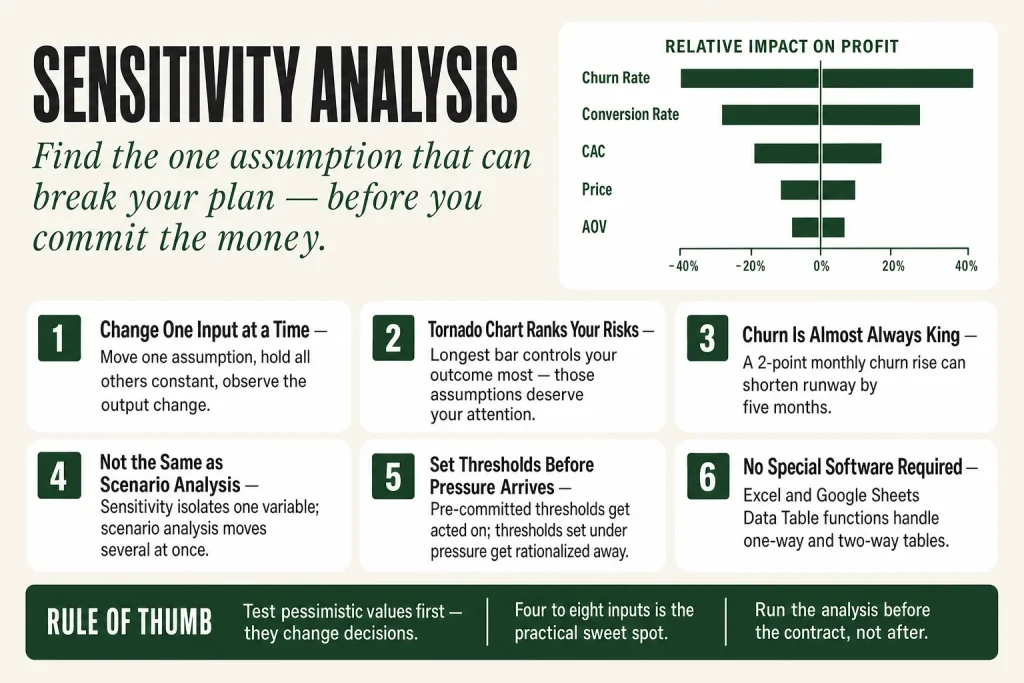
- A tornado chart ranks those inputs by impact so you can see the biggest levers at a glance.
- Sensitivity analysis isolates individual variables; scenario analysis changes them all at once. Know which tool you’re picking up.
- The goal isn’t a perfect forecast, it’s knowing which assumption is worth fighting over before the plan gets approved.
Where the Idea Came From (the Short Version)
Sensitivity analysis doesn’t have a single named inventor. The logic, vary one input, hold everything else steady, observe the effect, runs through several disciplines and developed in parallel over decades.
The statistical underpinning traces to Ronald Fisher’s experimental design work in the 1920s and 1930s, which established methods for manipulating variables to test their effect on an outcome. After the Second World War, the method spread into peacetime resource planning, and as computing improved through the 1970s and 1980s, researchers developed more sophisticated global methods. One technical milestone was mathematician R. I. Cukier’s Fourier Amplitude Sensitivity Test (FAST), which allowed multiple variables to be tested simultaneously rather than strictly one at a time, documented as part of the broader timeline in Tarantola, S. Ferretti, F. Lo Piano, S. et al. (2024), “An annotated timeline of sensitivity analysis,” Environmental Modelling and Software174, 105977 (DOI: 10.1016/j.envsoft.2024.105977). The spreadsheet revolution did the rest for mainstream business use: VisiCalc (1979) and Lotus 1-2-3 (1983) made it practical for any analyst to change a cell and instantly see the effect on a projected number.
That’s really the whole history you need. The underlying logic never changed: every forecast rests on assumptions about how many customers will sign up, what they’ll pay, what acquisition will cost, how long they’ll stay. Sensitivity analysis tests those assumptions one by one. The sophistication is in choosing the right inputs to test and knowing what to do with the result.
The Core Mechanics of Sensitivity Analysis
The procedure is straightforward enough to describe in a paragraph, though doing it carefully takes discipline. You identify the independent variables that might affect your outcome, then change one variable at a time, keeping all others constant, and observe how much the output moves. The output you’re watching is whatever the decision hangs on: monthly profit, LTV, CAC payback period, cash runway.
Three formats do most of the work in practice:
One-Way Sensitivity
One-way sensitivity changes a single variable while holding all others at their base-case values. Pick your output (say, first-year gross profit), list every significant input (conversion rate, average order value, CAC, churn, price), and define a plausible low and a plausible high for each. Run the model at each extreme, one input at a time, and record what happens to the output. Repeat for every input.
The Tornado Chart
Stack those results into a horizontal bar chart sorted by the size of the swing, largest to smallest, and you have a tornado chart. The longer the bar, the more that input’s uncertainty controls your outcome. A bar that crosses the break-even line means that input can turn the project into a loss on its own. Those are the assumptions worth paying to resolve before you commit.
Two-Way Sensitivity
Once you know your top one or two drivers, a two-way table lets you examine how they interact. You vary two inputs simultaneously and display the output in a grid or heatmap. A classic marketing example: vary price across the rows and conversion rate across the columns, with profit in each cell. The table shows immediately which price-conversion combinations are viable and which aren’t. Get to the two-way table after the tornado chart has told you which two variables deserve the attention.
What Sensitivity Analysis Is Not
It is not scenario analysis, and the distinction matters operationally. Sensitivity analysis changes one variable at a time while holding everything else constant, you are measuring the isolated effect of a single input. Scenario analysis changes multiple variables simultaneously to model a complete situation: a recession, a competitor entering the market. A recession scenario where revenue drops, acquisition costs rise, and churn spikes all at once is scenario analysis. Asking what happens to profit if just your CAC increases 30%, everything else held flat, is sensitivity analysis. Both belong in the kit. Start with sensitivity to learn which levers matter most; then build scenarios that move those specific levers together in realistic combinations.
Sensitivity Analysis in Marketing: The Inputs That Actually Move the Number
Most operators who encounter sensitivity analysis think of it as a finance tool, something CFOs do with NPV models before approving capital spending. The logic applies directly to marketing decisions, though, and arguably with more urgency: marketing plans are built on assumptions that change faster than steel prices or discount rates.
Here are the inputs worth testing in most small-business marketing models, roughly in the order they tend to cause the most pain when they move:
Churn Rate
For any subscription or recurring-revenue business, churn is almost always the highest-sensitivity variable, and most operators underestimate it badly. The arithmetic is unforgiving: 5% annual churn implies a 20-year average customer lifespan (using the standard 1/churn-rate formula); 10% annual churn implies 10 years. A 2-point rise in monthly churn can shorten a SaaS company’s cash runway by months while a 10% salary increase barely registers. That tells you exactly where to put retention resources. If a churn sensitivity test shows the business model only works when churn stays below 3% monthly and your current rate is 4.5%, that is the conversation to have, not the channel optimization meeting.
And churn moves more than most operators expect. It varies significantly by segment: SMB-focused SaaS products tend to see much higher churn than enterprise-focused ones, and the gap between a good year and a bad year within a segment is wide enough to swing the model completely. Any plan that treats churn as a fixed number rather than a range is quietly assuming away the variable that controls the most.
Conversion Rate
Conversion rate shows up as a top driver in most marketing sensitivity analyses because small absolute changes in the percentage produce large revenue swings. A landing page converting at 2.5% versus 3.5% sounds like a one-point difference. At 1,000 visitors a month and a $400 average order, that’s $4,000 in monthly revenue. At 10,000 visitors, it’s $40,000. The sensitivity of your outcome to conversion rate scales with traffic volume, which means the value of conversion rate optimization work should be estimated this way before you decide whether to hire for it or buy tools.
Customer Acquisition Cost
A CAC increase of 20% to 50% can break the payback period, growth pace, and runway in a business whose LTV hasn’t kept up. The two-way table that plots CAC against churn rate will frequently look alarming, and that’s the point. Testing CAC at optimistic, base, and pessimistic values simultaneously against churn gives you a map of the viable operating region. The cells outside that region are the assumptions you cannot afford to get wrong. If your current plan only stays profitable when CAC stays under $80 and you’re already at $72 with an upward trend, that’s not a minor concern to note in an appendix, it’s the primary risk.
Note the difference from scenario analysis here: you’re not asking “what if we have a bad quarter where CAC rises, conversion drops, and a competitor enters?” That’s scenario work. You’re asking what CAC alone does to the model, holding everything else flat. That isolation is what lets you rank the variables.
Price
Price is the input most operators undertest. The interaction between price and conversion rate is worth a two-way table almost every time: at low price elasticity, aggressive pricing works; at high elasticity, price increases hurt more than they help. You need to know which world you’re operating in before you set a price, not after you’ve published it to 10,000 customers.
Average Order Value / ARPU
For e-commerce, changes in average order value often have moderate to high sensitivity. The practical move is to test AOV alongside conversion rate: sometimes a higher price point drops conversion enough that net revenue is lower, and sometimes it doesn’t. The model will tell you. Sensitivity testing also reveals whether upsell and cross-sell programs are worth prioritizing, if a 15% AOV improvement moves profit by 30%, the math on an email upsell sequence is easy to justify.
What Rarely Matters as Much as You Think
Fixed costs like rent, software subscriptions, and modest salary adjustments are frequently low-sensitivity items once you’re past the earliest stage. If cutting the price assumption by 5% wipes out half the profit while a 5% change in office rent barely registers, rent is a low-sensitivity variable that doesn’t deserve another week of research. Operators routinely spend more time negotiating lease renewals than thinking about their conversion rate assumptions. The tornado chart tends to reveal this disparity fairly clearly, which is reason enough to build one before the annual planning process.
How to Actually Run a Sensitivity Analysis as an Operator
You don’t need specialized software. A standard spreadsheet handles everything up to a Monte Carlo simulation, and for most small-business decisions, one-way and two-way tables are sufficient. Excel and Google Sheets both have built-in Data Table functions that make two-way tables straightforward to build without formulas. AI assistants integrated into spreadsheet tools, Microsoft Copilot in Excel, or finance-focused tools like Shortcut.ai, can now draft the table structure and suggest input ranges from your existing model, which cuts setup time significantly. The judgment calls about which inputs matter and what constitutes a realistic range are still yours. The tool builds the table; you decide what goes in it.
Here is the working procedure:
- Define the output you care about. Pick one number: gross profit, LTV, cash runway, payback period. If you try to optimize for multiple outputs at once, the analysis becomes unwieldy. Choose the metric the decision actually turns on.
- List every meaningful input. Write down every assumption that went into reaching that output, price, volume, conversion rate, CAC, churn, average order value, gross margin, fixed costs. If an assumption shaped the output, it belongs on the list.
- Set a base case and a range for each input. Use your current actuals as the base case. Set a pessimistic value at something plausible if things go wrong, a 20% to 30% deterioration is usually defensible for volatile inputs like paid CAC, and an optimistic value if things go better than expected. Anchor ranges to actual historical variation in your own data or credible benchmarks for your category. Don’t use a floor of zero and a ceiling of infinity.
- Move one input at a time, record the output. Set every other input to its base-case value, move one input to its pessimistic value, record the output. Then move it to its optimistic value, record again. Repeat for every input. You now have a table with one row per input, two result columns (low and high), and the base case in the middle.
- Sort by the size of the swing and build your tornado chart. Rank inputs by how far the output swings. Draw that ranking as a horizontal bar chart. The inputs at the top are where you spend disproportionate time in planning, diligence, and risk management. The inputs at the bottom can be accepted at their base-case estimate without much anguish.
- Run a two-way table on the top two drivers. Build a grid: the first driver across the top, the second down the side, the output in every cell. Highlight the cell that represents the plan you’re committing to and the cell that represents your current trajectory. If those aren’t the same cell, you have a conversation to have.
- Document the decision thresholds. Write down: “If CAC exceeds $X, we pause paid spend. If churn exceeds Y%, we delay the expansion hiring plan.” Those thresholds, decided in advance, are what make the analysis useful when you’re under pressure three months from now and the temptation is to rationalize rather than respond.
The whole exercise for a moderately complex marketing plan takes three to four hours the first time and under an hour for subsequent updates. That’s cheap relative to what it costs to discover a broken assumption after you’ve hired two people and signed a new channel contract.
Putting this to work? The ideas in the Canon are the foundation under the tactical playbook in Build a Complete Marketing Department. Grab the free companion kit at mmsvegas.com/resources.
Where Sensitivity Analysis Changes Real Decisions
The most instructive examples are not grand strategic pivots. They’re the quiet moments where an operator looked at a sensitivity result and stopped doing something they were about to commit to.
The Churn Redirect
Consider a subscription analytics business modeling its cash runway. A sensitivity check, one variable moved at a time, everything else held flat, shows that a 2-point rise in monthly churn shortens runway by five months, while a 10% rise in salaries shortens it by one month. The board redirects the quarterly plan toward onboarding and customer success rather than a hiring freeze. Without the test, a hiring freeze feels like fiscal discipline. With it, you can see the hiring freeze barely moves the number while churn control is the whole game.
The Price Threshold in Construction
A contractor bidding on a large fit-out project tests steel price assumptions across a range of plus or minus 15%, one variable, everything else constant. The analysis shows the job turns loss-making above a certain steel price, so the contractor writes a materials escalation clause into the bid. The sensitivity analysis didn’t change the bid number. It changed the contract structure to protect against the single input that could have converted a profitable job into a loss.
The E-Commerce Launch Redirect
An e-commerce expansion model surfaces a counterintuitive result: return rates and customer retention are the highest-sensitivity variables in isolation, while traffic volume and pricing rank much lower when each is tested individually. Without sensitivity analysis, the team would have focused on traffic and pricing while ignoring returns and retention. The tornado chart changed how they approached the entire launch, a redirect from acquisition toward retention and operations that’s difficult to argue for without a ranked list of drivers showing it clearly.
The Hotel Refurbishment Question
A hotel group building a refurbishment case flexes occupancy, average room rate, and build cost, each separately. Average room rate proves the most sensitive input when isolated, so the team commissions additional market research on pricing before committing to the spend. A modest research investment to resolve the variable that controls whether a large refurbishment pays off is cheap insurance. The sensitivity analysis identifies which uncertainty is worth paying to resolve before you commit, not after.
The SaaS Unit Economics Stress Test
Run an LTV:CAC sensitivity test and what you usually find is that the ratio is far more sensitive to churn assumptions than to either ARPU or CAC individually, this is a one-variable-at-a-time finding, not a combined scenario. The arithmetic isn’t subtle: 5% annual churn implies a 20-year average customer lifespan, 10% annual churn implies 10 years, and the LTV figures tied to those lifespans differ by roughly 2x before you’ve changed anything else in the model. An operator whose model shows a healthy 4:1 LTV:CAC ratio built on a 5% annual churn assumption should immediately test what happens at 10% and 15% churn. If the ratio collapses below 2:1 at 15% annual churn, the business model depends on retaining customers at a rate it has never actually measured, and that is worth knowing before the next round of paid acquisition spend.
Where Sensitivity Analysis Works Best
Not every decision needs a sensitivity analysis. The tool earns its place when three conditions hold:
- The decision is irreversible or expensive to reverse. Signing an annual channel contract, hiring a full-time specialist, committing to a pricing change across your entire customer base, launching a new product tier, these are the decisions where discovering a broken assumption after the fact is painful. A ten-minute experiment costs nothing to abandon. A twelve-month agency retainer does not.
- You have at least three to four meaningful input assumptions. A decision with one or two inputs can usually be stress-tested in your head. Once you have four or more inputs that could plausibly move the outcome, intuition breaks down and you need the ranked list.
- You don’t know which assumption is most dangerous. If you already know the outcome is dominated by one variable, sensitivity analysis just confirms it. The value is highest when you genuinely are not sure which input controls the result, because that uncertainty is where bad decisions hide.
The tool is particularly well-suited to marketing budget allocation decisions, pricing changes, channel expansion decisions, and any model that involves both acquisition and retention variables simultaneously. Those models have enough moving parts that the dominant driver is rarely obvious in advance.
Where Sensitivity Analysis Falls Short
The core limitation is built into the method: it moves one variable at a time while holding everything else constant. Real markets don’t cooperate. A price change might simultaneously affect sales volume and customer acquisition costs, interactions that one-way sensitivity won’t capture. When variables are correlated, when a competitor’s entry raises your CAC and suppresses your conversion rate at the same time, the analysis understates actual risk.
That’s precisely where scenario analysis picks up. Use sensitivity analysis to learn which variables matter most in isolation, then build a small number of scenarios that move your top two or three drivers together in realistic combinations. The two tools answer different questions: sensitivity tells you which levers exist; scenario analysis tells you what happens when several of them move at once.
Three other limitations worth naming:
- Garbage ranges produce garbage rankings. If you set an unrealistically narrow pessimistic range for one variable and an unrealistically wide one for another, the tornado chart will reflect those choices, not reality. The discipline is in setting ranges honestly, based on actual historical variation or credible external benchmarks, not on what you’d prefer the output to look like.
- It doesn’t assign probabilities. A sensitivity analysis tells you how much the output moves if an input changes by a given amount. It doesn’t tell you how likely that input is to move. Churn rising from 3% to 6% might produce a catastrophic swing in LTV, but if churn has never moved more than a quarter-point in three years of data, the risk profile looks different than the sensitivity chart alone suggests. Probability is a separate judgment call.
- It can produce analysis paralysis. An operator who discovers that four different inputs can individually break the model may conclude the whole plan is unfeasible, when the right response is to decide which of those four risks is actually likely and what to do about it. The analysis surfaces the risks; it doesn’t resolve them. You still have to make a call.
What People Get Wrong About Sensitivity Analysis
Misunderstanding 1: “It’s only useful for complex financial models.”
Any decision built on more than two uncertain assumptions can benefit from a sensitivity check. A content marketing plan that assumes a certain organic traffic growth rate, a conversion rate, and an average order value is a model with three inputs. You can run a one-way sensitivity analysis on it in twenty minutes with a simple spreadsheet. No financial modeling background required.
Misunderstanding 2: “The point is to find the most optimistic scenario.”
Some operators run what they call sensitivity analysis but are actually just optimism exercises, testing the upside of each input while barely nudging the downside. The whole point of the tool is to find the assumption that can break the plan. You’re not looking for the scenario where everything works. You’re looking for the scenario where one thing doesn’t and you lose anyway. That’s the assumption to resolve.
Misunderstanding 3: “Sensitivity analysis and scenario analysis are the same thing.”
They answer different questions. Sensitivity analysis moves one variable at a time to measure its isolated effect on the outcome. Scenario analysis moves multiple variables simultaneously to model a complete change in circumstances, a recession, a new market entrant, a supply chain disruption. If someone hands you a “sensitivity analysis” that changed five inputs at once and called it a worst case, what they’ve actually built is a scenario. That’s not wrong, scenarios are useful, but calling it sensitivity analysis means you can’t use it to rank which individual input is the biggest risk.
Misunderstanding 4: “Once you’ve run it, you’re done.”
A sensitivity analysis is a snapshot of the model at a point in time. As actuals come in, the analysis should be updated. The thresholds you set in advance matter more if you actually check them quarterly.
Misunderstanding 5: “A high-sensitivity variable is a problem.”
A variable that moves your output a lot is a lever, not automatically a threat. If conversion rate is your highest-sensitivity input, that means small improvements in conversion have an outsized positive effect on profit. High sensitivity is information about where the leverage is. What you do with it, whether you work to improve the input, hedge against its downside, or simply monitor it closely, depends on whether you control it and how confident you are in your base-case estimate.
Common Mistakes
- Testing only the upside. For each input, run both the pessimistic and optimistic value. The pessimistic result is the one that changes decisions, so it must be honest, anchored to realistic bad-quarter data, not invented to make the plan look safe.
- Setting ranges based on what you want the output to show. Anchor ranges to actual historical variation in your own data or credible benchmarks for your category. A range you invented to produce a favorable result gives you a tornado chart that creates false confidence.
- Running the analysis after the resource commitment. The whole value of the tool is pre-commitment. Run it before signing a contract, launching a channel, or finalizing a pricing change. Post-hoc sensitivity analysis usually becomes rationalization, not risk management.
- Never updating it with actuals. Set a quarterly reminder to compare the sensitivity model’s assumed ranges against what actually happened. Inputs that moved outside their modeled range need a fresh analysis before the next planning cycle, not a shrug.
- Stopping at the tornado chart without setting decision thresholds. For every high-sensitivity input, document in advance the value at which you change the plan. Thresholds decided before the pressure arrives get acted on. Thresholds decided during the pressure tend to get rationalized away.
- Confusing sensitivity analysis with scenario analysis. Sensitivity analysis moves one variable at a time and measures its isolated effect. Scenario analysis moves several variables simultaneously to model a complete situation. They answer different questions. Using scenario results to rank individual input risk, or using sensitivity results to model correlated downturns, gives you the wrong answer from the right-looking tool.
Operator’s Take
Here’s a pattern that shows up constantly: an operator builds a solid-looking plan, runs the numbers until they feel right, and then spends the next budget meeting defending assumptions nobody tested. The plan gets approved or rejected based on whoever argues most confidently. Sensitivity analysis changes that dynamic. It replaces the argument about whether the CAC assumption is too aggressive with a ranked list showing how much CAC actually controls the outcome compared to the three other things everyone’s been debating.
The practical question is always: which input do I build a two-way table on first? For most SaaS and subscription operators, the answer is churn, almost without exception. The two-way table with churn on one axis and CAC on the other is the single most useful thing you can build before a paid acquisition decision. That table will show you the viable operating region. If the pessimistic cell, CAC up 20%, churn up 2 points, shows your LTV:CAC ratio collapsing below 2:1, the right next move is onboarding work and customer success resourcing, not another Google Ads experiment. I’ve seen teams skip that table and spend $40,000 on a paid channel that the math never supported once you stress-tested the churn assumption.
For e-commerce operators, the two-way table on price and conversion rate does most of the work. The question isn’t whether a price increase is a good idea in the abstract, it’s whether the conversion hit you’d realistically take at the new price still produces better profit than the current price. Suppose you’re running at a 3.2% conversion rate and considering a 15% price increase. The two-way table will show you exactly which conversion rate floors keep you ahead. If anything above a 0.4-point drop in conversion kills the improvement, that’s a very different risk conversation than if the model stays positive all the way down to 2.0%. Test it before you publish a new price to your entire customer list, not after.
A word on where this tool is overrated: Monte Carlo simulation. Most small-business decisions don’t require thousands of modeled scenarios with probability distributions assigned to every input. One-way and two-way sensitivity tables capture most of the value in a fraction of the time. If you find yourself building Monte Carlo models for a $50,000 channel decision, you’re optimizing the planning process at the expense of actually making the decision. Save the simulation for genuinely complex, high-stakes calls where the input distributions are well understood.
The single most actionable thing you can do right now: decide your thresholds before you’re under pressure. Write down “if CAC exceeds $X, we pause this channel” and “if monthly churn hits Y%, we delay the next hire” while the plan is still calm on paper. When those numbers actually move three months from now, you’ll have a decision rule instead of a rationalization session. Plans without pre-committed thresholds are just intentions with a spreadsheet attached, the thresholds are what make the analysis stick when the moment comes.
Used in
- ✓ Build a Complete Marketing Department
Used to stress-test channel budget allocations before committing spend, identifying which conversion or CAC assumption controls whether a channel is worth scaling. - ✓ The Missing Manual for FunnelKit
Applied to funnel design decisions, specifically to test which step’s conversion rate has the largest effect on overall funnel revenue before investing in optimization. - ✓ The Missing Manual for Make
Used when evaluating automation build decisions to determine which input variable (lead volume, qualification rate, close rate) most controls whether an automated workflow generates positive ROI.
FAQ
Do I need special software to run a sensitivity analysis?
No. A standard spreadsheet handles one-way and two-way sensitivity tables without add-ins. Excel and Google Sheets both have built-in Data Table functions that make two-way tables straightforward to build. AI-assisted tools like Microsoft Copilot in Excel or finance-focused platforms can help draft table structures and suggest input ranges, which cuts setup time, but the judgment calls about what ranges are realistic remain yours. Specialized simulation software adds value for Monte Carlo work, which most small-business decisions don’t require.
How is sensitivity analysis different from scenario analysis?
Sensitivity analysis changes one input at a time while holding everything else constant, so you can measure the isolated effect of each variable on your outcome. Scenario analysis changes multiple variables simultaneously to model a complete situation, a recession, a new competitor, a supply disruption. The practical sequence: use sensitivity analysis first to learn which inputs matter most, then build scenarios that move those specific inputs together in realistic combinations.
How many inputs should I test?
Include every input that meaningfully shapes the output you’re tracking, typically four to eight for a marketing or financial plan. More than ten inputs usually indicates the model needs simplification before it can produce actionable rankings.
What makes a good range for each input?
Anchor ranges to historical variation in your own data or credible external benchmarks for your category. A pessimistic value should represent a realistic bad quarter, not a catastrophic outlier. Ranges invented to produce a favorable result defeat the purpose of the exercise.
What do I do once I’ve identified the highest-sensitivity variable?
Spend disproportionate diligence on it: gather better data, commission research to narrow the uncertainty, build contract clauses that protect against the downside, or set a pre-committed threshold at which the plan changes. High sensitivity is not a reason to abandon a plan; it’s a signal of where the plan’s success depends on an assumption worth resolving.
How often should I update the analysis?
At least quarterly for any plan involving significant ongoing spend. As actuals come in, compare them to the ranges you set and revise inputs that moved outside their modeled bounds. A sensitivity analysis built on last year’s assumptions about CAC or churn can be actively misleading if the market has shifted.
Further reading
- Tarantola, S. Ferretti, F. Lo Piano, S. et al. (2024). “An annotated timeline of sensitivity analysis.” Environmental Modelling and Software174, 105977.A peer-reviewed chronological account of sensitivity analysis development, from early methodological roots through modern global methods. DOI: 10.1016/j.envsoft.2024.105977.
- McCloskey, J. F. (1987). “The Beginnings of Operations Research: 1934 to 1941.” Operations Research35(1), 143 to 152. INFORMS.First in McCloskey’s three-part series on early OR history. Companion pieces appear in Vol. 35, Nos. 3 (pp. 453 to 470) and 6 (pp. 910 to 925) of the same journal.
- Any standard corporate finance textbook covering capital budgetingsensitivity analysis in the context of NPV and IRR is explained clearly in most MBA-level finance texts. Brealey and Myers’s Principles of Corporate Finance is one widely used example.
- Vose Software’s sensitivity analysis in Excel guide (vosesoftware.com), a practical, technically grounded walkthrough of one-way tables, tornado charts, and two-way data tables with downloadable examples.
Sources:
Claims about sensitivity analysis mechanics draw on: The Decision Lab reference guide on sensitivity analysis; Tarantola, S. Ferretti, F. Lo Piano, S. et al. (2024), “An annotated timeline of sensitivity analysis,” Environmental Modelling and Software174, 105977 (peer-reviewed; DOI: 10.1016/j.envsoft.2024.105977); Vose Software Excel sensitivity analysis guide; Finance Alliance on sensitivity vs. scenario analysis; Phoenix Strategy Group on scenario planning vs. sensitivity analysis; CFO Perspective on tornado diagrams; Quadratic HQ on types of sensitivity analysis; Plan Projections on sensitivity vs. scenario analysis; Synario Finance blog on sensitivity analysis in finance.
The condensed historical section draws on: McCloskey, J. F. (1987), “The Beginnings of Operations Research: 1934 to 1941,” Operations Research35(1), 143 to 152 (INFORMS); McCloskey, J. F. (1987), “British Operational Research in World War II,” Operations Research35(3), 453 to 470 (INFORMS); McCloskey, J. F. (1987), “U.S. Operations Research in World War II,” Operations Research35(6), 910 to 925 (INFORMS); and Tarantola et al. (2024) for the FAST method and broader timeline. The spreadsheet democratization of sensitivity analysis (VisiCalc 1979, Lotus 1-2-3 1983) is documented in multiple capital budgeting history sources.
No vendor statistics are cited without study identification. Ranges, thresholds, and worked dollar examples in the marketing applications section are editorial illustrations constructed by the author, not sourced benchmarks, and are labeled as such in context. The LTV lifespan arithmetic (5% annual churn = 20-year average lifespan; 10% = 10-year lifespan) is derived from the standard 1/churn-rate formula, not a proprietary finding. References to AI-assisted spreadsheet tools (Microsoft Copilot in Excel, Shortcut.ai) reflect their documented feature sets as of 2026 and do not constitute vendor endorsements.
Brian Kasday spent forty years in direct-response marketing before rebuilding the whole operation as a one-person shop. He writes The Operator’s Library — including “Build a Complete Marketing Department” — for operators who’d rather build it themselves than wait on someone else.
Build the department these ideas describe. The free companion kit: mmsvegas.com/resources.
More The Operator's Canon guides
Free · Operator Toolkit
Want the tools, not just the guide?
Get the free operator toolkit — templates and checklists for the systems you actually run, plus a note when this guide changes.
Get the free toolkit →