
Last updated: July 2026
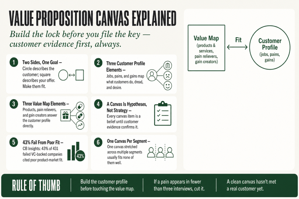
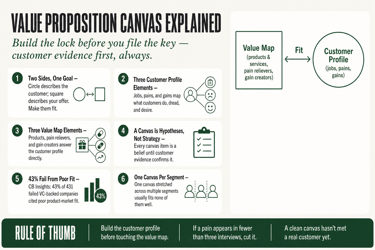
The value proposition canvas explained in plain terms: it’s a two-sided diagram, a circle on the right describing your customer, a square on the left describing your offer, and the whole game is to make them fit so snugly that a prospect looks at your message and thinks, that’s exactly what I need. By the end of this page, you’ll be able to build a canvas grounded in real customer evidence, use it to write sharper messaging, and spot the common traps that turn this powerful tool into an expensive afternoon with sticky notes.
A lot of offers don’t fail because the quality is bad. They fail because they were built around what the operator thought mattered, not what the customer is actually losing sleep over. The messaging talks about features the business is proud of, not the outcomes the buyer is desperate for. The Value Proposition Canvas is the antidote to that, but only if you treat it as a research instrument, not a brainstorm. That distinction is what this page is about.
The idea in 30 seconds
- The Value Proposition Canvas splits your world into two halves: what the customer is dealing with (Customer Profile) and what you offer in response (Value Map).
- The Customer Profile contains three elements: customer jobs (what they’re trying to accomplish), pains (what frustrates or blocks them), and gains (what success looks and feels like).
- The Value Map answers back with three matching elements: your products and servicesthe pain relievers they provide, and the gain creators they deliver.
- Fitthe goal of the whole exercise, happens when the right side and the left side genuinely correspond, not just on paper but confirmed by customer evidence.
- The most common operator mistake: treating a completed canvas as a finished strategy rather than a set of hypotheses still waiting to be tested.
- Used well, the canvas sharpens your positioning, tightens your messaging, and tells you which features to keep and which to drop.
Where the Value Proposition Canvas Came From
Alexander Osterwalder, a Swiss business theorist who developed his core ideas during his PhD research at the University of Lausanne, is best known for the Business Model Canvas, co-created with Yves Pigneur and published in Business Model Generation in 2010. One of the most widely adopted strategy tools of the past two decades. Wide enough that real-world friction with it surfaced fast.
The friction: operators and startup teams were repurposing the Business Model Canvas to sketch out their value proposition, a job it was never designed to do. The canvas is built for the 30,000-foot view. The customer-offer relationship needs a closer lens.
Recognizing that gap, Osterwalder and his Strategyzer co-authors, Yves Pigneur, Alan Smith, Greg Bernarda, and Trish Papadakos, built a dedicated tool. Value Proposition Design was published on October 20, 2014, through John Wiley & Sons. Its publication date is confirmed by the book’s copyright page and its ISBN record (9781118968055). One useful contribution of the book is weaving the jobs-to-be-done framework together with lean-startup-style experimentation, structured empathy plus disciplined testing, which separates the canvas from older positioning exercises that lived entirely inside a conference room.
It arrived at the right moment. The lean startup movement, Clayton Christensen’s jobs-to-be-done thinking, and the customer development work championed by Steve Blank had all primed practitioners to think of product-market fit as something you discover through evidence, not something you invent through insight. Osterwalder gave that instinct a concrete, teachable form.
The Problem Every Operator Recognizes
You’ve been there. You build something, a new service package, a redesigned offer, a new product line, and it doesn’t sell the way it should. Not because the quality is bad. Because you built it around what you think matters, not around what the customer is actually worried about.
CB Insights analyzed 431 failed VC-backed companies that shut down since 2023 and found that 43% cited poor product-market fit as the primary root cause of failure, the single largest category in the dataset. That updated their earlier analysis of 110+ startup post-mortems, which put the equivalent figure at 42%, framed as “no market need.” Same finding. Four times the data. A decade apart. That’s not a startup problem in isolation, it shows up every time a small business launches a new service nobody asked for, rewrites a website around features the owner loves but buyers ignore, or prices based on internal cost logic rather than perceived customer value.
The canvas shifts focus from product features to customer context, understanding not just what customers buy, but why they hire your product to solve specific problems. That reframing alone is worth the exercise. Most operators default to describing their offer from the inside out. The canvas forces the outside-in view.
Think of it as building a lock and a key at the same time. The right side of the canvas is the lock, the customer’s world, as it actually is. The left side is the key, your offer. The exercise only works if you build the lock first, with real input from real customers, before you start filing down the teeth of the key.
Value Proposition Canvas Explained: All Six Components
The canvas pairs a Customer Profile, what the customer is trying to do, what frustrates them, and what they want, with a Value Map: what you offer, how it removes friction, and what positive outcomes it creates. Six components total. Three on each side. Here’s what each one actually means for an operator.
The Customer Profile (the lock)
1. Customer Jobs. Customer jobs represent the functional, social, and emotional tasks customers are trying to accomplish. Functional jobs are practical tasks, getting accurate financials on time, keeping a building’s HVAC running. Social jobs are about how the customer wants to be perceived, looking competent to a bank, or to an ownership group. Emotional jobs are about how they want to feel, not anxious every April, not blindsided by a surprise repair bill. For a bookkeeping firm, all three are real. Most competitors only address the first one.
2. Pains. Pains are the negative experiences, risks, and obstacles customers run into while trying to get their jobs done. They have a spectrum. At one end: minor irritants (a slow-loading client portal). At the other: blockers that stop the job cold (can’t get financing approved because the books are a mess). The most powerful pains to address are the ones that feel high-stakes and frequent, the ones the customer thinks about in the shower.
3. Gains. Gains are the benefits the customer expects, the outcomes they want beyond the minimum, and the things that would genuinely delight them. They range from expected (the thing just works) to desired (it works faster than expected) to unexpected (it also solved a problem they didn’t know they had). That distinction matters because expected gains are table stakes, getting them right doesn’t win loyalty. Unexpected gains are what customers tell friends about.
The Value Map (the key)
4. Products and Services. This is simply a list of what you actually offer, the deliverables, not the marketing copy around them. Concrete. Specific. Not “world-class customer service” but “same-day email response, dedicated account manager, quarterly review call.” Write it like you’d write a scope of work.
5. Pain Relievers. Pain relievers describe exactly how your products and services address the specific pains you’ve identified on the customer side. The key word is specific. A pain reliever that maps to no identified pain is a feature looking for a problem. Strip those out.
6. Gain Creators. Gain creators explain how your offerings produce the positive outcomes customers want, or deliver unexpected benefits that exceed what they were hoping for. You don’t need gain creators for every gain on the customer side. You need them for the gains that actually drive the decision to buy.
Fit: The Goal of the Whole Exercise
Fit, the goal of all of this, happens when every important job, pain, and gain on the right is met by a specific element on the left. Not partial. Not vague. A specific pain on the customer side should be able to draw a line to a specific pain reliever on the offer side. If it can’t, you have a gap, either in your offer or in how you’re communicating it. Both are fixable, but only once you can see the gap clearly.
A product or service reaches fit when it fulfills enough customer jobs, relieves enough customer pains, and creates enough customer gains. “Enough” is doing a lot of work in that sentence. It doesn’t have to be perfect. It has to be good enough that the customer looks at your offer and sees themselves in it.
The Difference Between a Canvas and a Strategy: Evidence
Here’s the part most pages on this topic skip, and it’s the part that actually matters: a completed canvas is not a strategy. It’s a set of hypotheses.
Every item you put on the canvas is really a belief statement: “We believe our customers have this pain.” “We believe our product relieves it this way.” Until you’ve tested those beliefs with actual customer evidence, interviews, experiments, market tests, you have an educated guess, not a strategy.
The distinction between “we believe” and “we know” is where most operators get burned. You can fill out a canvas in two hours, feel like you’ve done the work, and then spend six months building an offer around an assumption that was wrong from the start. The canvas didn’t fail you, you stopped one step too early.
So what does validation actually look like for a small-business operator who isn’t running a lean startup with a product team?
Customer interviews first. Talk to five to ten existing customers, not prospects, customers, and ask about jobs, not features. “Walk me through the last time you dealt with [the problem your business solves]. What made it hard? What were you hoping for that you didn’t get?” Let them talk. Record the language they use, because that language is your future ad copy. This is Voice of Customer research by another name, and it’s the fastest way to know whether your canvas assumptions are grounded.
Rank the pains and gains. Not all pains are equal. Ask customers to rank them, or look for the ones that come up unprompted across multiple interviews. A pain that only one customer mentions is not a canvas item. A pain that shows up in seven out of ten interviews with nearly identical language, that’s a canvas item, and probably the headline of your next landing page.
Distinguish validated from assumed. A canvas that’s actually been tested looks different from one that hasn’t. Items are crossed out, ranked, annotated. There’s a clear visual distinction between what’s confirmed and what’s still a belief. If a canvas looks perfect and clean, it probably hasn’t met a real customer yet. Keep two columns or two colors, one for what you’ve confirmed with evidence, one for what you still believe. Move items from belief to confirmed one test at a time.
Once you’ve identified your assumptions, design experiments to test them. For most operators, a landing page with a clear headline derived from one pain/reliever pair, plus a direct response mechanism, will tell you more in two weeks than a brainstorm session ever will. The canvas is the map. The experiments are how you find out if the map matches the territory.
Putting this to work? The ideas in the Canon are the foundation under the tactical playbook in Build a Complete Marketing Department — grab the free companion kit at mmsvegas.com/resources.
What the Canvas Looks Like on Real Businesses
The three most cited examples, Uber, Airbnb, Spotify, are overused, but they’re cited constantly because the fit is clean and instructive. Let’s use them quickly, then talk about what this looks like closer to ground level.
Uber named one dominant pain in the urban-rider profile: unpredictable wait and arrival times for traditional taxis. The pain relievers were real-time GPS tracking, an upfront fare estimate, and cashless payment. Notice the precision. Not “taxis are bad”, one specific pain with three specific relievers. That’s a tight canvas.
Airbnb identified two customer segments with completely different canvases. Travelers’ top pains were cost and the impersonal nature of hotels; gain creators included a local, unique stay and the ability to live in a neighborhood rather than a hotel corridor. Hosts’ top pain was the risk of property damage; pain relievers included the Host Guarantee and reviewable identity profiles. Two canvases, two segments, which is exactly the right move. One canvas per segment, always.
Spotify mapped a customer profile around music access frustration: piracy risk, album-purchase cost, and discovery friction. Gain creators were an all-you-can-listen catalog, personalized playlists like Discover Weekly, and offline mode.
Now pull it down to small-business scale. A local HVAC company serving commercial property managers: the functional job is “keep the building comfortable and the equipment from failing.” The social job is “look like I’m on top of maintenance before the building owner calls.” Pains: surprise breakdowns, invoices that are impossible to explain to ownership, technicians who show up whenever they feel like it. Gains: predictable costs, documentation the property manager can forward to ownership, a technician who actually calls when they’re 20 minutes out. The canvas writes the service contract, the sales pitch, and the upsell to a maintenance plan, all at once.
A B2B software consultant: the client’s functional job is implementing a tool without blowing the timeline. Their pain is that every vendor promises a smooth implementation and none of them deliver one. Their gain is going live looking like a hero to their CFO. The consultant who leads with the implementation horror stories, names the pain the client is afraid to say out loud, wins the room before showing a slide deck.
The canvas doesn’t care about your industry. It cares about whether you’ve actually listened to the people you’re trying to serve.
Where the Value Proposition Canvas Earns Its Keep
The canvas pulls the most weight in a handful of situations that every operator eventually faces.
New offer design. Before you build the new service tier, new product bundle, or new program, do the canvas. Specifically: do the Customer Profile half first, before you touch the Value Map. If you can’t populate the customer’s jobs, pains, and gains from actual interviews or real customer data, you don’t have enough to build anything yet. Go talk to people.
Messaging rewrites. When your website converts poorly or your sales calls stall out, the canvas is a useful diagnostic. Map what you’re currently saying on the Value Map side, products, relievers, creators, then ask: does this map to anything on the Customer Profile side that’s real and ranked? Often you’ll find the messaging is loaded with features the operator cares about that land nowhere on the customer’s list of active concerns. The fix is almost always to lead with the pain, not the feature.
Competitive differentiation. Build the canvas for your most direct competitor based on their public messaging and reviews. Then compare it to yours. Where the canvases overlap, you’re in a commodity fight on price. Where yours covers a pain that theirs ignores, that’s your positioning. Your unique selling proposition lives in the gap between your competitor’s canvas and yours.
Existing offer audit. The canvas isn’t just for new offers, it’s equally useful for auditing what you already sell. Run your current offer through it every year or so. Customer jobs evolve. New pains emerge, regulation changes, economic shifts, new competitors that redefine what buyers expect. An offer that fit beautifully in 2021 might have a widening gap by now.
Segment prioritization. A customer profile should be created for each distinct segment, because each one has different jobs, pains, and gains. If your business serves two different types of customers, say, residential and commercial, or SMBs and enterprise, build two canvases. The fit will look different. The messaging should look different. One-size-fits-all copy is usually the output of a one-canvas-for-everyone approach that hasn’t been tested against either segment.
Where the Canvas Falls Short
The canvas has real limits, and pretending otherwise leads operators to over-invest in the wrong places.
It doesn’t tell you which job to go after. The canvas helps you design an offer for a customer job that already exists. It doesn’t help you decide which job to prioritize, the most painful one, the most frequent one, the one with the least competition, or the one with the biggest margin potential. That’s a strategy question the canvas doesn’t answer. You’ll need something like Rumelt’s strategy kernel to handle that. The canvas executes on a strategic choice; it doesn’t make it for you.
It assumes the customer can articulate what they want. Sometimes they can’t. Customers are good at describing pains and bad at predicting the solutions that will resolve them. The classic Henry Ford line about faster horses applies here. The canvas will surface the frustration, waiting too long, unreliable horses, but can’t generate a car. For genuinely disruptive or novel offers, you need to read between the lines of customer interviews rather than take stated preferences at face value.
It’s a static snapshot. Markets move. Customer jobs shift. The fit that exists today may not exist in eighteen months. The canvas is most dangerous when it’s treated as a one-time deliverable rather than a living document. Build it, validate it, then revisit it when you notice conversion rates dropping or churn creeping up, those are usually early signals that fit is eroding.
It’s not a messaging template. A well-validated canvas tells you what to say. It doesn’t tell you how to say it, in what order, or for which level of market awareness. You’ll still need to think about where your buyer sits on the awareness spectrum and structure your copy accordingly. The canvas feeds the messaging; it doesn’t write it.
It can create false consensus. Run a canvas workshop with a mixed room, sales, product, leadership, and everyone feels like things got done. Everyone agreed on the sticky notes. But group consensus in a conference room is not customer validation. The canvas is only as good as the customer data underneath it.
What People Get Wrong About the Value Proposition Canvas
Several persistent misunderstandings follow this tool around, and clearing them up saves a lot of wasted effort.
Misunderstanding 1: The canvas is about your positioning statement. Operators often conflate building the canvas with writing their tagline or one-liner. Those are related but different jobs. The canvas is a research and design tool. The positioning statement is an output that might emerge from it, but the canvas itself is the map, not the destination.
Misunderstanding 2: Gains are just the opposite of pains. Not quite. Pains are the bad things that happen (or might happen) while trying to do a job. Gains are positive outcomes, some expected, some desired, some unexpected. A customer buying accounting software has a pain: manual entry errors. They also have a gain that’s independent of that pain: they want to look financially sophisticated to their board. Resolving the pain doesn’t automatically create the gain. You need gain creators for both.
Misunderstanding 3: You only need one canvas per business. Very few businesses have a single type of customer. If your product or service reaches different kinds of customers, create individual canvases for each. A single canvas stretched across multiple segments is like one key for every lock in the building. Doesn’t work.
Misunderstanding 4: The canvas is a one-time exercise. The canvas is a living document. As markets shift and customers evolve, so does fit. Many operators build a great canvas in year one and let it sit in a drawer while the world changes around it. Revisit it annually or whenever your conversion numbers start moving in the wrong direction.
Misunderstanding 5: Fit means addressing every single pain and gain. It doesn’t. Your products and services don’t have to address every pain and gain, only the ones that matter most to the buying decision. Trying to address everything dilutes everything. Pick the highest-stakes pains and the most desired gains, go deep on those, and leave the rest alone. Trying to cover every item on the canvas is how you end up with a sprawling offer that’s forgettable on all of it.
Common Mistakes
- Filling the canvas from internal opinions, then wondering why the offer doesn’t land — Do at least five customer interviews before you open the canvas template. Use the Customer Profile to organize what you <em>heard</em>, not what you assume. If a pain didn’t surface in at least three conversations, it doesn’t earn a canvas item yet.
- Building one canvas to cover multiple distinct segments — One canvas per segment, no exceptions. If you serve two meaningfully different types of buyers, build two canvases. The 90 minutes it takes to split them is far cheaper than six months of messaging that fits nobody.
- Listing features as pain relievers without tracing them to a named pain — Draw a literal line from each pain reliever to the pain it addresses. If the line can’t be drawn, the item is a feature, not a reliever. Either add the corresponding pain, if real customers have confirmed it, or cut the item.
- Treating a canvas that looks complete as though it’s been validated — Mark every canvas item as ‘assumed’ until you have behavioral evidence, not stated preference, that confirms it. A customer saying ‘that would be great’ in an interview is not validation. A customer paying for it, using it, or referencing it unprompted in a renewal conversation: that’s validation.
- Never revisiting the canvas after the initial build — Schedule a canvas review whenever your close rate drops more than 10 points or your churn ticks up for two consecutive quarters. Either signal usually means fit is eroding, the customer’s world has shifted and your offer hasn’t caught up yet.
Operator’s Take
The Value Proposition Canvas is one of the more useful tools in an operator’s kit, and one of the most casually abused. So here’s what I actually think, separate from everything above.
The single move that changes everything: do not start with the canvas template. Start with a calendar invite. Block 90 minutes and call three to five current customers, not prospects, customers, before you open a single diagram. Your canvas is only as good as the quality of listening that precedes it. Every operator I’ve watched do this well starts with real language from real people. Every operator I’ve watched fumble it started with a template and assumptions.
When you do sit down with the canvas, make one tactical decision up front: pick one customer segment and one specific context. Not “our SMB clients.” The office manager at a 20-person professional services firm who’s personally responsible for the lease renewal negotiation. That specificity feels uncomfortable, it feels like you’re leaving money on the table. You’re not. You’re giving your message a fighting chance to land with somebody instead of sliding off everybody.
Here’s a use case most operators miss entirely: use the canvas to set your pricing floor. If you’ve done the Customer Profile well, you have a clear picture of which pains are high-stakes and which are low-stakes. High-stakes pains, the ones that keep your customer up at night, the ones with a dollar figure attached if they’re not solved, justify premium pricing. A bookkeeper who understands that her client’s biggest pain is “I might fail my bank covenant review and lose my credit line” can price against that fear, not against the going rate for bookkeeping hours. The canvas doesn’t just write your pitch; it tells you what the pitch is worth.
Another underused move: run the canvas on your own business from your client’s point of view before your next big sales conversation. Sit in your prospect’s chair. What’s their functional job in this purchase? What social risk are they taking by hiring you over a bigger firm? What does success look like to them the morning after they sign, not six months later, the morning after? Then structure your proposal to answer those questions in that order. It’s not a trick. It’s just having the conversation the customer is already having in their head, out loud, with you in the room.
AI is genuinely useful here, specifically for processing interview transcripts, clustering pain language from reviews, and drafting first-pass canvas hypotheses from a batch of customer data. What it won’t do is tell you whether a pain is real enough to buy against. That judgment, which pains are actual purchase triggers versus polite complaints, stays with you. And it’s the most important call in the exercise. Don’t outsource it.
Last thing: the canvas has a way of making a meeting feel conclusive. Five people, a whiteboard, a lot of nodding. That feeling is a trap. Consensus in the room is not evidence from the market. If the canvas looks clean and everyone agreed, you have a good-looking hypothesis. Go test it before you build anything around it.
Used in
- ✓ Build a Complete Marketing Department
Used at the offer-design stage to ensure every service tier and messaging claim maps to a validated customer pain or gain rather than an internal assumption. - ✓ The Missing Manual for FunnelKit
Used to populate the pain-point and outcome language that drives funnel headlines, email subject lines, and landing page copy at each stage of the customer journey. - ✓ The Missing Manual for Make
Used to define the trigger conditions and outcome data points in automated workflows, the canvas determines which customer signals matter enough to act on.
FAQ
What is the Value Proposition Canvas in simple terms?
It’s a two-sided diagram. The right side maps your customer, what they’re trying to do, what frustrates them, and what success looks like. The left side maps your offer, what you provide, how it removes their frustrations, and how it delivers what they’re after. The goal is to make both sides line up, confirmed by real customer evidence.
How is the Value Proposition Canvas different from the Business Model Canvas?
The Business Model Canvas maps your entire business model across nine blocks. The Value Proposition Canvas zooms in on just one relationship, between your customer segment and your offer. Think of it as the lens you use to inspect the part of the Business Model Canvas that matters most to whether people actually buy.
How many canvases should I build for my business?
One per distinct customer segment. If you serve residential and commercial clients, or SMBs and enterprise accounts, their jobs, pains, and gains are different enough to need separate canvases. A single canvas stretched across multiple segments usually fits none of them well.
Can I use the Value Proposition Canvas for an existing business, not just a new one?
Yes, and it’s often more valuable for established businesses than for startups. Running your current offer through the canvas tells you where fit has eroded, which features to cut, and which pains you’re not addressing that a competitor could exploit. It’s an audit tool as much as a design tool.
How do I validate the canvas without a research budget?
Five to ten 20-minute customer interviews will get you further than any survey. Ask customers to walk you through the last time they faced the problem your business solves, listen for the language they use, what frustrated them most, and what a good outcome looked like to them. That data populates the Customer Profile more accurately than any team brainstorm.
What’s the difference between a pain reliever and a gain creator?
A pain reliever addresses something that goes wrong or blocks the customer, it removes a negative. A gain creator produces a positive outcome, it creates something the customer wants more of. Some features do both, but they serve different psychological purposes: pain relief reduces risk and friction, gain creation increases desire and delight.
Further reading
- Value Proposition DesignAlexander Osterwalder, Yves Pigneur, Greg Bernarda, Alan Smith, Trish Papadakos (Wiley, 2014). The source. The second half of the book, on testing and validating the canvas, is more valuable than the first, most readers stop at the framework and miss the discipline.
- Competing Against LuckClayton Christensen, Taddy Hall, Karen Dillon, David Duncan. The jobs-to-be-done theory that underpins the ‘customer jobs’ component of the canvas; reading this alongside Value Proposition Design deepens both.
- The Mom TestRob Fitzpatrick. The best short guide to conducting customer interviews that surface real pains rather than polite agreement. Pairs directly with canvas validation work.
Sources:
- Alexander Osterwalder, Yves Pigneur, Greg Bernarda, Alan Smith, Trish Papadakos, Value Proposition Design (John Wiley & Sons, 2014). ISBN 9781118968055. Publication date October 20, 2014, confirmed by publisher copyright page and ISBN record.
- Strategyzer.com, multiple library pages and homepage (accessed July 2025).
- CB Insights, The Top Reasons Startups Failoriginal analysis of 110+ startup post-mortems (2014 to 2021), finding 42% cited no market need as primary failure cause; 2024 updated study of 431 failed VC-backed companies that shut down since 2023, finding 43% failed due to poor product-market fit. Both studies cited from CB Insights research report (cbinsights.com/research/report/startup-failure-reasons-top/, accessed July 2025).
- Unicorn Screener VC, ‘Why Startups Fail: What the Data Actually Shows’ (May 2026), synthesis of CB Insights original and updated datasets.
- B2B International, ‘What is the Value Proposition Canvas?’ (updated January 2026).
- IxDF (Interaction Design Foundation), ‘What is The Value Proposition Canvas?’ (updated April 2026).
- Linden Innovation, ‘Value Proposition Canvas: B2B examples, 100+ sessions’ (May 2026).
- Mooncamp Glossary, ‘Value Proposition Canvas’ (May 2026).
Brian Kasday spent forty years in direct-response marketing before rebuilding the whole operation as a one-person shop. He writes The Operator’s Library — including “Build a Complete Marketing Department” — for operators who’d rather build it themselves than wait on someone else.
Build the department these ideas describe — the free companion kit: mmsvegas.com/resources.
More The Operator's Canon guides
Free · Operator Toolkit
Want the tools, not just the guide?
Get the free operator toolkit — templates and checklists for the systems you actually run, plus a note when this guide changes.
Get the free toolkit →