
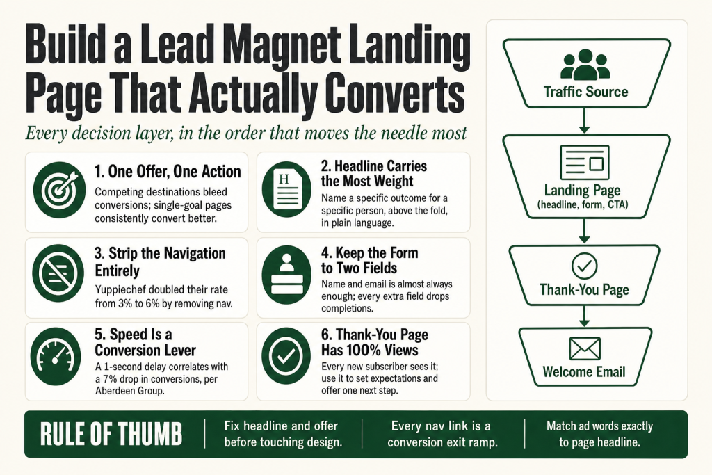
The 30-second answer
- One offer, one page, one primary action. Competing destinations bleed conversions. Pages with a single CTA goal consistently convert better than pages with several competing ones. Repeating the same CTA button at multiple scroll depths is not the same as competing CTAs, and on longer pages that repetition is smart.
- The headline carries the most weight. It needs to name a specific outcome for a specific person above the fold, in plain language.
- Strip the navigation. Removing the site nav keeps visitors on the conversion path instead of clicking away to your blog.
- Keep the form short. Name and email is almost always enough. Every extra field adds friction and drops completions.
- Speed is a conversion lever, not just a tech detail. Research consistently links slower load times to lower conversion rates. On a page you are actively driving traffic to, that matters.
- The thank-you page is part of the funnel. It has a 100% view rate from every new subscriber. Use it to set expectations and offer a logical next step.
- Match the page to your traffic source. The words in your ad or email need to echo on the page or visitors bounce before they read the offer.
Take this fix into your next scenario. The free Builder’s Companion Kit collects the checklists and templates that pair with this guide — so next time, you start from a template, not a blank page. Grab it free →
- Start With the Offer, Not the Page
- Write the Headline Before You Touch the Design
- Remove the Navigation, Every Link Is an Exit Ramp
- The Form: Ask for Less Than You Think You Need
- Match the Page to the Traffic That Arrives
- Trust Signals: The Right Ones in the Right Places
- Page Speed: A Conversion Lever You Control Before Anyone Arrives
- CTA Button Copy: One Line That Closes the Loop
- A Worked Example: Building the Lead Magnet Landing Page From Scratch
- The Thank-You Page: Your Highest-Intent Touchpoint
- Where AI Helps on This Page (and Where It Does Not)
- What to Track and When to Change Something
- FAQ
A lead magnet landing page is a single-purpose machine with one job: turn a skeptical stranger into a subscriber. Most operators build it wrong. They treat it like a mini website, stuff in navigation links, ask for five fields of contact info, and write a headline that could belong to any business in their category. Then they wonder why the page converts at 1%.
The good news: the fixes are concrete. This guide walks you through every decision layer of a lead magnet landing page, in the order that moves the needle most, with the data to back each call. Your judgment stays in the driver’s seat. AI can help you draft copy faster, but it cannot substitute for you knowing your audience well enough to make the real calls correctly.
Start With the Offer, Not the Page
No amount of design polish rescues a weak offer. Before you open a page builder, you need a lead magnet specific enough that someone reads the headline and thinks “that is exactly my problem.” Generic titles like “The Complete Marketing Guide” signal generic value. Specific titles like “The Service Business Owner’s 7-Day Plan for Getting the First 100 Email Subscribers” signal that you understand their exact situation.
Specificity also self-selects for qualified leads. Fewer total downloads, yes. But dramatically higher percentages of people who are actually your buyers. That trade is almost always worth making for a solo operator who cannot afford to spend hours following up with the wrong audience.
If you have not yet settled on which problem your magnet solves, read Lead Magnet for Service Business: Pick the Right Problem, Make It Specific, Turn It Into a Sale before you build this page. The page only amplifies what the offer already is. It cannot compensate for an offer that does not resonate.
One honest caveat: the format matters too. Checklists and cheat sheets tend to convert at higher rates than full ebooks because they promise a faster payoff for less reading time. If your audience is busy operators, a one-page reference beats a 40-page PDF most of the time.
Write the Headline Before You Touch the Design
The headline is the single highest-impact element on the page. It is what a visitor reads in the first three seconds and uses to decide whether to keep scrolling. Write it last and you are designing a frame before you know what goes inside it.
A strong lead-magnet headline does three things: names the outcome, names the audience (implicitly or explicitly), and gives a reason to believe the outcome is attainable. “Get More Leads” fails all three. “The 5-Step Checklist Plumbers Use to Fill Their Schedule Without Buying Ads” passes all three.
Plain language also matters more than you might expect. Copy written at a lower reading-grade level consistently outperforms copy that uses industry jargon, even with sophisticated audiences. Your reader is skimming, not studying. Write for skimmers.
Beneath the headline, a subhead earns its space by handling one objection or adding one specific detail the headline left out. It is not a restatement; it is an advance. Think of the headline as the promise and the subhead as the first piece of proof that the promise is real.
Below the subhead, a short bullet list (three to five items) of specific things the reader will get or be able to do after downloading works better than a paragraph of description. Bullets are scannable. Paragraphs are not.
Remove the Navigation, Every Link Is an Exit Ramp
Here is the counterintuitive one: your site navigation actively hurts this page. Every menu item is a door your visitor can walk out of. Data from A/B tests across multiple organizations consistently shows that removing navigation from dedicated landing pages increases conversions. The most widely cited example involves a career college client of Unbounce’s, which saw conversions climb from 3.12% to 13.64% after simultaneously removing top navigation and moving the form above the fold, a 336% increase, as reported by Unbounce. Both changes were made at the same time, so the 336% figure reflects a combination of both moves, not navigation removal alone. The direction of the effect is consistent across dozens of documented tests. Yuppiechef doubled their rate from 3% to 6% by removing nav. HubSpot’s own A/B test across five pages found lifts of 0 to 28%, with middle-of-funnel pages seeing the biggest gains.
The reason is simple. Your visitor landed here for one reason. Give them one decision: opt in or leave. The moment you add six menu links, you give them seven decisions. Most people unconsciously choose the path of least resistance, which is clicking away to something that feels less like a commitment.
There are three acceptable exceptions, per the data: an anchor-based on-page navigation for very long pages (links that jump to sections of the same page, not to other URLs), a logo-only header that provides brand trust without exit paths, and a footer link to your privacy policy for legal compliance. Everything else, social icons, blog links, service pages, comes off.
If your page builder makes this hard, that is a sign you may need a dedicated landing page tool rather than building inside your main WordPress theme. The friction of stripping nav in a poorly structured theme costs you more time than switching tools would.
The Form: Ask for Less Than You Think You Need
The form is where most conversions die quietly. The instinct is to collect everything useful upfront: name, email, company, phone, industry, how they heard about you. The reality is that every additional field drops completion rates. Reducing a form from many fields down to a handful produces documented conversion lifts that are hard to get any other way.
For a lead magnet, name and email is almost always sufficient. You can learn everything else through the welcome email sequence and future conversations. Asking for a phone number on a free-download form is the equivalent of asking for someone’s home address before handing them a business card. It kills trust and signals that the “free” offer has a hidden cost.
There is also a legal dimension worth knowing. Under GDPR, which applies to anyone collecting data from EU residents regardless of where you are based, the data minimisation principle (Article 5(1)(c)) requires that personal data collected be adequate, relevant, and limited to what is necessary for the specific purpose. A clear affirmative consent action is also required for marketing emails: the accepted form is an unchecked opt-in checkbox that the person must actively tick. Pre-ticked boxes do not meet the standard, and the CJEU confirmed this in its 2019 Planet49 ruling. Consent also cannot be bundled with downloading the resource itself; if someone must check the marketing box to get the file, that consent is not freely given. Link to your privacy policy near the form. CCPA, which applies if you collect data from California residents, requires a Notice at Collection at or before every point where you gather personal information, disclosing the categories of data you collect and the purposes for which you collect them. The rules evolve and vary by jurisdiction, so verify your specific obligations with a qualified legal or compliance professional rather than treating this paragraph as legal advice.
A few form details that matter: make sure your form fields support browser autofill, since autofill-enabled forms convert measurably better on mobile than forms without it. Keep tap targets large enough on mobile, because small input fields are a known abandonment driver on touch screens. And put the form above the fold on desktop; do not make visitors scroll to find the action you want them to take.
If you need to qualify leads rather than just capture emails, consider putting a single qualifying question after the initial email capture, not before. Get the email first, then learn more.
Match the Page to the Traffic That Arrives
Message match is one of the most overlooked conversion killers. If your ad says “Free Checklist: How to Price Your Services” and your landing page headline says “Download Our Marketing Resources,” visitors register the disconnect immediately and bounce. They clicked on a specific promise. Land them on a page that echoes that exact promise.
This applies to every traffic source: paid social ads, Google ads, email links, and even organic search. The words in the source need to appear on the page, quickly. A visitor should never have to re-read to confirm they are in the right place.
Traffic source also changes your conversion expectations. Email traffic from your own list converts at a far higher rate than cold paid social traffic, because those visitors already trust you. Organic search visitors land somewhere in between. If your page converts at 6% from organic traffic, that is roughly in line with the all-industry median. If it converts at 6% from your own email list, something is probably wrong with the offer or the page copy.
Before you spend any money driving paid traffic to a new lead-magnet page, run it through your existing audience first, even a small segment. Their behavior tells you whether the offer and message are working before you pay for cold eyeballs.
For a broader look at how traffic sources interact with your full funnel, see How to Build a Sales Funnel Without a Team: A Solo Operator’s Playbook.
Trust Signals: The Right Ones in the Right Places
Trust signals work. The research consistently shows that adding credibility elements, social proof, testimonials, download counts where real, recognizable logos, lifts conversions. But the wrong trust signals in the wrong places create noise instead of confidence.
For a lead-magnet page, the most effective trust elements are: a short bio or credential line that establishes why you are qualified to teach this topic (above the fold or just below); one or two specific testimonials from real people who either downloaded this resource or worked with you and got the outcome the magnet promises; and a clear privacy statement near the form button (“No spam. Unsubscribe any time.”) that reduces the perceived risk of handing over an email address.
What you do not need: generic five-star ratings with no context, a wall of client logos unrelated to the topic, or social share counts from other pages. These signal effort but not relevance.
One trust element that gets skipped constantly: a clear statement of what happens after someone opts in. “You will get an email with your download link within five minutes” removes uncertainty. Uncertainty is friction. Friction kills conversions.
Page Speed: A Conversion Lever You Control Before Anyone Arrives
Speed is not a tech detail. It is a conversion rate decision you make at build time. Research from the Aberdeen Group found that a 1-second delay in page load time correlates with a 7% drop in conversions, though the actual impact on your specific page will vary by traffic type, industry, and audience. What does not vary: slower pages consistently convert worse. On a page you are actively sending traffic to, slow load times are one of the most expensive mistakes you can make.
The practical checklist for a solo operator goes beyond compressing images. Here are the highest-impact fixes, in rough order of effort versus return:
- Compress and modernize images. WebP format now has over 97% browser support globally, covering all modern browsers, and reduces file size substantially without visible quality loss. If your audience skews toward very old devices or corporate environments with legacy browsers, a JPEG fallback is cheap insurance. Do not lazy-load your hero (above-the-fold) image; lazy loading delays the browser’s rendering of the most visible element and tanks your Largest Contentful Paint score.
- Lazy-load everything below the fold. Images and other media that the visitor has not scrolled to yet should not load on page open. Add
loading="lazy"to all below-fold images. Most modern page builders and WordPress plugins handle this with a single setting. - Defer or remove non-essential scripts. Third-party scripts (chat widgets, social embeds, analytics tags beyond what you need) block rendering. Load non-critical JavaScript after the main page content has rendered, or cut it entirely from this page. A landing page does not need your full site’s script stack.
- Minify HTML, CSS, and JavaScript. Stripping unnecessary whitespace and comments out of your code files reduces file sizes. Most caching plugins for WordPress do this automatically.
- Use a CDN for static assets. A content delivery network serves your images and scripts from a server geographically closer to each visitor, which cuts round-trip time, especially for mobile users on slower connections.
- Preload your hero image. Tell the browser to fetch your above-the-fold image immediately, before it finishes parsing the rest of the page. A preload link in the document head regularly shaves hundreds of milliseconds off load time on mobile.
Run the full check using Google PageSpeed Insights before you drive any traffic. Check the mobile score separately from the desktop score. They often differ significantly, and mobile is where most of your visitors will land. The tool’s “Opportunities” section tells you exactly what to fix and how much time each fix saves. That is the highest-ROI tech work you will do on this page.
Mobile load time deserves separate attention. More than half of lead-magnet interactions happen on mobile devices, and mobile visitors are especially sensitive to slow pages. If your page takes more than three seconds to load on mobile, a significant share of your visitors will leave before the page finishes rendering.
The fastest pages are usually the simplest pages. Every element you add costs load time. This is another reason to strip the page down to its functional minimum: headline, subhead, bullets, form, trust signals, CTA. Nothing else.
CTA Button Copy: One Line That Closes the Loop
“Submit” is the worst button label in marketing. It tells the visitor what they are doing (giving you something) instead of what they are getting. Benefit-specific CTA copy, “Send Me the Checklist,” “Get the Free Guide,” “Yes, I Want This,” consistently outperforms generic labels because it reinforces the value exchange at the final moment of decision.
Keep the CTA button visually dominant: high-contrast color against the page background, large enough to tap comfortably on a phone screen, and placed where the eye naturally lands after reading the form. On a short page, one CTA at the top is usually enough. On a longer page, repeat the same CTA (same label, same destination) lower on the page so a visitor who scrolled to the bottom does not have to scroll back up to act. Repeating the same button at different scroll depths is not the same as competing CTAs, and the data supports doing it.
Keep all CTA buttons pointing to a single destination. Every competing action pulls attention away from the primary goal. A single, clear next step keeps the decision simple, and simple decisions get made faster.
A Worked Example: Building the Lead Magnet Landing Page From Scratch
Here is how to put all of it together for a real scenario. Suppose you run a bookkeeping practice for independent contractors and your lead magnet is a one-page tax-prep checklist called “The Freelancer’s Q4 Tax Checklist: 11 Things to Do Before December 31.”
Step 1: Verify the offer clears the specificity bar. Ask four questions before writing a word of page copy. Who is it for? Freelancers. What specific problem does it solve? Q4 tax prep overwhelm. What format is it in? A one-page checklist, not a 30-page guide. What is the time or effort ask on the reader? Twenty minutes, not a weekend. This one passes all four. If yours does not, fix the offer before you fix the page.
Step 2: Write the headline as a complete sentence of value. A working draft: “The 11-Item Q4 Checklist Freelancers Use to Stop Overpaying Taxes.” It names the outcome (stop overpaying), names the audience (freelancers), and the number makes the effort feel concrete. Do not ship the first draft. Write five alternatives, then pick the one that sounds most like something your best client would forward to a peer.
Step 3: Write the subhead to handle the biggest objection. For this audience, the objection is usually time. “Takes 20 minutes. Saves the headache of scrambling in January.” The subhead adds a time commitment (low) and names the consequence of not acting (scrambling in January). One sentence is enough. Two sentences is probably one too many.
Step 4: Write three to five outcome-framed bullets, not topic bullets. The difference: “Section 3: Deductible Expenses” is a topic. “Know exactly which expenses to deduct before year-end so you are not leaving money on the table” is an outcome. Every bullet should complete the sentence “After using this checklist, you will…” If it does not, rewrite it until it does.
Step 5: Build the form with the fewest fields that still let you follow up. For this page: first name and email only. Button copy: “Send Me the Checklist.” Directly below the button, add a single line: “No spam. One email with your download link, then our weekly tax tip.” That line does two things: it eliminates the fear of inbox flooding and it pre-sells the ongoing relationship. Also include a link to your privacy policy near the form. If you collect data from EU residents, GDPR requires a clear affirmative consent action for marketing emails, typically an unchecked opt-in checkbox the person must actively tick. That checkbox cannot be pre-selected, and checking it cannot be required in order to receive the download (consent must be freely given). If you collect data from California residents, CCPA requires a Notice at Collection at or before the point of data collection, disclosing what you collect and why. Keep your form short not just for conversions but because collecting only what you need is sound practice under the most common privacy frameworks. Verify your specific legal obligations with a qualified compliance professional.
Step 6: Place one trust signal near the form, not above the headline. A credential line below the form earns its place here: “Used by 400+ freelancers. Written by a CPA with 12 years of contractor-specific experience.” If you do not yet have 400 downloads, use a different specific: a client quote, the publication where your work appeared, or the credential alone. Do not invent a number.
Step 7: Remove the navigation and audit every remaining link. Logo in the header links to the homepage only, for brand recognition. Every other nav link comes out. Then check the page for any other exit paths you may have missed: sidebar widgets, footer menus, related-post links. Each one is a leak.
Step 8: Match the traffic source copy to the page headline exactly. If you are running a Facebook ad, the ad headline and the page headline should use the same core phrase. If the ad says “Free Q4 Tax Checklist for Freelancers,” the page headline should include “Q4 Tax Checklist” and “Freelancers” in that order, above the fold, in the first five words if possible. Visitors should feel instant confirmation, not mild recognition.
Step 9: Run the speed check before you launch any traffic. Compress all images and convert to WebP where possible (97%+ browser support globally). If your visitors skew toward legacy corporate environments or very old devices, keep a JPEG version as a fallback. Lazy-load all images below the fold, but do not lazy-load the hero image at the top of the page. Defer or remove any third-party scripts not needed for the opt-in to work. Open Google PageSpeed Insights, paste your URL, and check both the mobile and desktop scores before you drive a single click. Fix whatever the tool flags in the “Opportunities” section first. That is the highest-ROI tech work you will do on this page.
This is not a complex page. It is a disciplined one. Every element earns its place by moving the visitor toward one action. The steps above take roughly two to three hours for a first pass. Most of the time you spend after that should go into testing the headline, not rearranging the layout.
The Thank-You Page: Your Highest-Intent Touchpoint
Every person who opts in sees the thank-you page. That is a 100% view rate, higher than any email you will ever send. Most operators treat it as a formality. It is not. It is the best real estate in your funnel for a low-friction next step.
The thank-you page has three jobs, in this order. First, confirm the action worked: “You are in. Check your inbox for your download link in the next few minutes.” Remove doubt before you ask for anything. Second, set expectations for what comes next, not as a warning, but as a value promise. “Over the next few days, you will get one email per week with a practical tax tip for freelancers. That is it.” Third, offer one logical next step that makes sense for someone who just downloaded a tax checklist: a link to a related article, an invitation to book a 20-minute call, or a pointer to your most useful free resource.
One and only one next step. The same discipline that applies to the opt-in page applies here. Multiple competing offers on the thank-you page dilute each other.
Delivering the lead magnet via email rather than directly on the thank-you page has a secondary benefit: it trains your new subscriber to open your emails. The first email you send should deliver the promised resource clearly and quickly, then flow naturally into a welcome sequence. For how to build that sequence, see Welcome Email Sequence for Small Business: The Complete Setup Guide.
Where AI Helps on This Page (and Where It Does Not)
AI tools can accelerate real work on a lead-magnet page: drafting headline variations, rewriting bullet points at a lower reading-grade level, suggesting CTA copy alternatives, and generating first-draft privacy policy language for the form area. These are legitimate time-savers for a solo operator. They cut how much you depend on outside help for the drafting work. The judgment on what to say, who to say it to, and whether it actually sounds like your brand, that stays with you entirely. AI does not replace your copywriting judgment. It reduces how much outside copywriting help you need for the drafting stage. The strategic calls, every single one, stay with you.
What AI cannot do is decide which offer to build, identify the specific language your audience actually uses for their problems, or evaluate whether your trust signals are credible to the people you are trying to reach. Those calls require knowing your market. No prompt fixes that gap. Feed the tool bad inputs and you get polished-sounding copy that converts at the same rate as a generic page, which is to say, poorly.
If you are using AI to draft page copy, give it the specifics it needs: your audience’s exact job title or situation, the one outcome your magnet delivers, the objection you most need to overcome, and the reading level you are targeting. Vague prompts produce generic copy. Generic copy produces low conversions. You are using the tool to go faster, not to hand off the thinking.
For a practical method of using AI in the copy process without giving up control of the strategy, see How to Write Marketing Copy With AI (the Solo Operator’s Method). And if you want a structured pre-build document to run before you touch the page builder, the Landing Page Brief Template: Settle the Strategy Before Design Starts is the place to start.
What to Track and When to Change Something
The median landing page across all industries converts at around 6.6%, based on Unbounce’s analysis of tens of thousands of pages. For a lead-magnet page with warm traffic (your own email list, organic search from people who found you intentionally), you should be above that. For cold paid social traffic, being below that median is normal. Compare your rate to the right benchmark for your traffic source, not the overall average.
If you are below 3% for any traffic source, you likely have one of three problems: a headline that does not connect with the audience, an offer that does not feel worth the email address, or friction in the form. Fix them in that order: offer and headline first, form second, design last. Unbounce’s own research across tens of thousands of landing page variants found that copy has roughly twice the relative importance of design when it comes to predicting conversion rates. That does not mean design is irrelevant, but it does mean that if you are spending your first hour of troubleshooting moving buttons around instead of rewriting the headline, you are fixing the wrong thing. Context matters: in aesthetically driven categories, design carries more weight, and your mileage will vary. But for most lead-magnet pages serving busy, practical audiences, copy and relevance are the first place to look.
Track conversions with a goal set up in GA4 (or your email platform’s built-in reporting) before you drive any meaningful traffic. If you are not measuring, you cannot improve. Use UTM parameters on every link that points to this page so you know which traffic sources are actually converting. For UTM setup, see UTM Naming Convention: Fix Fragmented GA4 Campaign Data for Good.
When you do test, changing headline variations is typically the highest-impact first test, because copy drives more of the conversion outcome than layout does. That said, what you test first should follow what your data tells you is broken. If analytics show that visitors scroll past the headline and drop off at the form, start there. Give any test enough traffic to reach a real conclusion before you act on it. A page with 50 visitors is not a data point.
FAQ
What is a good conversion rate for a lead magnet landing page?
The all-industry median is around 6.6%, based on Unbounce’s analysis of tens of thousands of pages. For warm traffic (your own email list or organic search), a well-built page should clear that. For cold paid social traffic, 2-5% is typical. Below 3% on any traffic source is a signal to look at your headline and offer before anything else.
How many form fields should a lead magnet opt-in form have?
Name and email is almost always enough for a free lead magnet. Every field you add creates friction and drops completions. There is also a practical legal angle: GDPR’s data minimisation principle (Article 5(1)(c)) means you should collect only what you genuinely need for the stated purpose. CCPA requires a Notice at Collection at or before the point of data collection, disclosing what you collect and why. If you collect from EU residents, GDPR also requires a clear affirmative consent action for marketing emails, typically an unchecked checkbox the person actively ticks. Pre-ticked boxes do not comply, and consent cannot be bundled with downloading the resource. Keeping the form short is both a conversion best practice and sensible privacy hygiene. You can collect additional information through your welcome email sequence or a post-opt-in survey once trust is established. Verify your specific obligations with a qualified compliance professional, since the rules vary by jurisdiction and audience geography.
Should a lead magnet landing page have a navigation menu?
No. Multiple A/B tests show that removing the site navigation increases conversions, sometimes significantly. Every menu link is an exit path. The only acceptable exceptions are a logo-only header, anchor links within a very long page, and a footer privacy policy link for legal compliance.
What should I put on the thank-you page after someone opts in?
Three things, in order: confirm the action worked (“Your download is on its way”), set expectations for what comes next (how often you will email, what kind of content), and offer one logical next step matched to where that subscriber is in the journey. One next step only, not three competing offers.
Does page load speed really affect lead magnet conversions?
Yes, meaningfully. Research consistently links slower pages to lower conversion rates. The often-cited Aberdeen Group figure suggests a 1-second delay correlates with roughly a 7% drop in conversions, though your actual impact will vary by traffic type and industry. What holds across contexts: pages that load faster convert better. Compress and modernize images (WebP format is supported by 97%+ of browsers globally), lazy-load below-fold images, defer non-essential scripts, minify your HTML and CSS, and run the page through Google PageSpeed Insights before sending traffic. Check mobile and desktop scores separately.
Can I use AI to write my lead magnet landing page copy?
AI is useful for generating headline variations, rewriting bullets at a lower reading level, and drafting CTA copy quickly. It can reduce your dependence on outside copywriting help for the drafting work. What it cannot do is replace your strategic judgment: deciding which offer will resonate with your specific audience, identifying the objections your readers actually have, or judging whether your trust signals land as credible. Those calls require knowing your market, and they stay with you entirely. AI handles drafting speed. You handle strategy, audience knowledge, and the final call on every word that goes live. Feed it specific inputs: audience, outcome, main objection. Verify the output against what you know before publishing.
Sources:
Conversion benchmark data: Unbounce Conversion Benchmark Report (analysis of 41,000+ landing pages, 464 million visitors), cited across Leadpages.com, DigitalApplied.com, and Subpage.co (2026). Navigation removal lift: HubSpot A/B test data (blog.hubspot.com) and SeedProd analysis citing career college case study (seedprod.com, May 2026); the career college result (3.12% to 13.64%, a 336% increase) reflects simultaneous nav removal and form repositioning above the fold, as reported by Unbounce (unbounce.com). Yuppiechef nav removal result (3% to 6%) cited in HubSpot and SeedProd. Form field friction: analysis cited in Lovable landing page guide and Woonyb.com CRO analysis (2026). Privacy and data collection: GDPR data minimisation principle, Article 5(1)(c), and affirmative consent requirements for marketing emails confirmed via GDPR official text and compliance sources including Adaptivesecurity.com, Securiti.ai, and Litmus.com (2024 to 2026); CJEU Planet49 ruling (2019) confirming pre-ticked checkboxes do not satisfy GDPR consent; GDPR bundling prohibition (consent for marketing emails cannot be required as a condition of downloading a resource) confirmed by Litmus.com and Marketo community (2024 to 2026). CCPA Notice at Collection requirement confirmed via PrivacyForge.ai (2026) and Secureprivacy.ai (2025); CCPA 2025 updated regulations summarised from DLA Piper (September 2025) and California AG (oag.ca.gov). Mobile conversion data: HubSpot 2026 landing page report figures cited in DigitalApplied.com (April 2026). Page speed and conversion: Aberdeen Group research (1-second delay correlated with 7% conversion drop, cited across multiple CRO sources) and Portent research (100M+ pageviews), cited in Leadpages.com and SellersCommerce.com (2026). Page speed techniques: W3Era Page Speed Optimization Guide (2026), CirclesStudio.com speed guide (2026), OneComMedia.com speed guide (2026), Weblogic.ie speed guide (2026). Copy vs. design importance: Unbounce analysis of 36,928 landing page variants, finding copy has approximately twice the relative importance of design in predicting conversion rates (Unbounce.com). Thank-you page best practices: Apexure.com (3,000+ project audit data, March 2026) and Leadpages.com thank-you page guide (July 2026). Lead magnet format conversion ranges: Subpage.co benchmarks citing checklist/cheatsheet vs. ebook rates (July 2026). WebP browser support: caniuse.com/webp (97%+ global browser support as of April 2026), confirmed by CleverUtils.com and WebHelpAgency.com (2026).
Brian Kasday spent forty years in direct-response marketing before rebuilding the whole operation as a one-person shop. He writes The Operator’s Library — including “Build a Complete Marketing Department” — for operators who’d rather build it themselves than wait on someone else.
Get the Builder’s Companion Kit — the free checklists and templates that pair with this guide: mmsvegas.com/resources.
This guide handles one marketing job. Build a Complete Marketing Department builds the whole department. See the manual →
More Marketing guides
Free · Marketing Operator Toolkit
Running marketing on your own?
Get the free toolkit — the templates and the expensive mistakes behind a one-person marketing department, plus a note when this guide changes.
Get the free toolkit →